
What is Double Exposure Portraiture?
Double exposure portraiture is a mesmerizing photographic technique that combines two separate images into a single frame, creating a dreamlike, ethereal effect that has captivated artists and photographers for decades. This technique, originally achieved through analog film photography by exposing the same frame of film twice, has evolved dramatically in the digital age, with Adobe Photoshop providing unprecedented control and creative possibilities.
The beauty of double exposure portraits lies in their ability to tell a complex visual story through the layering of two distinct images. A silhouette of a person merged with a forest landscape, or a profile view combined with city architecture, creates a powerful visual narrative that speaks to themes of identity, nature, memory, and connection. The technique transforms ordinary portraits into extraordinary works of art that evoke emotion and spark imagination.
Historically, double exposure photography emerged in the 19th century as photographers experimented with the limitations and possibilities of their medium. Artists like Man Ray and Harry Callahan popularized the technique in fine art photography, using it to explore surrealism and abstract expressionism. Today, the technique has experienced a renaissance, appearing in everything from album covers and movie posters to fashion photography and social media content.
The fundamental principle behind double exposure is the strategic overlaying of two images, where the lighter areas of one image allow the details of the second image to show through. This creates a harmonious blend where both images contribute to the final composition, each adding its own visual elements, textures, and emotional resonance. When executed skillfully, the result is greater than the sum of its parts—a unified image that transcends what either individual photograph could achieve alone.
In Photoshop, creating double exposure portraits offers several advantages over traditional in-camera techniques. You have complete control over opacity levels, blending modes, masking, color grading, and composition. You can experiment freely, undo mistakes, and refine your vision until it perfectly matches your creative intent. This flexibility makes Photoshop the ideal tool for both beginners learning the technique and professionals pushing its boundaries.
Historical Note
The double exposure technique was originally discovered accidentally by photographers who forgot to advance their film. What began as a mistake became one of photography's most enduring and beloved artistic techniques, now celebrated for its ability to create surreal, multi-layered visual narratives.
Double exposure portraits can convey a wide range of themes and emotions depending on the images you choose to combine. A portrait merged with a stormy sky might suggest inner turmoil or emotional intensity, while the same portrait combined with blooming flowers could represent growth, beauty, or renewal. The possibilities are truly endless, limited only by your imagination and willingness to experiment.
Include a side-by-side comparison showing a traditional portrait alongside a double exposure version to demonstrate the dramatic transformation this technique achieves.
Selecting Complementary Images
The success of any double exposure portrait begins long before you open Photoshop—it starts with selecting the right pair of images. The images you choose will determine whether your final composition feels cohesive and intentional or chaotic and disjointed. Understanding how to select complementary images is perhaps the most critical skill in creating compelling double exposures.
The first image, typically your portrait, should ideally feature strong contrast and clear definition. Silhouettes work exceptionally well because their strong, recognizable shapes provide a clear framework for the second image to fill. However, portraits with dramatic lighting, deep shadows, and well-defined facial features can also serve as excellent base images. The key is to have areas of deep shadow that will remain relatively dark and areas of highlight that will allow the second image to show through clearly.
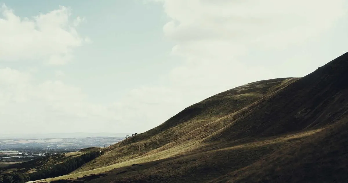
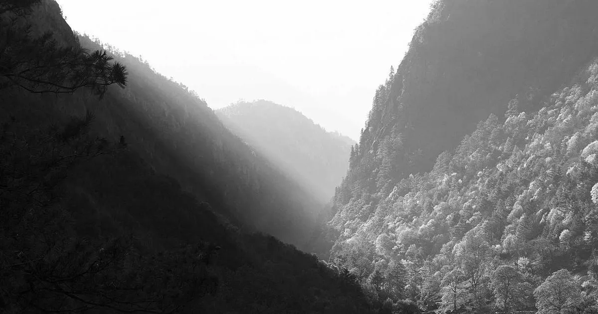
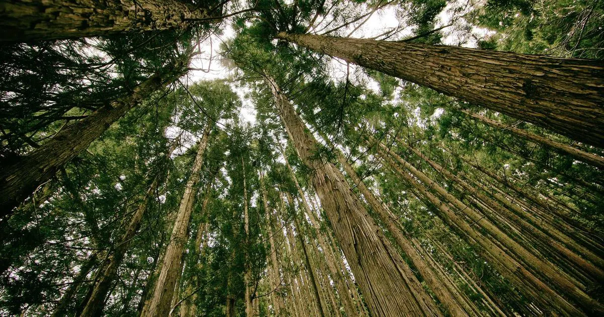
The second image, often referred to as the texture or overlay image, should complement the mood, theme, and visual structure of your portrait. Consider the emotional resonance you want to create: nature scenes like forests, mountains, or oceans often evoke feelings of freedom, mystery, or tranquility. Urban landscapes with buildings, streets, and neon lights can suggest modernity, isolation, or energy. Abstract textures, smoke, or light patterns can add a surreal, dreamlike quality to your composition.
Color palette considerations play a significant role in image selection. Images with complementary color schemes will blend more naturally and create a more harmonious final result. For example, a warm-toned portrait might pair beautifully with a sunset landscape, while a cool-toned portrait could work well with a misty forest or moonlit scene. However, don't be afraid to experiment with contrasting color palettes—sometimes the most striking double exposures come from unexpected color combinations.
Consider the directional flow and composition of both images. If your portrait is facing right, you might want your landscape image to have visual elements that flow in the same direction, creating a sense of movement and harmony. Conversely, opposing directional flows can create tension and dynamic energy in your composition. Pay attention to the lines, shapes, and visual weight in both images, and consider how they will interact when layered together.
Pro Tip
Create a mood board before starting your project. Gather 10-15 potential overlay images and test them quickly with your portrait using different blend modes. This rapid prototyping approach will help you identify the most promising combinations before committing to detailed editing work.
Best Image Pairings for Double Exposure Portraits
- Silhouette + Nature: A person's silhouette filled with forests, mountains, or starry skies creates a sense of connection with nature and often evokes feelings of freedom and exploration.
- Profile + Architecture: Combining a profile view with city buildings or architectural elements can suggest themes of urban life, structure, and the relationship between individuals and their environment.
- Close-up + Abstract Textures: Detailed facial features merged with smoke, water, or light patterns create ethereal, dreamlike compositions with strong emotional impact.
- Dancing Figure + Flowers: Movement captured in a portrait combined with floral elements creates poetic, romantic compositions celebrating life and beauty.
- Portrait + Music: Merging a portrait with musical instruments, notes, or concert scenes can represent a person's passion and creative spirit.
Show a gallery grid of 4-6 different image pairing examples, each demonstrating a different thematic combination that works well for double exposure portraits.
High Contrast Portrait Preparation
Before creating your double exposure, preparing your portrait image with high contrast is essential for achieving the best results. A high contrast portrait features pronounced differences between the light and dark areas, which is crucial for the blend modes to work effectively. The darker areas of your portrait will remain relatively dark in the final composition, while the lighter areas will reveal the details of your overlay image.
Open your portrait image in Photoshop and duplicate the background layer by pressing Ctrl+J (Windows) or Cmd+J (Mac). This non-destructive approach ensures you can always return to your original image if needed. Name this duplicate layer "High Contrast Portrait" to keep your layers panel organized, especially as your project grows more complex.
With your duplicated layer selected, navigate to Image > Adjustments > Levels (or press Ctrl+L / Cmd+L). In the Levels dialog box, you'll see a histogram representing the tonal distribution of your image. To increase contrast, drag the black point slider to the right and the white point slider to the left. Watch as the shadows deepen and the highlights brighten, creating a more dramatic tonal range. The goal is to create an image with strong, defined shadows and bright, clear highlights while maintaining detail in the midtones.
For even more control, consider using the Curves adjustment instead of Levels. Access it through Image > Adjustments > Curves (Ctrl+M / Cmd+M). Creating a gentle S-curve—pulling the shadows down slightly and the highlights up slightly—is a classic technique for adding contrast while maintaining a natural appearance. You can add multiple control points to fine-tune specific tonal ranges with precision.
The Camera Raw Filter provides another excellent option for contrast enhancement. Access it through Filter > Camera Raw Filter and adjust the Contrast, Blacks, Whites, Shadows, and Highlights sliders to create a punchy, high-contrast look. The Clarity slider can also add midtone contrast that emphasizes texture and detail, making your portrait more visually striking.
Important Note
While high contrast is desirable for double exposures, avoid crushing your blacks or blowing out your highlights completely. You want to maintain some detail in the shadow areas, as these will contain subtle hints of your overlay image. Similarly, preserving highlight detail ensures your portrait's features remain recognizable in the final composition.
Portrait Preparation Checklist
- Duplicate your background layer to preserve the original image and work non-destructively. This practice allows you to make adjustments without permanently altering your source material.
- Convert to black and white (optional but recommended). While color double exposures can be stunning, starting with a black and white portrait simplifies the process and gives you more control over the final color grading. Use Image > Adjustments > Black & White for nuanced control over individual color channels.
- Increase contrast using Levels or Curves to create strong tonal separation. Focus on deepening shadows and brightening highlights while maintaining important facial detail.
- Sharpen your portrait to enhance edge definition. Use Filter > Sharpen > Unsharp Mask with settings around Amount: 100%, Radius: 1.0 pixels, and Threshold: 3 levels for crisp, defined edges.
- Clean up the background by removing distracting elements. Use the Clone Stamp tool or Content-Aware Fill to create a clean, uniform background that won't compete with your overlay image.
- Adjust the canvas size if needed to accommodate your final composition. Consider the aspect ratio and orientation that will best showcase your double exposure concept.
Include a before-and-after slider or split-screen showing the original portrait alongside the high-contrast version, demonstrating the tonal improvements.
Using Screen Blend Mode
The Screen blend mode is the cornerstone of double exposure photography in Photoshop, and understanding how it works is essential for mastering this technique. When you set a layer's blend mode to Screen, Photoshop essentially inverts both layers, multiplies them, and then inverts the result. The practical effect is that lighter areas become more prominent while darker areas become more transparent, making it perfect for overlaying images where you want the bright parts of your top layer to show through on the lighter areas of your base layer.
To apply the Screen blend mode, first ensure your overlay image is placed as a new layer above your portrait in the Layers panel. Select the overlay layer and click on the blend mode dropdown menu (which defaults to "Normal") at the top of the Layers panel. Scroll down and select "Screen" from the list. You'll immediately see the double exposure effect take shape, with your overlay image appearing in the lighter areas of your portrait.
The beauty of the Screen blend mode lies in its ability to create natural-looking composites where both images contribute to the final result. Unlike simple opacity reduction, which uniformly fades an entire layer, Screen mode preserves the luminosity relationships within both images, creating a more sophisticated and visually appealing blend. The darker areas of your overlay will become transparent, while the lighter areas will appear over the corresponding areas of your portrait.
After applying the Screen blend mode, you'll likely need to adjust the opacity of your overlay layer to achieve the right balance. Start with an opacity of around 70-80% and adjust from there based on your specific images. The ideal opacity depends on the tonal characteristics of both images and the effect you're trying to achieve. Lower opacity values allow more of the portrait to show through, while higher opacity values emphasize the overlay image.
While Screen is the most commonly used blend mode for double exposures, don't overlook other options that might work better for specific image combinations. Lighten mode is similar to Screen but produces a slightly different result—it simply displays whichever pixel is lighter between the two layers. Overlay and Soft Light modes can create more subtle blending effects with enhanced contrast. Multiply mode, while typically used for darkening, can create interesting effects when applied selectively with layer masks.
Quick Technique
Use the keyboard shortcut to cycle through blend modes quickly. Select your layer, press Shift + Plus or Shift + Minus to move through the blend modes. This rapid cycling approach lets you preview all options and discover combinations you might not have considered.
Understanding How Screen Mode Interacts with Different Tones
Screen blend mode behaves differently depending on the tonal values of your images. In areas where your portrait is pure black (RGB 0,0,0), the overlay image will appear at full intensity, unaffected by the portrait beneath. In areas where your portrait is pure white (RGB 255,255,255), the screen mode produces pure white regardless of the overlay's content. Midtone areas create the most interesting interactions, where both images contribute to the final result in varying degrees.
This tonal interaction is why high contrast portraits work so well for double exposures. The strong shadows in your portrait become windows through which your overlay image is fully visible, while the bright highlights maintain the definition of facial features. The transition between these extremes creates the beautiful, dreamy gradient effect that defines classic double exposure photography.
Experiment with the Levels of your overlay image before applying the Screen blend mode. Adjusting the tonal range of your overlay gives you additional control over how it interacts with your portrait. Brightening your overlay will make it more visible in the Screen composite, while darkening it will make it more subtle. This pre-adjustment step can significantly reduce the amount of post-processing required.
Create a step-by-step visual guide showing the Layers panel at different stages: original layers, after applying Screen mode, and after opacity adjustment.
Layer Masking for Refinement
Layer masking is where your double exposure transitions from a simple overlay to a refined, professional-looking composition. While the Screen blend mode creates the basic double exposure effect, it applies uniformly across the entire image. Layer masking gives you precise control over which parts of the overlay image are visible and which are hidden, allowing you to emphasize certain areas and minimize others for a more intentional, artistic result.
To add a layer mask to your overlay layer, select the layer in the Layers panel and click the "Add Layer Mask" button at the bottom of the panel (the rectangle with a circle icon). A white mask thumbnail will appear next to your layer thumbnail. This mask controls the visibility of your layer: white areas of the mask reveal the layer, black areas hide it, and gray areas create partial transparency proportional to the shade of gray.
With the mask selected (click on the mask thumbnail to ensure it's active), select the Brush tool (B) and set your foreground color to black. Painting with black on the mask will hide parts of the overlay, revealing more of the portrait beneath. Start with a large, soft brush (hardness 0-20%) for smooth transitions and gradual blending. Work slowly and deliberately, building up the masking effect through multiple strokes rather than trying to achieve perfect results in one pass.
For areas where you want to fully reveal facial features—such as the eyes, nose, and mouth—use a smaller brush and paint more precisely. These features should typically remain clear and recognizable to maintain the portrait's identity and emotional connection with the viewer. The overlay effect is most effective when it fills the silhouette without obscuring the subject's key characteristics.
To reveal parts of the overlay that you may have accidentally hidden, simply switch your foreground color to white (press X to toggle between black and white) and paint over those areas. This non-destructive approach is one of the greatest advantages of layer masking—unlike erasing, you can always refine your mask without losing any image data. The ability to add, subtract, and refine your mask endlessly is what separates casual double exposures from professional-looking compositions.
Keyboard Shortcuts
Master these essential shortcuts for efficient masking work: B for Brush tool, [ and ] to change brush size, X to toggle foreground/background colors, Alt+Click on mask to view mask directly, Shift+Click on mask to toggle mask visibility. These shortcuts will dramatically speed up your workflow.
Advanced Masking Techniques
For more precise masking around complex edges like hair, consider using the Select and Mask workspace. Access it by clicking the "Select and Mask" button in the Properties panel when your mask is selected. This workspace provides advanced tools like the Refine Edge Brush, which excels at capturing fine details like individual hair strands. The Radius slider helps Photoshop detect edges, while the Smooth, Feather, and Contrast sliders refine the mask's quality.
Gradient masks create beautiful, gradual transitions between the overlay and portrait. Select the Gradient tool (G) and choose a black-to-white or black-to-transparent gradient. Drag across your mask to create a smooth fade that gradually transitions from fully visible to fully hidden. Linear gradients work well for directional fades, while radial gradients can create spotlight effects that emphasize the center of your composition.
Using channels for masking provides another level of precision. If your portrait has strong tonal separation between the subject and background, you can use one of the color channels as the basis for a mask. In the Channels panel, examine each channel and identify the one with the greatest contrast between subject and background. Duplicate this channel, adjust its levels to create a clean silhouette, and then load it as a selection to create a highly accurate mask.
Consider using multiple masks at different stages of your workflow. You might use one mask for the initial blend, another for color adjustments, and a third for specific refinements. This layered masking approach gives you maximum control and flexibility, allowing you to isolate and address specific aspects of your composition independently.
Common Mistake
Avoid the temptation to over-mask your double exposure. The magic of this technique lies in the interplay between both images. If you mask too aggressively, you'll simply end up with a regular portrait with some texture added. Trust the blend and only mask where absolutely necessary for clarity or emphasis.
Silhouette Technique for Portraits
The silhouette technique is arguably the most iconic and recognizable approach to double exposure portraiture. By creating a strong, defined silhouette and filling it with a secondary image, you produce compositions that are both visually striking and emotionally powerful. This technique works because silhouettes are universally recognizable as human forms while remaining anonymous, allowing viewers to project their own emotions and interpretations onto the image.
To create a silhouette from your portrait, start by opening your image in Photoshop and duplicating the background layer. Navigate to Image > Adjustments > Threshold and adjust the slider until you have a clean, black-and-white silhouette. The exact threshold level will depend on your specific image, but generally, you want to preserve the overall shape of the head and shoulders while eliminating most internal detail. Don't worry about perfection at this stage—you'll refine the silhouette with additional tools.
Refine your silhouette using the Brush tool. Paint with black to fill in any gaps or light spots within the silhouette, and paint with white to clean up any stray marks outside the silhouette's boundaries. The goal is to create a solid, recognizable human form with clean edges. Pay special attention to areas like the hair, collar, and shoulders, where the silhouette's edge definition is most important for recognition.
For a more natural-looking silhouette, consider using a backlit portrait as your starting point. Backlit images naturally create silhouettes when properly exposed, and they retain more subtle tonal gradations at the edges, which can add depth and interest to your double exposure. If you're shooting specifically for double exposure purposes, position your subject facing a bright window or outdoors with the sun behind them.
Once your silhouette is ready, place your overlay image as a new layer above it and set the blend mode to Screen. The overlay image will appear within the silhouette's boundaries, creating the classic double exposure effect. Adjust the overlay's position and scale to achieve the most compelling composition—often, positioning the most interesting part of the overlay image within the silhouette's face area creates the strongest visual impact.
Silhouette Variations
Experiment with different silhouette variations: full profile, three-quarter view, facing left vs. right, with hair flowing or pulled back, wearing different headwear. Each variation creates a distinct mood and allows for different compositional possibilities with your overlay image.
Creating Detailed Silhouettes with Pen Tool
For the most precise silhouettes, use the Pen tool (P) to manually trace around your subject. While this approach requires more time and skill, it produces the cleanest, most professional results. Click to create anchor points around the subject's outline, using click-and-drag to create curves that follow the natural contours of the body and clothing.
When using the Pen tool for silhouettes, work slowly and zoom in for precision around complex areas like the face, hair, and clothing details. Use fewer anchor points on smooth curves and more points on complex, detailed edges. After completing your path, right-click and choose "Make Selection" to convert it into a selection, then fill the selection with black on a new layer to create your silhouette.
The Quick Selection tool combined with Select and Mask provides a middle ground between the automatic Threshold method and the manual Pen tool approach. Use the Quick Selection tool to make an initial selection of your subject, then refine it in the Select and Mask workspace using the Refine Edge Brush for hair and the various sliders for overall mask quality. This approach offers good precision with less time investment than the Pen tool.
Consider creating multiple silhouette variations from the same portrait. By adjusting the Threshold level, edge refinement, and cleanup, you can create a range of silhouettes from the same source image—some with more detail visible, others more abstract. Having multiple options gives you flexibility when experimenting with different overlay images and compositions.
Display a sequence showing the progression from original portrait to threshold adjustment to refined silhouette, demonstrating the complete silhouette creation process.
Adding Landscape Textures
Landscape textures are among the most popular and effective overlay choices for double exposure portraits, and for good reason. Nature's diverse visual elements—forests, mountains, oceans, skies, and flowers—create rich, emotionally resonant compositions that speak to universal themes of beauty, mystery, and our connection to the natural world. Understanding how to effectively incorporate landscape textures will significantly enhance your double exposure work.
When adding landscape textures, the positioning of key elements within the overlay image is crucial. Trees, mountains, or other vertical elements that align with the silhouette's spine or profile create a sense of integration and harmony. Horizontal landscape elements like horizons or mountain ranges can create interesting divisions within the silhouette, separating the composition into distinct visual zones. Consider the natural flow of the landscape and how its lines interact with the contours of your portrait.
The scale of your landscape texture relative to your portrait dramatically affects the final mood. Large-scale landscapes where a single tree or mountain dominates the silhouette create dramatic, impactful compositions with strong visual focus. Small-scale textures like fields of flowers, forests viewed from a distance, or ripples on water create more intricate, detailed compositions that reward close viewing. Experiment with different scales to find the effect that best serves your creative vision.
Seasonal considerations can add another layer of meaning to your double exposure. Autumn foliage suggests transition and change, spring blossoms evoke renewal and hope, winter scenes convey solitude and contemplation, and summer landscapes represent vitality and abundance. Choose your landscape season intentionally to reinforce the emotional narrative of your portrait.
Lighting conditions in your landscape image significantly impact the double exposure result. Golden hour landscapes with warm, directional light create romantic, nostalgic moods. Blue hour images with cool, soft light produce contemplative, melancholic atmospheres. Harsh midday light can create bold, graphic compositions with strong shadows and highlights. Overcast conditions provide even, diffused light that works well for subtle, delicate double exposures.
Photography Tip
Build a library of landscape textures by photographing nature in various conditions and seasons. Capture wide landscapes, close-up textures (bark, leaves, water), and atmospheric conditions (fog, rain, snow). Having a diverse collection of textures gives you maximum creative flexibility when creating double exposures.
Best Landscape Textures for Different Moods
- Dramatic & Powerful: Storm clouds, crashing waves, mountain peaks, lightning, volcanic landscapes, waterfall rapids.
- Peaceful & Serene: Calm lakes, gentle meadows, soft clouds, misty forests, flowing streams, sunset reflections.
- Mysterious & Ethereal: Foggy landscapes, moonlit scenes, bioluminescent waters, deep forests, cave interiors, northern lights.
- Vibrant & Energetic: Wildflower fields, autumn forests, coral reefs, tropical beaches, cherry blossoms, sunlit canopies.
- Minimalist & Modern: Sand dunes, snow fields, empty beaches, clear skies, desert landscapes, geometric rock formations.
Texture Integration Tip
Pay attention to the tonal distribution of your landscape texture. Images with a good range of tones from deep shadows to bright highlights will blend more naturally with your portrait. Flat, evenly-lit landscapes can produce muddy double exposures that lack visual interest and contrast.
Create a visual mood board showing different landscape textures paired with the mood they evoke, helping readers select appropriate textures for their desired emotional tone.
Color Tinting Double Exposures
Color tinting transforms a standard double exposure from a simple technical exercise into a cohesive, emotionally charged work of art. By applying unified color tones across your entire composition, you tie the two overlay images together visually, creating a sense of harmony and intentionality. Color also carries powerful emotional associations that can dramatically influence how your double exposure is perceived and felt by viewers.
The most straightforward approach to color tinting is using a Gradient Map adjustment layer. Create a new Gradient Map by clicking the adjustment layer icon at the bottom of the Layers panel and selecting "Gradient Map." Choose or create a gradient that transitions between two complementary colors—for example, deep purple to warm gold, or cool blue to soft pink. This adjustment maps the image's tonal range to your chosen colors, creating a unified color wash across the entire composition.
Solid Color fill layers offer another simple tinting method. Create a new Solid Color layer, choose your desired tint color, and then change the layer's blend mode to Color or Soft Light. Adjust the opacity to control the intensity of the tint. This approach gives you more control over the specific hue applied and allows for easier experimentation with different colors.
Split toning—applying different colors to shadows and highlights—creates more sophisticated color effects. Use the Color Balance adjustment layer (Image > Adjustments > Color Balance, or via adjustment layers) to independently adjust the color balance of shadows, midtones, and highlights. For example, you might add blue to the shadows and yellow to the highlights for a cinematic color grading effect that adds depth and visual interest.
For the most control over color tinting, combine multiple adjustment layers. Use a Curves adjustment to fine-tune individual color channels, a Hue/Saturation adjustment to control color intensity, and a Selective Color adjustment to target specific hues. This layered approach to color grading gives you precise control over every aspect of your double exposure's color palette.
Color Psychology
Use color intentionally to reinforce your narrative: warm oranges and reds suggest passion, energy, and warmth; cool blues and teals evoke calm, melancholy, and mystery; greens convey growth, nature, and renewal; purples suggest luxury, creativity, and spirituality. Consider the emotional journey you want your viewers to experience when choosing your color palette.
Popular Color Palettes for Double Exposure Portraits
Warm Golden Tones
Golden yellows, warm oranges, and rich ambers create nostalgic, romantic moods. Perfect for portraits paired with sunset landscapes or autumn foliage.
Cool Blue Tones
Deep blues, teals, and cyan create contemplative, mysterious atmospheres. Ideal for night scenes, water landscapes, or introspective portraits.
Purple & Violet
Rich purples, lavenders, and violets evoke creativity, luxury, and spirituality. Beautiful for artistic portraits paired with floral or abstract textures.
Natural Greens
Forest greens, sage, and olive tones suggest growth, nature, and tranquility. Perfect for portraits merged with woodland or garden landscapes.
When applying color tinting, always consider the existing colors in your source images. A warm-tinted landscape overlay might clash with a cool-toned portrait if not properly unified through color grading. Use your tinting adjustments to harmonize the color palettes of both images, creating a cohesive visual experience rather than two separate images with conflicting colors.
Show the same double exposure composition with four different color treatments, demonstrating how dramatically color tinting can alter the mood and emotional impact of the same base image.
Adjusting Brightness and Contrast
Fine-tuning brightness and contrast is the polish that elevates a good double exposure to a great one. After combining your images and applying blend modes and masks, the resulting composite often needs tonal adjustments to achieve the optimal balance between visibility, mood, and visual impact. These final adjustments ensure that both images are properly represented while maintaining the cohesive, unified appearance that defines successful double exposures.
Begin by adding a Curves adjustment layer at the top of your layer stack. This placement ensures it affects the entire composite uniformly. Click on the diagonal line in the Curves panel and drag it to adjust the overall brightness and contrast. Pulling the curve upward brightens the image, while pulling it downward darkens it. Creating a gentle S-curve—lowering the shadows and raising the highlights—instantly adds contrast and visual punch to your double exposure.
The Brightness/Contrast adjustment layer offers a simpler alternative for straightforward adjustments. Increase brightness if your double exposure appears too dark or muddy, which can happen when both source images have predominantly dark tones. Increase contrast to enhance the separation between light and dark areas, making the double exposure effect more pronounced and visually striking. Use this adjustment judiciously, as excessive brightness or contrast can destroy the delicate balance of your composition.
Consider using the Levels adjustment for more precise control over specific tonal ranges. The input levels slider lets you set the black point, white point, and midtone gamma independently. Moving the black point slider right darkens the shadows, moving the white point slider left brightens the highlights, and adjusting the midtone slider shifts the overall brightness without affecting the extreme tones. This three-point control system provides excellent precision for fine-tuning your double exposure's tonal balance.
Shadow and highlight recovery can save details that may have been lost during the blending process. Use the Shadows/Highlights adjustment (Image > Adjustments > Shadows/Highlights) to selectively brighten shadow areas or darken blown-out highlights. This adjustment is particularly useful for recovering facial features that may have become too dark or landscape details that have become too bright during the Screen blend mode application.
Visual Check
Periodically zoom out to 100% or less while adjusting brightness and contrast. Details that look important when zoomed in may be insignificant at normal viewing size, while overall tonal balance is what viewers notice first. Ensure your double exposure looks compelling at typical viewing sizes before fine-tuning individual details.
Troubleshooting Common Tonal Issues
- Washed-out appearance: Increase contrast and check that your Screen blend mode opacity isn't too low. A washed-out look often indicates that neither image is contributing strongly enough to the final result.
- Too dark overall: Brighten the midtones using Curves or Levels. If only certain areas are too dark, use a mask to apply brightness adjustments selectively to those regions.
- Flat, lifeless look: Add a subtle S-curve to increase contrast, and consider adding a slight vignette to draw attention toward the center of the composition.
- Blown-out highlights: Reduce the white point in Levels or pull down the highlight curve. Check your overlay image for bright areas that may be causing unwanted brightness in the composite.
- Lost facial features: Use a layer mask to selectively reduce the overlay's opacity over the face area, ensuring the portrait's key features remain visible and recognizable.
Avoid Over-Processing
While it's tempting to push brightness and contrast to extremes for dramatic effect, over-processing can make your double exposure look artificial and processed. Aim for a natural, balanced appearance where the double exposure effect enhances rather than overwhelms the underlying portrait. When in doubt, less is more.
Creative Composition Tips
Composition transforms a technically proficient double exposure from an interesting experiment into a compelling work of art. While the technical aspects of blending, masking, and color grading are essential, it's composition that determines whether your final image captures attention, tells a story, and leaves a lasting impression on viewers. Thoughtful composition elevates the visual impact and emotional resonance of your double exposure portrait.
The rule of thirds remains a valuable guideline for double exposure compositions. Position your subject's eyes along the upper third line, and align key landscape elements—like horizons, mountain peaks, or tree trunks—along the thirds grid lines. This placement creates balanced, visually pleasing compositions that feel natural and intentional. However, don't be afraid to break this rule when central composition or other arrangements better serve your creative vision.
Negative space plays a crucial role in double exposure composition. The areas outside your silhouette or portrait frame provide breathing room and visual contrast that help your subject stand out. Strategic use of negative space can emphasize isolation, freedom, or contemplation depending on how it's employed. Consider leaving more space in the direction your subject is facing, creating a sense of looking toward the future or toward something beyond the frame.
Leading lines within your overlay image can direct the viewer's eye toward important areas of your composition. A winding river, a path through a forest, or architectural lines that flow toward the face create visual pathways that guide the viewer's journey through your image. These lines create movement and narrative flow, transforming a static image into a dynamic visual experience.
Framing within framing—using elements of the overlay image to create frames within your portrait—adds depth and complexity to your composition. Tree branches arching over a head, window frames surrounding a face, or architectural arches that echo the silhouette's contours create nested compositions that reward careful viewing. This technique adds layers of visual interest and creates a sense of looking through multiple windows into the subject's inner world.
Composition Principle
Consider the visual weight of elements in both images. A small, bright element in your overlay can balance a large, dark area of your portrait. Aim for a balanced distribution of visual weight that feels stable yet dynamic, creating compositions that are both harmonious and engaging.
Advanced Compositional Techniques
- Fibonacci Spiral: Arrange key elements along a Fibonacci spiral for mathematically pleasing, naturally flowing compositions that feel organic and balanced.
- Golden Ratio: Position your subject at the golden ratio point (approximately 61.8% from either edge) for compositions that feel instinctively right to the human eye.
- Diagonal Composition: Use diagonal lines and placements to create dynamic, energetic compositions that convey movement and tension.
- Symmetry: Create mirror-like compositions where the overlay image perfectly fills the portrait silhouette, producing impactful, graphic designs.
- Asymmetry: Deliberately unbalanced compositions can create tension, interest, and a sense of movement or instability that serves specific emotional narratives.
Consider the story your double exposure tells. Every element in your composition should contribute to this narrative—the overlay image should complement and enhance the portrait's emotional content, not compete with it. A portrait of a musician merged with musical instruments tells a different story than the same portrait merged with a quiet forest. Choose your overlay and composition to support the specific narrative you want to communicate.
Create an overlay grid showing rule of thirds, golden ratio, and Fibonacci spiral compositional guides applied to double exposure portraits, demonstrating how these principles guide element placement.
Before and After Showcase
Seeing the transformation from original images to finished double exposure is one of the most powerful learning tools available. Before and after comparisons reveal not just the dramatic visual change but also the decision-making process that guided each step of the transformation. By studying these comparisons, you develop an understanding of how individual adjustments contribute to the final result and learn to make more informed creative decisions in your own work.
The most effective before and after comparisons show not just the starting and ending points but also the intermediate stages of the process. Displaying the original portrait, the high-contrast version, the silhouette preparation, the initial Screen blend, and the final color-graded result tells the complete story of the transformation. Each stage represents a decision point where the artist chose a specific direction for the composition.
When presenting before and after comparisons, consider what each image pair reveals about the technique. A portrait-to-silhouette comparison demonstrates contrast preparation. A silhouette-to-initial-blend comparison shows the Screen mode effect. A blend-to-final comparison illustrates the impact of masking, color grading, and tonal adjustments. Together, these comparisons provide a comprehensive visual education in double exposure creation.
Before and after comparisons also serve an important marketing and portfolio function. They demonstrate your skill and artistic vision to potential clients and collaborators, showing not just what you can create but how you think through the creative process. In a field where many practitioners can execute the technical aspects, the artistic decisions revealed through before and after comparisons differentiate skilled artists from mere technicians.
Consider creating before and after comparisons that showcase different styles and approaches. Show a nature-themed double exposure alongside an urban-themed one, demonstrating your versatility. Display a high-contrast, dramatic example alongside a soft, ethereal one, showing your range. Present a color-graded version alongside a black and white one, illustrating the impact of color choices. These varied comparisons appeal to different tastes and demonstrate your creative breadth.
Portfolio Strategy
Create a dedicated before-and-after gallery on your website or portfolio platform. Include 10-15 of your best transformations, each with clear descriptions of the techniques used and the creative decisions made. This showcase not only demonstrates your skills but also educates potential clients about the value and complexity of your work.
Key Transformations to Showcase
Portrait Preparation
Show the dramatic difference between an original portrait and the high-contrast, sharpened version prepared for double exposure blending.
Blend Mode Effect
Display the immediate impact of applying Screen blend mode, showing how two separate images merge into a unified composition.
Masking Refinement
Compare an unmasked double exposure with the refined version after strategic masking that emphasizes key features and minimizes distractions.
Color Grading Impact
Present the same double exposure with different color treatments, demonstrating how color transforms mood and emotional impact.
Create a dramatic before-and-after slider or side-by-side comparison showing a complete transformation from two separate source images to the final double exposure portrait.
Exporting Portrait Double Exposures
The final step in your double exposure workflow is exporting your masterpiece in the optimal format and quality for your intended use. Proper export ensures that your carefully crafted image maintains its visual quality across different platforms, devices, and print applications. Understanding export settings is the difference between a double exposure that looks stunning online and one that appears compressed, blurry, or color-shifted.
For web and social media use, navigate to File > Export > Export As (or File > Save for Web for older versions). Select JPEG as your format, as it provides the best balance of quality and file size for online viewing. Set the quality to 80-90% for a good balance between visual fidelity and file size. Higher quality settings produce larger files with diminishing visual returns, while lower settings may introduce visible compression artifacts that degrade your image quality.
For print applications, export at the highest quality settings or save as a TIFF file to preserve maximum detail and color accuracy. Ensure your image resolution is at least 300 DPI (dots per inch) for print-quality output. If your double exposure will be printed at a specific size, check that the pixel dimensions are sufficient for that size at 300 DPI. For example, an 8x10 inch print at 300 DPI requires an image that is at least 2400x3000 pixels.
Color profile management is crucial for maintaining accurate colors across different devices and platforms. For web use, convert your image to the sRGB color profile (Edit > Convert to Profile > sRGB), as this is the standard color space for web browsers and most consumer displays. For professional printing, you may need to convert to a printer-specific color profile or use Adobe RGB for a wider color gamut.
Consider exporting multiple versions of your double exposure for different uses. Create a high-resolution version for print, a web-optimized version for your portfolio website, and appropriately sized versions for different social media platforms. Instagram, for example, performs best with images that are 1080x1080 pixels for square posts or 1080x1350 pixels for portrait orientation. Facebook prefers images around 2040 pixels on the longest side. Having platform-specific versions ensures your double exposure looks its best everywhere it appears.
Export Checklist
Before exporting, flatten your image (Layer > Flatten Image) or save a copy to ensure all adjustments, masks, and effects are properly rendered. Keep your layered PSD file as a master copy for future edits. Create a naming convention for your exports that includes the project name, version, and intended use (e.g., "double-exposure-forest-v1-web.jpg").
Export Settings for Different Platforms
- Instagram: 1080x1080px (square) or 1080x1350px (portrait), JPEG, 80% quality, sRGB profile
- Facebook: 2040px longest side, JPEG, 85% quality, sRGB profile
- Twitter: 1600x900px (landscape) or 1080x1350px (portrait), JPEG, 80% quality
- Portfolio Website: 1920px longest side, JPEG, 90% quality, sRGB profile
- Print (Standard): 300 DPI, TIFF or high-quality JPEG (100%), appropriate color profile
- Print (Large Format): 150-300 DPI depending on viewing distance, TIFF preferred
Finally, consider watermarking your double exposures before sharing them online, especially if they represent original artistic work. A subtle, semi-transparent watermark in a corner protects your intellectual property without significantly impacting the viewing experience. For professional portfolio use, you might skip the watermark to showcase your work in its purest form, relying instead on proper copyright notices and attribution.
Quality Assurance
Always review your exported image at actual size on multiple devices before sharing. Check for compression artifacts, color accuracy, and overall visual quality. What looks perfect on your calibrated monitor might appear differently on an uncalibrated phone screen or laptop display. Testing across devices ensures your double exposure looks great everywhere.
Show the Export dialog box with recommended settings highlighted, along with a visual comparison of the same image exported at different quality levels to demonstrate the impact of export settings.
Was this article helpful?
Pro Pixel Agency
Want this done for you? Try our image editing free.
Send a sample, get the finished result back, and only then decide. Clear prices, no commitment.