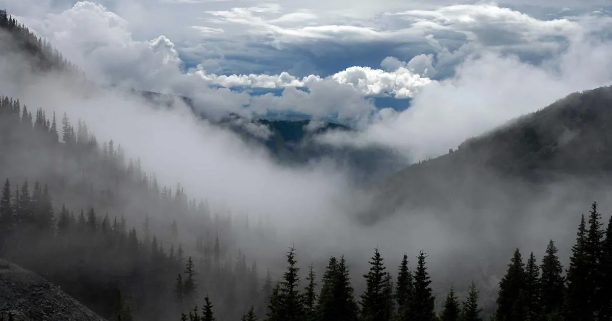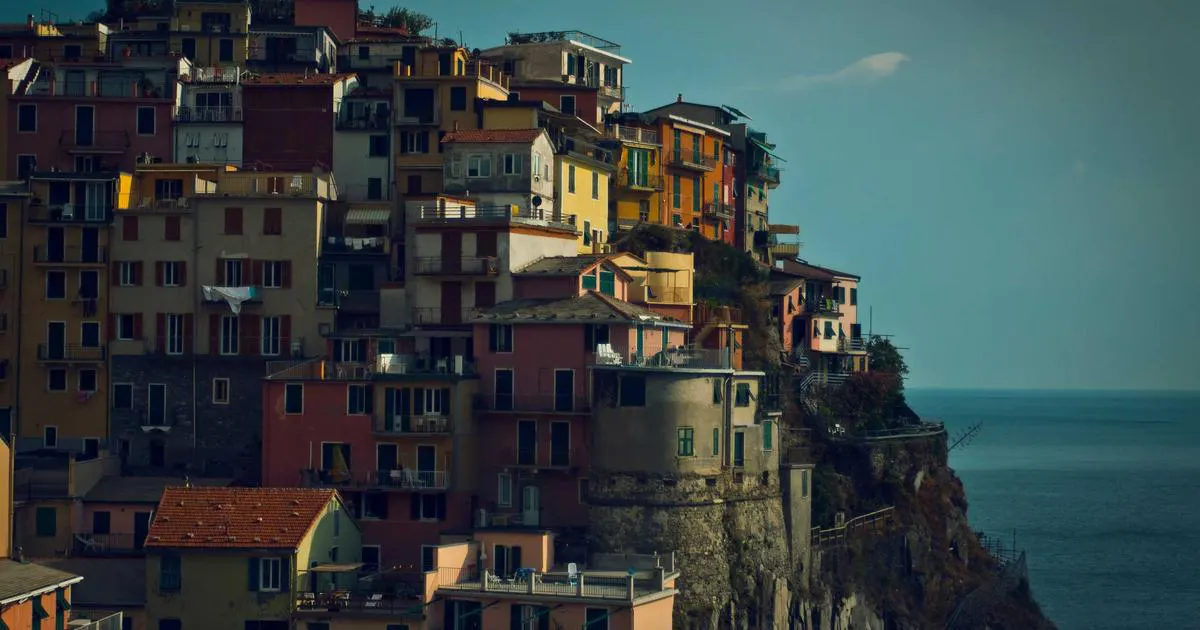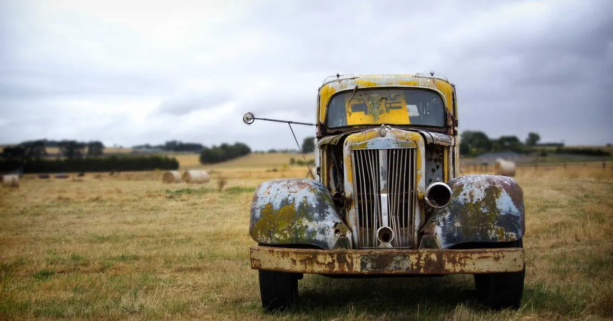

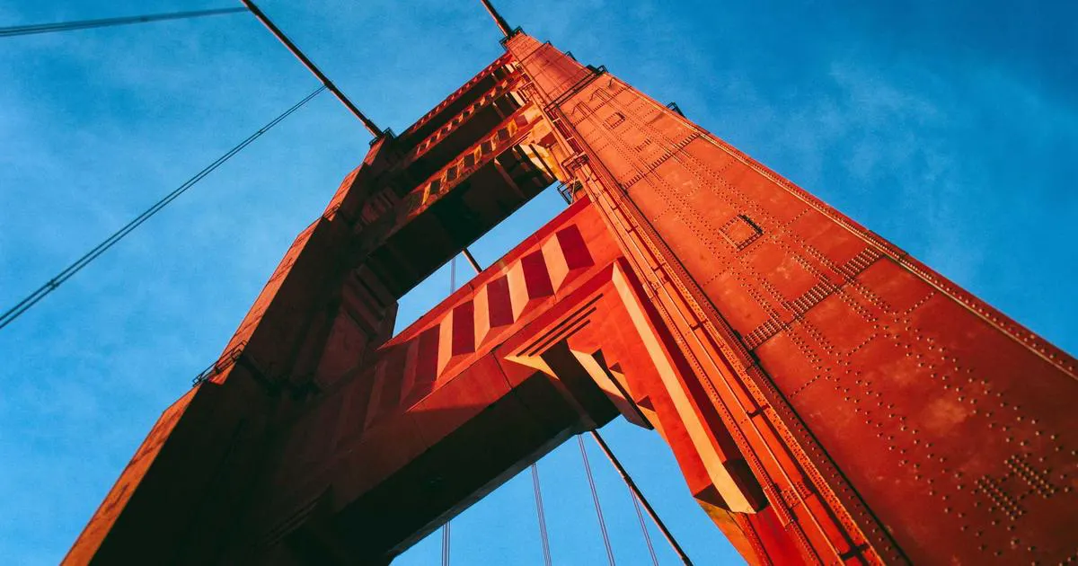
A comprehensive, step-by-step guide to mastering the duotone effect in Adobe Photoshop. Learn how to transform ordinary photos into stunning two-color artworks using gradient maps, color grading techniques, and professional color theory.
DesignStudio Team
Featured Image: Duotone Effect Showcase – 1200 x 630px recommended
What Is Duotone Photography?
Duotone photography is a visual technique that uses only two colors to create an image, replacing the traditional grayscale or full-color spectrum. This technique has deep roots in the world of print design and commercial art, dating back to the early days of photographic reproduction when printing technology was limited to a small number of ink colors. By combining two carefully chosen hues, designers and photographers can evoke specific moods, establish visual cohesion, and create images that immediately grab the viewer's attention.
The concept behind duotone is surprisingly simple yet incredibly powerful. Instead of allowing an image to be represented by thousands of colors, you constrain the palette to just two tones — typically one for the shadows and another for the highlights. The mid-tones are then expressed as blends and gradients between these two anchor colors. This constraint forces a creative reimagining of the original photograph and often results in images that feel more intentional, more artistic, and more emotionally resonant than their full-color counterparts.
The duotone effect is not merely a filter or a quick preset you apply and forget. At its core, it is a deliberate design decision rooted in color theory, composition, and storytelling. When you choose to render an image in duotone, you are making a statement about what matters in that image. You are stripping away distractions and focusing the viewer's eye on form, contrast, and mood. This is why duotone has become one of the most popular techniques in modern graphic design, branding, editorial layouts, and social media content.
In the context of Photoshop, creating a duotone effect involves using specific tools and adjustment layers that allow you to map two colors onto the tonal range of an image. The most common and versatile method is using the Gradient Map adjustment layer, which gives you precise control over how each tonal value in the image corresponds to your chosen color palette. Other approaches include using the Duotone mode directly in Photoshop's Image Mode menu, blending solid color layers with blend modes, or combining multiple adjustment layers for more nuanced results.
The beauty of the duotone effect lies in its versatility. It works on virtually any type of photograph — from portraits and landscapes to urban street photography and abstract compositions. A portrait rendered in deep navy and warm gold feels regal and timeless. A cityscape in electric cyan and hot pink feels futuristic and energetic. A still life in muted olive and dusty rose feels contemplative and serene. The same underlying image can tell completely different stories depending on which two colors you choose to represent it.
Historically, duotone printing was born out of necessity. In the early 20th century, newspaper and magazine publishers could not afford full-color printing for every image. Duotone offered a middle ground between black-and-white and expensive four-color process printing, allowing publishers to add visual richness and depth to their pages while keeping production costs manageable. This practical origin has given duotone a lasting association with editorial design, haute couture photography, and vintage aesthetics that persists to this day.
Today, the duotone effect has transcended its utilitarian origins to become a deliberate artistic choice. Spotify famously popularized duotone imagery in its branding, using bold two-color treatments of artist portraits that have become instantly recognizable worldwide. Major brands like Nike, Apple, and various media outlets have embraced duotone as a way to create visually striking campaigns that stand out in an increasingly crowded visual landscape. The technique has become synonymous with modern, sophisticated design.
Key Insight: Duotone is not just a visual effect — it is a design philosophy that prioritizes intentionality, mood, and visual impact over photorealistic representation. Understanding this distinction will elevate how you approach color in all your design work.
Understanding what duotone photography is and where it comes from gives you a strong foundation for the practical techniques that follow in this tutorial. Now that we understand the history and significance of duotone, let us explore why you would want to use this effect in your own work and the specific advantages it offers over other color treatments.
Why Use the Duotone Effect?
Before diving into the technical steps of creating a duotone effect in Photoshop, it is important to understand why this technique is worth your time and attention. The duotone effect offers numerous advantages that make it a valuable tool in any designer's or photographer's arsenal. Whether you are working on a personal project, a client deliverable, or content for social media, understanding the "why" behind duotone will help you use it more effectively and make better creative decisions.
One of the primary reasons designers gravitate toward the duotone effect is its ability to create immediate visual impact. In a world where people are bombarded with thousands of images every day on social media, websites, and digital platforms, standing out is more important than ever. A duotone image cuts through the noise by presenting a bold, distinctive aesthetic that demands attention. The constrained color palette creates a sense of visual unity and intentionality that full-color photographs often lack, making duotone images feel more polished and deliberate.
Another significant advantage of the duotone effect is its ability to establish and reinforce brand identity. When a brand consistently uses a specific duotone color scheme across its visual content, it creates a cohesive and recognizable visual language. This consistency helps customers associate specific colors and moods with the brand, strengthening brand recall and recognition. Spotify's signature duotone artist portraits are a perfect example of this — the technique has become so closely associated with the brand that it is instantly recognizable even without the company logo.
The duotone effect also excels at evoking specific emotions and moods. Color psychology is a well-established field of study, and by carefully selecting your two duotone colors, you can tap into the emotional associations that different hues carry. Warm duotones like orange and deep red evoke passion, energy, and warmth. Cool duotones like teal and navy suggest calmness, professionalism, and depth. High-contrast duotones with complementary colors create excitement and dynamism. This emotional precision makes duotone an invaluable tool for storytelling through imagery.
From a practical standpoint, the duotone effect offers excellent flexibility in handling images with limited color information. If you are working with a black-and-white photograph or an image that was shot in poor lighting conditions, applying a duotone treatment can breathe new life into it. The two-color treatment adds depth, visual interest, and emotional resonance that the original image may have lacked. This makes duotone an excellent rescue technique for images that might otherwise be discarded or overlooked.
Pro Tip
When deciding whether to use duotone, ask yourself: "Does this image need color to communicate its message?" If the answer is no, and you want to emphasize mood, form, or brand consistency, duotone is likely the right choice.
The duotone effect also provides remarkable consistency across different media and platforms. An image that might look different on various screens due to color calibration issues will maintain its visual identity more reliably when reduced to two specific colors. This makes duotone particularly valuable for cross-platform branding, where consistent color representation across web, mobile, print, and social media is essential for maintaining a professional appearance.
Additionally, the duotone technique serves as an excellent learning tool for understanding color theory, tonal relationships, and image composition. By working within the constraint of two colors, you develop a deeper appreciation for how tonal values work, how colors interact with each other, and how subtle adjustments in hue, saturation, and brightness can dramatically alter the mood and impact of an image. Many professional designers credit their early experiments with duotone as a pivotal moment in their understanding of color and design.
Finally, the duotone effect is remarkably accessible. Unlike many advanced Photoshop techniques that require extensive knowledge of complex tools and workflows, creating a duotone effect can be accomplished in just a few simple steps. This accessibility makes it an ideal technique for beginners who want to achieve professional-looking results without a steep learning curve, while also offering enough depth and nuance to keep experienced designers engaged and creatively challenged.
Converting to Grayscale First
The first step in creating a high-quality duotone effect is understanding how to properly convert your image to grayscale. While it might seem tempting to skip this step and apply your duotone colors directly to a full-color image, taking the time to create a well-optimized grayscale version will give you significantly better results. The grayscale conversion determines the tonal foundation of your duotone, and getting it right is crucial for achieving the depth, contrast, and visual quality you want in the final result.
In Photoshop, there are several ways to convert an image to grayscale, and each method produces slightly different results. The simplest approach is to go to Image > Mode > Grayscale, but this method discards color information without giving you any control over how different colors are translated into gray tones. A more sophisticated approach is to use a Black & White adjustment layer, which allows you to control exactly how each color channel contributes to the final grayscale result. This level of control is essential for optimizing the tonal range of your image before applying the duotone colors.
1
Open Your Image in Photoshop
Begin by opening the photograph you want to transform into a duotone. Choose an image with good tonal range — one that has clear highlights, mid-tones, and shadows. Images with too much contrast or too little detail in the shadows will not produce the best duotone results.
2
Add a Black & White Adjustment Layer
Go to Layer > New Adjustment Layer > Black & White. This creates a non-destructive adjustment that you can modify at any time. The Properties panel will open with sliders for Reds, Yellows, Greens, Cyans, Blues, and Magentas, each controlling how that color range is represented in the grayscale output.
3
Fine-Tune the Grayscale Conversion
Adjust the color sliders to optimize the tonal balance of your grayscale image. For portraits, you might want to lighten the reds and yellows to smooth skin tones. For landscapes, you might darken the blues to add drama to skies. The goal is to create a grayscale image with rich tonal depth and good contrast that will serve as a strong foundation for your duotone colors.
4
Adjust Contrast with Curves
After the Black & White conversion, add a Curves adjustment layer to fine-tune the contrast. A gentle S-curve typically works well, deepening shadows slightly and brightening highlights to add dimension to the image. Be careful not to crush the blacks or blow out the whites, as you want to preserve tonal detail across the entire range.
The Black & White adjustment layer gives you creative control that the simple Grayscale mode conversion does not. By adjusting how each original color translates to gray, you can emphasize certain elements in the image while de-emphasizing others. For example, in a portrait, you might want to lighten the blue channel to brighten the subject's eyes, or darken the red channel to add more definition to facial features. In a landscape, you might darken the blue channel to create a more dramatic sky while lightening the greens to make foliage stand out.
Another important consideration during the grayscale conversion is preserving detail in both the highlight and shadow areas. When you apply duotone colors later, these areas will be mapped to your chosen highlight and shadow colors. If you lose detail in the grayscale conversion, you will also lose it in the duotone result. Take the time to examine your image at 100% zoom, paying particular attention to the darkest shadows and brightest highlights, and make sure you are retaining the tonal information you need.
The Curves adjustment layer is your best friend during this stage. It allows you to precisely control the tonal mapping of your image, making subtle adjustments that have a significant impact on the final result. A common technique is to use a gentle S-curve to increase overall contrast, then use the point tool to selectively adjust specific tonal ranges. For example, if you want to darken mid-tones while keeping highlights bright, you can add a control point in the mid-tone range and pull it down slightly.
It is also worth noting that the order in which you apply adjustments matters. The Black & White adjustment should be your first step, followed by the Curves adjustment for contrast refinement. Any additional adjustments, such as sharpening or noise reduction, should be applied before the duotone colors are added. This systematic approach ensures that each step builds upon the previous one, resulting in a cleaner and more controlled workflow.
Important: Always work non-destructively in Photoshop. Use adjustment layers rather than applying adjustments directly to the image. This allows you to go back and modify any step at any point in the process without having to start over.
Once you are satisfied with your grayscale conversion, you have a solid tonal foundation upon which to build your duotone effect. The quality of this grayscale version directly determines the quality of your final duotone image, so do not rush this step. A well-optimized grayscale image with rich tonal detail will produce a duotone that looks professional, polished, and visually compelling.
Creating Duotone with Gradient Map
The Gradient Map adjustment layer is the most powerful and flexible tool for creating duotone effects in Photoshop. Unlike the Image > Mode > Duotone option, which applies the effect destructively and offers limited control, the Gradient Map adjustment layer is non-destructive, fully customizable, and can be combined with other adjustment layers for more complex results. This is the method that professional designers and photographers rely on for creating duotone images, and mastering it will give you the ability to create any duotone look you can imagine.
The Gradient Map works by mapping the tonal values of your image to a gradient that you define. In a duotone application, you create a gradient that transitions from your chosen shadow color on the left to your chosen highlight color on the right. Every pixel in your image is then recolored based on its brightness value — dark pixels receive the shadow color, bright pixels receive the highlight color, and mid-tone pixels receive a blend of the two. This creates a smooth, natural-looking duotone effect that preserves the tonal relationships of the original image.
1
Add a Gradient Map Adjustment Layer
With your grayscale image ready, go to Layer > New Adjustment Layer > Gradient Map. This adds a Gradient Map adjustment layer above your image. The Properties panel will open, showing a default gradient that typically transitions from black to white. Click on the gradient bar to open the Gradient Editor.
2
Set Your Shadow Color
In the Gradient Editor, click on the left color stop (the small square below the gradient bar on the far left). This controls the color applied to the darkest areas of your image. Click the color swatch at the bottom of the editor to open the Color Picker. Choose your shadow color. For a classic duotone look, you might choose a deep, rich color like dark navy, deep purple, or rich burgundy.
3
Set Your Highlight Color
Now click on the right color stop to control the color applied to the brightest areas of your image. Click the color swatch and choose your highlight color. This should generally be lighter or warmer than your shadow color to create visual separation and depth. Common choices include warm gold, soft pink, light cyan, or pale cream.
4
Adjust the Gradient Midpoint
The diamond-shaped midpoint marker between the two color stops controls how the transition between shadow and highlight colors is distributed. Moving it left gives more prominence to the highlight color, while moving it right emphasizes the shadow color. Adjust this to achieve the balance that looks best for your specific image.
5
Fine-Tune with Blending Modes
Experiment with changing the blending mode of the Gradient Map layer. The Normal mode gives a pure duotone effect, but switching to Color, Soft Light, or Overlay can produce more subtle and nuanced results. You can also adjust the layer opacity to blend the duotone effect with the original grayscale image for a more muted look.
One of the great advantages of using the Gradient Map method is the ability to save and reuse your duotone presets. Once you have created a gradient combination that you love, click the "New" button in the Gradient Editor to save it to your presets. You can then apply this same duotone look to any image with a single click, ensuring visual consistency across a series of images or a brand campaign. Over time, you can build a library of duotone presets tailored to different moods, styles, and applications.
For even more control, consider adding additional color stops to your gradient. While a true duotone uses only two colors, adding a third stop in the middle of the gradient can create a more nuanced effect. For example, you might use deep blue for shadows, a neutral gray for mid-tones, and warm gold for highlights. This three-color approach technically creates a "tritone" effect, but it follows the same fundamental principles as duotone and can produce richer, more complex results.
The Gradient Map adjustment layer also interacts beautifully with other adjustment layers in your layer stack. By placing a Levels or Curves adjustment layer below the Gradient Map, you can modify the tonal distribution of the image before the duotone colors are applied. This gives you an additional level of control over how the shadow and highlight colors are distributed across the image, allowing you to create lighter, darker, more contrasty, or more subtle duotone effects depending on your creative vision.
Remember that the Gradient Map adjustment is non-destructive, which means you can modify it at any time. If you decide later that you want to change the shadow color, adjust the midpoint, or switch to an entirely different color combination, you can simply double-click the adjustment layer thumbnail to reopen the Properties panel and make your changes. This flexibility is one of the biggest advantages of the Gradient Map method over other approaches to creating duotone effects.
Pro Technique: Create multiple Gradient Map adjustment layers with different color combinations and toggle their visibility to quickly compare different duotone looks. This A/B testing approach helps you find the perfect color combination for your image.
Choosing Duotone Color Pairs
The selection of your two duotone colors is arguably the most critical creative decision in the entire process. The colors you choose will determine the mood, tone, and emotional impact of your final image. A poorly chosen color pair can make even a beautifully composed photograph look flat, muddy, or visually unappealing. Conversely, the right color combination can transform an ordinary image into something extraordinary. Understanding color theory and having a systematic approach to selecting duotone colors will dramatically improve the quality of your work.
Before selecting specific colors, it helps to understand the basic principles of color harmony. Colors that work well together typically follow one of several established color relationships: complementary colors (opposite on the color wheel), analogous colors (adjacent on the color wheel), split-complementary colors, triadic colors, and monochromatic colors (different values of the same hue). Each of these relationships produces a different visual effect and emotional response, and understanding them gives you a framework for making informed color choices.
Complementary color pairs, such as blue and orange, purple and yellow, or red and green, create the highest contrast and most dynamic visual impact. These combinations are ideal for images where you want to create excitement, energy, and visual tension. The strong contrast between complementary colors makes them excellent for grabbing attention in advertising, social media, and editorial design. However, they can also feel jarring or aggressive if not applied thoughtfully, so consider the context and purpose of your image when choosing complementary duotone colors.
Analogous color pairs, such as blue and teal, orange and red, or purple and pink, create a more harmonious and cohesive look. These combinations are ideal for images where you want to create a sense of unity, calm, or elegance. Analogous duotones tend to feel more sophisticated and refined, making them excellent choices for luxury branding, editorial photography, and fine art applications. The lower contrast of analogous pairs also makes them more forgiving to work with, as the two colors naturally blend well together.
Color Pair Recommendations
Classic: Navy (#1d4245) and Gold (#9edc29) — Timeless elegance
Bold: Magenta (#3d7a7f) and Cyan (#3d7a7f) — Electric energy
Vintage: Olive (#5a6e3c) and Cream (#dceae8) — Warm nostalgia
Modern: Black (#1a1a1a) and Neon Pink (#3d7a7f) — Contemporary edge
Nature: Deep Teal (#1d4245) and Warm Sand (#3d7a7f) — Organic beauty
The split-complementary approach offers a nice middle ground between the high contrast of complementary colors and the harmony of analogous colors. To use this approach, choose one base color and pair it with the two colors adjacent to its complement on the color wheel. For example, instead of pairing blue directly with orange (its complement), you might pair blue with red-orange and yellow-orange. This creates visual interest and contrast without the intensity of a direct complementary pairing.
When choosing duotone colors, always consider the emotional connotations of each hue. Colors carry deeply ingrained psychological associations that influence how viewers perceive and respond to your images. Red evokes passion, urgency, and energy. Blue suggests trust, calm, and professionalism. Green communicates nature, growth, and health. Purple implies luxury, creativity, and mystery. Yellow conveys optimism, warmth, and happiness. Understanding these associations helps you select colors that align with the message and mood you want to convey.
It is also important to consider the brightness and saturation of your two colors in relation to each other. For the best duotone results, choose one color that is significantly darker than the other. This ensures that there is sufficient tonal separation between the shadow and highlight areas of the image, preserving the sense of depth and dimension. If both colors are similar in brightness, the image may appear flat and lack definition. As a general rule, the shadow color should be noticeably darker and more saturated, while the highlight color should be lighter and potentially less saturated.
Another consideration is the context in which the duotone image will be used. If the image is part of a branding project, the colors should align with the brand's existing color palette and visual identity. If it is for social media, consider how the colors will look on different devices and in different lighting conditions. If it is for print, be aware that colors may appear differently on paper than on screen, and consider using CMYK-safe colors for the best print results. Always test your duotone colors in the final output medium before committing to them.
Take the time to experiment with different color combinations before settling on your final choice. The Gradient Map method makes this easy — you can quickly swap out colors and compare different options. Create several variations of your image with different duotone color pairs and evaluate them side by side. Sometimes a color combination that seems perfect in theory does not work well in practice, and vice versa. Trust your eyes and your intuition, and do not be afraid to try unexpected combinations that break conventional rules.
Finally, remember that there is no single "correct" color combination for any given image. The beauty of duotone lies in its subjectivity and the personal creative expression it allows. Different designers will make different color choices for the same image, and each choice will produce a unique and valid result. The key is to make your color selection intentional and informed, understanding why you are choosing these specific colors and what effect you want them to achieve.
Vintage Duotone Looks
The vintage duotone aesthetic has experienced a massive resurgence in popularity, driven by nostalgia for analog photography and the warm, organic qualities of film-era imagery. Vintage duotone typically features muted, desaturated colors with warm undertones — think faded sepia, aged paper, retro film stocks, and the characteristic color shifts that occur as photographic prints age over time. This aesthetic is particularly effective for creating images that feel timeless, nostalgic, and emotionally resonant.
Creating an authentic vintage duotone in Photoshop requires careful attention to color selection, tonal range, and subtle textural details. The color palette for vintage duotone tends toward earth tones, muted pastels, and warm hues that evoke the feeling of aged photographs. Common color combinations include sepia and cream, olive and warm gray, dusty rose and muted gold, and faded teal and parchment. These colors should be slightly desaturated — overly vivid colors will undermine the vintage feel and make the image look more modern than intended.
The key to achieving an authentic vintage duotone look is understanding how film stocks and photographic prints aged over time. In the era of analog photography, color dyes in prints would gradually shift and fade, typically losing their cooler tones (blues and cyans) first while warmer tones (reds, oranges, and yellows) persisted longer. This natural aging process created the characteristic warm, yellowish cast that we associate with vintage photographs. To replicate this in your duotone, bias your color selection toward warm hues and slightly reduce the saturation of any cool colors you include.
1
Select Warm, Muted Colors
For an authentic vintage look, choose a shadow color that is warm and deep — think dark brown (#1d4245), deep olive (#4a5230), or rich burgundy (#5c1a1a). For the highlight color, go with a warm, slightly yellowed tone like aged cream (#d8efb0), faded gold (#d4b870), or soft peach (#dceae8). Avoid pure whites, as they will look too clean and modern.
2
Reduce Overall Contrast
Vintage photographs typically have a reduced contrast range compared to modern digital images. Add a Curves adjustment layer and lift the black point slightly (pull the bottom-left point of the curve upward) to reduce the depth of the shadows. This creates a slightly washed-out, faded look that is characteristic of aged prints.
3
Add Subtle Grain
Film grain is an essential element of the vintage aesthetic. Go to Filter > Noise > Add Noise, set the amount to 3-5%, choose Gaussian distribution, and check the Monochromatic option. Apply this on a separate layer above your duotone image so you can adjust its opacity and blending mode independently.
4
Apply a Slight Vignette
Many vintage photographs have a subtle darkening around the edges caused by lens characteristics. Add a new layer, fill it with black, then use a large soft eraser to remove the center portion. Set this layer to Multiply blending mode with an opacity of 20-30% for a subtle vignette effect.
The vintage duotone aesthetic works particularly well with certain subject matter. Portraits take on a timeless, classic quality when rendered in warm vintage duotones. Street photography and urban scenes gain a cinematic, documentary feel. Still life and food photography benefit from the warm, inviting quality of vintage colors. Nature and botanical images acquire a painterly, illustrated quality that elevates them beyond simple documentation.
One technique that adds authenticity to vintage duotones is selectively affecting different tonal ranges. Instead of a simple two-color gradient map, you can use multiple gradient stops or combine the Gradient Map with other adjustment layers to create more nuanced color transitions. For example, you might add a slight green tint to the shadows while keeping the highlights warm, replicating the uneven color shifts that occur in aged photographic prints.
The level of grain you add should be appropriate to the image and its intended use. Subtle grain (2-4% noise) adds texture without being distracting, while heavier grain (5-8%) creates a more pronounced vintage feel. For social media and web use, lighter grain tends to work better, as heavy grain can appear noisy or artifacted on smaller screens. For print or large-format display, you can afford to use more grain without compromising quality.
Vintage duotone is also an excellent technique for creating cohesive photo series. If you are working on a collection of images — whether for a portfolio, a social media campaign, or an editorial project — applying the same vintage duotone treatment to all images creates visual consistency that ties the series together. Save your vintage duotone Gradient Map preset so you can apply it consistently across all images in the series.
Vintage Inspiration: Study actual vintage photographs, old magazine ads, and retro movie posters for authentic color references. Pay attention to how the colors have shifted and faded over time, and try to replicate those qualities in your duotone work.
The vintage duotone technique is also wonderful for creating a sense of narrative and storytelling. The warm, faded quality of vintage colors naturally evokes feelings of memory, nostalgia, and the passage of time. When applied to portraits, vintage duotone can make contemporary subjects look like they are from another era. When applied to landscapes or cityscapes, it can create a sense of history and depth that connects the present to the past. This storytelling quality is what makes vintage duotone such a powerful and enduringly popular technique.
Modern Bold Duotone
While vintage duotone captures the warmth and nostalgia of the past, modern bold duotone is all about making a statement in the present. This style is characterized by highly saturated, vivid colors with strong contrast that creates an immediate visual impact. Modern bold duotone is the style most commonly seen in contemporary branding, advertising, and digital media — it is the look that Spotify made famous and that countless brands have since adopted for its eye-catching, contemporary appeal.
The defining characteristic of modern bold duotone is the use of highly saturated, vibrant colors that demand attention. Think electric blue and hot pink, neon green and purple, bright cyan and magenta, or vivid orange and deep indigo. These color combinations are chosen specifically for their ability to stand out in crowded digital environments — social media feeds, website headers, and advertising displays. The high saturation creates a sense of energy, confidence, and modernity that aligns with contemporary design sensibilities.
Unlike vintage duotone, which often features reduced contrast and a faded quality, modern bold duotone embraces full contrast and clean transitions. The shadows should be deep and rich, the highlights bright and clean, and the mid-tones should show smooth, clear transitions between the two anchor colors. This clean contrast creates images that are crisp, legible, and visually impactful even at small sizes, making them ideal for social media thumbnails, mobile app interfaces, and digital advertising.
1
Choose Highly Saturated Colors
Select colors with high saturation values. Use the HSB color model in Photoshop's Color Picker to ensure your saturation values are above 80%. For the shadow color, try deep violet (#275559), electric blue (#1d4245), or hot magenta (#3d7a7f). For the highlight color, consider neon cyan (#3d7a7f), bright coral (#3d7a7f), or vivid lime (#84cc16).
2
Maximize Contrast
Ensure your image has strong tonal contrast before applying the duotone colors. Use a Levels adjustment to push the shadows deep and the highlights bright. The wider the tonal range, the more dramatic and impactful your bold duotone will be. Do not be afraid to clip the blacks and whites slightly for maximum punch.
3
Use Clean Gradient Transitions
In the Gradient Editor, ensure your gradient has a smooth, linear transition between the two colors. Avoid adding extra color stops or complex gradient curves — the power of bold duotone lies in its simplicity. A clean two-color gradient with the midpoint centered will produce the best results for most images.
4
Keep It Clean
Modern bold duotone should look clean and polished. Avoid adding grain, vignettes, or other textural effects that would muddy the image. The goal is a sleek, contemporary look that feels fresh and digitally native. Let the colors do the talking.
The modern bold duotone style is particularly effective for certain types of content and applications. Music and entertainment brands love this style because it conveys energy, creativity, and youthfulness. Technology companies use it to signal innovation and forward-thinking. Fashion and lifestyle brands adopt it for its contemporary, trend-setting aesthetic. If your project needs to feel current, energetic, and visually striking, bold duotone is likely the right choice.
Color combinations for modern bold duotone often draw from contemporary color trends. Currently popular pairings include magenta and cyan (the quintessential Spotify-inspired combination), deep purple and electric blue, hot pink and bright yellow, and neon green and deep navy. These combinations are specifically designed to be attention-grabbing and to work well in digital environments where images compete for viewer attention.
When working with bold duotone colors, pay attention to how the colors interact at the boundaries where they meet. In the mid-tone range of your image, the two colors will blend and mix, creating transitional hues. With complementary color pairs, these transitional tones can sometimes appear muddy or gray. To mitigate this, consider using analogous or split-complementary color pairs that blend more cleanly, or adjust the midpoint of the gradient to minimize the range of transitional tones.
The modern bold duotone approach also works well when combined with other contemporary design elements. Consider pairing your bold duotone images with clean sans-serif typography, geometric shapes, gradient overlays, or dynamic layouts. The bold colors of the duotone provide a strong visual anchor that complements these modern design elements, creating a cohesive and contemporary aesthetic throughout your project.
Trending Now: The most popular modern duotone combinations in 2026 include magenta-to-cyan, deep violet-to-electric blue, and hot coral-to-neon teal. These combinations dominate social media, advertising, and digital branding.
Experimentation is key with modern bold duotone. The beauty of this technique is that even "wrong" color combinations can produce interesting and unexpected results. Create multiple variations of your image with different bold color pairs and evaluate them in context — what works for a music festival poster may not work for a corporate website. The versatility of the Gradient Map method makes it easy to test many options quickly, so take advantage of this flexibility to find the perfect bold duotone combination for your specific project.
Duotone for Portraits
Portrait photography presents unique opportunities and challenges when applying the duotone effect. The human face is one of the most recognizable and emotionally evocative subjects in photography, and the colors you choose for a portrait duotone will significantly affect how the viewer perceives and connects with the subject. A well-executed portrait duotone can create striking, memorable images that convey personality, mood, and emotion in ways that full-color photography sometimes cannot.
When working with portraits, the grayscale conversion step is particularly important. Human skin tones contain a complex mix of reds, yellows, and oranges, and how these colors translate to grayscale has a profound impact on the final duotone result. In the Black & White adjustment layer, you will often want to lighten the red and yellow channels to create smoother, more flattering skin tones in the grayscale version. This ensures that when the duotone colors are applied, the skin areas have a smooth, even appearance rather than showing excessive texture or unevenness.
The choice of duotone colors for portraits depends heavily on the mood and personality you want to convey. For a warm, inviting portrait, consider using warm shadow colors like deep burgundy, rich brown, or warm purple, paired with warm highlight colors like soft gold, peach, or cream. This combination creates a sense of warmth, approachability, and timeless elegance. For a more dramatic, moody portrait, opt for cooler or darker shadow colors like deep navy, charcoal, or forest green, paired with cooler highlight colors like pale blue, silver, or mint.
1
Optimize Skin Tones in Grayscale
In the Black & White adjustment layer, lighten the red and yellow sliders to create smoother skin tones. Pay particular attention to blemishes, shadows under the eyes, and other areas where skin tone irregularities are visible. The goal is to create a flattering grayscale base that will translate well to duotone.
2
Enhance Eye Detail
Eyes are the focal point of any portrait, and they should retain detail and sparkle in the duotone version. Use a Curves adjustment layer with a layer mask to selectively brighten the eye area before applying the duotone colors. This ensures that the eyes remain vibrant and engaging even after the two-color treatment is applied.
3
Apply the Duotone Colors
Add the Gradient Map adjustment layer and select your color combination. For portraits, a good starting point is to use a warm, deep color for the shadows and a lighter, complementary warm tone for the highlights. Adjust the midpoint to ensure the skin tones are well-represented in the gradient.
4
Refine with Masking
Sometimes the duotone effect may be too strong in certain areas of the portrait. Use a layer mask on the Gradient Map adjustment layer to selectively reduce the effect in specific areas. For example, you might want to reduce the duotone intensity on the lips to maintain a natural appearance, or soften the effect around the hairline for a more subtle transition.
Different portrait styles call for different duotone approaches. For professional headshots and corporate portraits, subtle duotone treatments with muted, professional colors work best. Think deep navy and soft gray, or dark charcoal and warm cream. These combinations add visual interest without distracting from the subject's face and convey professionalism and competence. For creative or artistic portraits, more bold and experimental color combinations can be used to express the subject's personality and the photographer's artistic vision.
Group portraits present additional considerations for duotone treatment. The same duotone colors will affect all subjects equally, so you need to choose colors that work well with all the skin tones present in the group. This often means avoiding extremely warm or extremely cool color combinations and opting for more neutral or balanced palettes. A mid-tone shadow color paired with a neutral highlight color tends to be the safest and most flattering choice for group portraits.
The duotone effect can be particularly powerful for portrait photography that aims to convey a specific mood or narrative. A portrait in deep purple and soft lavender might suggest mystery and introspection. A portrait in bright orange and deep brown could convey warmth and earthiness. A portrait in electric blue and hot pink might express youthful energy and creativity. The colors become an integral part of the portrait's storytelling, working alongside the subject's expression, pose, and environment to create a complete narrative.
When applying duotone to portraits, always keep the subject's face as the primary focal point. The duotone colors should enhance the portrait, not compete with it for attention. If the colors are too bright or too distracting, they can pull focus away from the subject's expression and features. The best portrait duotones use colors that complement and enhance the subject's features, skin tone, and expression while adding an artistic dimension to the image.
Portrait Tip
For studio portraits with controlled lighting, experiment with more dramatic duotone colors. The controlled environment gives you more predictability in how the colors will map to the tonal range. For natural light portraits, opt for more subtle color combinations that work with the organic tonal variations of the lighting.
Duotone for Landscapes
Landscape photography offers a unique canvas for the duotone effect, presenting opportunities to create images with extraordinary depth, atmosphere, and emotional resonance. Unlike portraits, where the subject is typically a single person with relatively predictable tonal values, landscapes contain a vast range of tones and textures — from the deep shadows of mountains and forests to the bright highlights of skies and water reflections. This tonal diversity gives landscape duotones a richness and complexity that can be truly breathtaking when executed well.
The key to successful landscape duotone is understanding how the natural elements in your image will translate to the two-color treatment. Skies, for example, typically occupy the highlight range and will be colored by your highlight color, while foreground elements and shadow areas will receive the shadow color. Mid-tones — which often include important landscape elements like fields, trees, and rock formations — will receive a blend of both colors. Understanding this mapping helps you choose colors that will enhance rather than obscure the natural beauty of the landscape.
One of the most effective approaches for landscape duotone is to use color combinations that echo the natural colors found in the scene, but pushed to more extreme or stylized values. For a sunset landscape, you might use deep purple for shadows and warm orange for highlights, intensifying the natural warm-to-cool gradient that occurs in golden hour light. For a forest scene, you might use deep green for shadows and warm yellow for highlights, creating a more vivid version of the natural color palette. This approach produces duotones that feel both artistic and natural.
1
Enhance Sky Detail
Skies are often the brightest element in a landscape and will be most affected by the highlight color of your duotone. Before applying the duotone, use a graduated filter or layer mask to enhance sky detail. Darken the sky slightly in the grayscale conversion to preserve cloud detail and create a more dramatic canvas for the highlight color.
2
Create Depth with Color Choice
Choose colors that enhance the sense of depth in the landscape. Cool colors (blues, purples, teals) tend to recede visually, while warm colors (reds, oranges, yellows) advance. Using a cool shadow color and a warm highlight color can create an enhanced sense of depth, making distant elements feel further away and foreground elements feel closer.
3
Preserve Texture Detail
Landscapes are rich in texture — the rough bark of trees, the rippled surface of water, the craggy face of a mountain. Ensure your duotone colors preserve these textures by maintaining good tonal contrast in the grayscale conversion. Use the Curves adjustment to fine-tune the mid-tone contrast where most texture detail resides.
4
Consider Atmospheric Effects
Landscapes often include atmospheric elements like mist, fog, haze, or light rays. These elements can interact beautifully with duotone colors, creating ethereal, painterly effects. Do not try to eliminate these atmospheric qualities — instead, choose duotone colors that enhance them. Mist and fog, for example, look stunning when rendered in soft pastel duotone colors.
Different types of landscapes call for different duotone approaches. Dramatic mountain landscapes benefit from high-contrast duotones with deep, moody shadow colors and bright, contrasting highlight colors. Coastal scenes look stunning in blue-based duotones that emphasize the aquatic environment. Desert landscapes come alive with warm, earthy duotones that evoke heat and aridity. Urban landscapes and cityscapes can go in many directions, from cool, futuristic blues to warm, nostalgic ambers, depending on the mood you want to create.
Water elements in landscapes — rivers, lakes, oceans, waterfalls — are particularly interesting subjects for duotone treatment. Water reflects light in complex ways, creating a range of tones from deep shadows in still pools to bright highlights in sunlit rapids. The duotone colors can enhance these reflective qualities, creating images where the water appears to glow with the highlight color or deepen into mysterious shadows with the shadow color. Experiment with different color combinations to find the one that best captures the character of the water in your image.
Seasonal landscapes offer natural color palettes that can guide your duotone color selection. Autumn landscapes, with their rich reds, oranges, and yellows, can be enhanced with warm duotone combinations that intensify the fall colors. Winter landscapes, with their cool blues and whites, benefit from cool, crisp duotone treatments. Spring landscapes, full of fresh greens and soft pastels, look beautiful in light, airy duotone combinations. Summer landscapes, with their deep greens and bright skies, can go in many directions depending on the specific mood you want to convey.
The scale of landscape photography also influences duotone choices. Wide-angle panoramic landscapes benefit from bold, high-contrast duotones that maintain visual impact across a large viewing area. Intimate, close-up landscape details — a single tree, a rock formation, a patch of wildflowers — can work well with more subtle, nuanced duotone treatments that reward closer inspection. The viewing distance and final display size of the image should inform your color and contrast decisions.
Golden Hour Duotone: For golden hour landscapes, try using deep indigo (#1d4245) for shadows and warm amber (#4d7a0f) for highlights. This combination enhances the natural warm-to-cool gradient of golden hour light and creates stunningly atmospheric images.
Combining Duotone with Other Effects
While the duotone effect is powerful on its own, combining it with other Photoshop effects and techniques can elevate your images to new levels of visual sophistication. The Gradient Map adjustment layer that creates the duotone effect sits within Photoshop's layer-based workflow, meaning it can be combined with virtually any other adjustment layer, filter, or effect without conflict. This compatibility opens up a world of creative possibilities for designers who want to push beyond basic duotone into more complex and nuanced visual territories.
One of the most effective combinations is duotone with texture overlays. By placing a texture layer — such as paper grain, fabric weave, concrete surface, or organic noise — above your duotone image and setting it to an appropriate blending mode (Overlay, Soft Light, or Multiply), you can add tactile depth and visual complexity to the image. The duotone colors interact with the texture to create a rich, layered effect that feels more like a physical art piece than a digital image. This technique is particularly effective for poster designs, album covers, and editorial layouts where a sense of physicality and craftsmanship is desired.
Combining duotone with selective color is another powerful technique. By using layer masks on the Gradient Map adjustment layer, you can apply the duotone effect to some areas of the image while leaving others in their original grayscale (or full-color) state. This creates a striking visual contrast between the duotone and non-duotone areas, drawing the viewer's eye to specific elements in the composition. For example, you might apply a bold duotone to the background while keeping the subject in grayscale, or vice versa, creating a focal point that immediately captures attention.
1
Duotone with Gradient Overlays
Add a Gradient overlay layer above your duotone image to create a smooth color transition across the frame. Use a transparent gradient that goes from one color to transparent, and set the blending mode to Soft Light or Overlay. This adds an additional layer of color complexity to the duotone, creating a more dynamic and visually interesting result.
2
Duotone with Blend Modes
Duplicate your original image and place it above the duotone layers. Set the blending mode to Screen for a lighter, more ethereal look, or Multiply for a darker, more dramatic effect. Adjust the opacity to control the intensity of the blend. This creates a layered effect that combines the duotone color treatment with the tonal detail of the original image.
3
Duotone with Double Exposure
Combine the duotone effect with a double exposure technique by blending two different images together before or after applying the duotone colors. The duotone treatment unifies the two images visually, creating a cohesive composite that would be difficult to achieve with full-color blending. This technique is excellent for creative and conceptual photography.
4
Duotone with Sharpening
Apply a High Pass sharpening filter to enhance detail and edge definition in your duotone image. Place a merged copy of all layers at the top of your layer stack, apply Filter > Other > High Pass with a radius of 2-4 pixels, and set the blending mode to Overlay or Soft Light. This adds crispness and definition that makes the duotone effect appear more polished and professional.
The combination of duotone with blur effects can create beautiful, dreamy results. Applying a Gaussian Blur or Lens Blur to a copy of the duotone image and blending it back with the sharp version at reduced opacity creates a soft glow effect that adds atmosphere and romance to the image. This technique is particularly effective for portraits and landscape images where a soft, ethereal quality is desired. The duotone colors take on a luminous, glowing quality when combined with blur effects.
For a more graphic, illustrative look, combine duotone with the Threshold adjustment layer. The Threshold converts the image to pure black and white based on a brightness threshold, creating a high-contrast, stencil-like effect. By combining this with duotone colors, you can create bold, graphic images that resemble screen prints or stencil art. This combination is excellent for poster designs, t-shirt graphics, and editorial illustrations where a strong, graphic aesthetic is needed.
The duotone effect also pairs beautifully with geometric overlays and masks. Create geometric shapes — circles, triangles, rectangles, or abstract forms — and use them as masks for the duotone layer, revealing the duotone effect only within the shapes while showing the original image (or a different duotone treatment) in the remaining areas. This creates a sophisticated, designed look that adds visual structure and compositional interest to the image.
When combining duotone with other effects, the key is to maintain visual clarity and avoid overcomplicating the image. Each additional effect should serve a specific purpose and contribute to the overall visual goal. A duotone image with too many competing effects can become muddy, confusing, or visually overwhelming. Start with the duotone as your foundation and add other effects selectively, evaluating the result after each addition to ensure it improves rather than detracts from the image.
Layer Management: When combining multiple effects, organize your layers into groups (duotone group, texture group, adjustment group). This makes it easier to manage complex compositions and allows you to toggle entire effect groups on and off to compare results.
Using Duotone in Branding
The duotone effect has become one of the most powerful tools in modern brand identity design, offering a unique combination of visual distinctiveness, consistency, and adaptability that few other techniques can match. When used strategically as part of a brand's visual identity system, duotone imagery can become an instantly recognizable brand asset that sets a company apart from its competitors and creates a cohesive, professional appearance across all visual touchpoints.
The reason duotone works so well for branding is rooted in how human vision and memory process color. When people see a consistent color treatment applied across multiple images, they begin to associate those specific colors and that particular aesthetic with the brand. Over time, this association becomes so strong that people can recognize the brand's imagery even without seeing a logo or company name. Spotify's duotone artist portraits are the quintessential example — the technique has become so synonymous with the brand that it is instantly identifiable worldwide.
Incorporating duotone into a brand identity system begins with defining the brand's duotone color palette. These two colors should be derived from or aligned with the brand's existing color palette, ensuring visual consistency with other brand elements like logos, typography, and graphic patterns. The shadow color is typically the brand's primary or secondary color, while the highlight color is often a lighter or complementary shade that provides contrast and visual interest. These colors should be documented in the brand's style guide with specific HEX, RGB, and CMYK values to ensure consistency across different applications and production methods.
1
Define Brand Duotone Colors
Select two colors that represent the brand's personality and align with its existing color palette. These colors should be documented with exact values (HEX, RGB, CMYK, Pantone if applicable) and saved as a Gradient Map preset in Photoshop for consistent application across all images.
2
Create a Duotone Style Guide
Document the duotone specifications in the brand's style guide, including the exact color values, recommended Gradient Map settings, guidelines for when to use duotone (and when not to), and examples of correctly and incorrectly applied duotone treatments. This ensures that anyone working with the brand's imagery can apply the duotone consistently.
3
Build a Duotone Preset Library
Create and save multiple duotone presets in Photoshop — the primary brand duotone, variations for different moods or seasons, and alternative combinations for special campaigns or limited editions. Having a library of approved presets ensures consistency while allowing for creative flexibility within defined parameters.
4
Apply Duotone Across Touchpoints
Apply the brand's duotone treatment consistently across all visual touchpoints — website imagery, social media content, marketing materials, presentations, email campaigns, and advertising. Consistency is the key to building the visual association between the duotone aesthetic and the brand.
Brand duotone works best when applied to photography rather than illustrations, logos, or typographic elements. Photographs have the tonal range and visual complexity that make the duotone treatment meaningful and visually interesting. When applying duotone to brand photography, focus on images that represent the brand's products, services, people, or lifestyle. Product photography, team portraits, lifestyle shots, and behind-the-scenes images all benefit from consistent duotone treatment.
One important consideration when using duotone in branding is accessibility. While bold, vibrant duotone colors may look stunning, they can sometimes reduce the legibility of text or the visibility of important details in the image. Always test your duotone treatments in the context where they will be used, ensuring that any text overlaid on the image remains readable and that important visual information is not obscured by the color treatment. Accessibility should always be a priority in brand design.
The duotone treatment can also be used to differentiate different categories or sections within a brand's visual system. For example, a media company might use different duotone color combinations for different content categories — one set of colors for news content, another for entertainment, and another for sports. This creates a visual coding system that helps viewers quickly identify the type of content they are looking at while maintaining overall brand consistency through the duotone technique itself.
When working with client brands, always present duotone as part of a comprehensive visual identity system rather than as an isolated technique. The duotone should complement and enhance other brand elements — typography, logo design, graphic patterns, and layout systems — rather than existing in isolation. When all these elements work together harmoniously, the result is a powerful, cohesive brand identity that communicates professionalism, consistency, and visual sophistication.
Brand Case Study: Spotify's implementation of duotone artist portraits has become one of the most recognized examples of duotone in branding. The technique transformed their visual identity and created a distinctive, instantly recognizable aesthetic that competitors have attempted to emulate.
Exporting Duotone Images
The final step in the duotone workflow is exporting your finished image in the appropriate format and quality settings for its intended use. Proper export settings ensure that the colors, contrast, and detail you have carefully crafted in Photoshop are preserved accurately in the final output file. Incorrect export settings can result in color shifts, compression artifacts, or loss of detail that undermine the quality of your duotone work. Understanding the different export options and when to use each one is essential for delivering professional-quality results.
Photoshop offers several methods for exporting images, each suited to different purposes. The primary export options are Save for Web (legacy), Export As, and Save a Copy. Each of these methods provides different controls over format, quality, color space, and metadata, and choosing the right one for your specific needs ensures the best possible output. For most duotone social media and web applications, the Export As dialog provides the best balance of control and convenience.
1
Flatten Before Export (Optionally)
Before exporting, create a merged copy of all visible layers by pressing Ctrl+Alt+Shift+E (Windows) or Cmd+Option+Shift+E (Mac). This creates a new layer at the top of your layer stack that contains the flattened result of all your adjustments. This preserves your original layered file while giving you a flattened version to export from.
2
Choose the Right Format
For web and social media use, JPEG is the most common format. It offers excellent compression and wide compatibility. PNG is preferable when you need transparency or want to avoid compression artifacts. For print, use TIFF or PSD to preserve maximum quality. For email, JPEG with moderate compression keeps file sizes manageable while maintaining good visual quality.
3
Set Color Space Appropriately
For web and social media, ensure your image is in sRGB color space, as this is the standard color space for web browsers and mobile devices. Go to Edit > Convert to Profile and select sRGB as the destination space. For print, convert to the color space specified by your print provider, typically CMYK with a specific ICC profile.
4
Optimize Compression Settings
When exporting as JPEG, use the highest quality setting that keeps the file size within your target range. For social media, quality 80-90 typically provides a good balance. For web use, quality 70-80 is often sufficient. Always preview the export at actual size to check for compression artifacts, particularly in the smooth gradient areas of the duotone where artifacts are most visible.
Resolution and dimensions are critical export parameters that directly affect how your duotone image will appear on different platforms. For Instagram posts, export at 1080x1080 pixels (square) or 1080x1350 pixels (4:5 portrait). For Instagram stories and Reels, export at 1080x1920 pixels. For Twitter, 1200x675 pixels provides optimal display. For LinkedIn, 1200x627 pixels is recommended. For Facebook, 1200x630 pixels works well. Always export at the exact dimensions required by the platform to avoid unwanted cropping, scaling, or quality loss.
When exporting duotone images, pay particular attention to the smooth gradient transitions between your two colors. JPEG compression can introduce visible banding or posterization in these gradient areas, especially at lower quality settings. If you notice banding in your exported image, try increasing the quality setting, adding a small amount of noise to the image before export (which helps mask banding artifacts), or switching to PNG format which uses lossless compression.
For batch exporting multiple duotone images — for example, when preparing a series of social media posts or a gallery of branded images — Photoshop's Actions and Batch processing features can save significant time. Record an Action that includes all the necessary export steps (flatten, convert to sRGB, resize, sharpen, and save), then run this Action on a batch of images using File > Automate > Batch. This ensures consistent export settings across all images while saving you from repetitive manual work.
Metadata and file naming are also important considerations when exporting duotone images. Use descriptive, consistent file names that include relevant keywords for easy organization and retrieval. For web use, consider adding basic metadata like title, description, and copyright information. For client work, ensure that any required watermarks, logos, or credits are included in the exported file according to the project specifications.
Quality control should be the final step before delivering or publishing your exported duotone images. View each exported file at actual size on a calibrated monitor, checking for color accuracy, compression artifacts, correct dimensions, and overall visual quality. If possible, also check the image on a mobile device, as the small screen can reveal issues that are not apparent on a larger monitor. This final quality check ensures that your carefully crafted duotone images look their best when they reach your audience.
Export Checklist
Before exporting, verify: 1) Correct dimensions for target platform, 2) sRGB color space for web, 3) Appropriate JPEG quality (80-90 for social media), 4) No compression banding in gradients, 5) Consistent file naming, 6) Metadata included if needed, 7) Tested on mobile device.
Final Step: Always keep your original Photoshop file with all layers intact. This allows you to go back and make adjustments later if needed, export in different formats or sizes, or apply the same duotone treatment to new images using your saved presets. Your layered PSD file is your master copy — treat it as a valuable asset.
Our Professional Services
Elevate your creative projects with our expert design and media services. We bring your vision to life with precision and artistry.
Web Design
Custom, responsive websites that captivate audiences and drive results. From sleek landing pages to complex e-commerce platforms.
Video Editing
Professional video editing and post-production services. Cinematic color grading, motion graphics, and seamless storytelling.
Image Editing
Expert photo retouching, compositing, and manipulation. Transform ordinary images into extraordinary visual experiences.
Audio Editing
Crystal-clear audio production and editing. Podcast production, music mixing, sound design, and professional voiceover editing.
3D Design
Stunning 3D modeling, rendering, and animation. Product visualization, architectural renders, and immersive 3D environments.
SEO Services
Data-driven SEO strategies that boost visibility and drive organic traffic. Technical audits, content optimization, and link building.
Was this article helpful?
Pro Pixel Agency
Want this done for you? Try our image editing free.
Send a sample, get the finished result back, and only then decide. Clear prices, no commitment.