Mastering Hover Effects in CSS A Comprehensive Guide
Hey there, fellow web enthusiasts! In the exciting world of web design, user interaction is the secret sauce that makes websites come alive.
 Pro Pixel Agency

Enhance user interaction with stunning hover effects
Table of contents
- Introduction to Hover Effects
- What Are Hover Effects?
- Basic Hover Effects
- Transitions and Animations
- Advanced Hover Effects
- JavaScript Enhancements
- Best Practices for Hover Effects
- Real-World Examples
- Troubleshooting Common Issues
- The Future of Hover Effects
- Conclusion
- Tools and Resources
- Frequently Asked Questions
- Case Studies: Hover Effects in Action
Introduction to Hover Effects
Hey there, fellow web enthusiasts! In the exciting world of web design, user interaction is the secret sauce that makes websites come alive. One of the coolest tools in a developer's toolkit for boosting interactivity is the CSS hover effect. These nifty effects let elements on your page change their look when someone hovers their mouse over them, giving instant feedback and making the experience way more engaging.
This comprehensive guide will take you through everything you need to know about hover effects in CSS. We'll cover basic implementations, advanced techniques, best practices, and even some JavaScript enhancements. Whether you're a beginner just starting out or an experienced developer looking to refine your skills, this article has something for you. Let's dive in and make your websites more interactive than ever!
What Are Hover Effects?
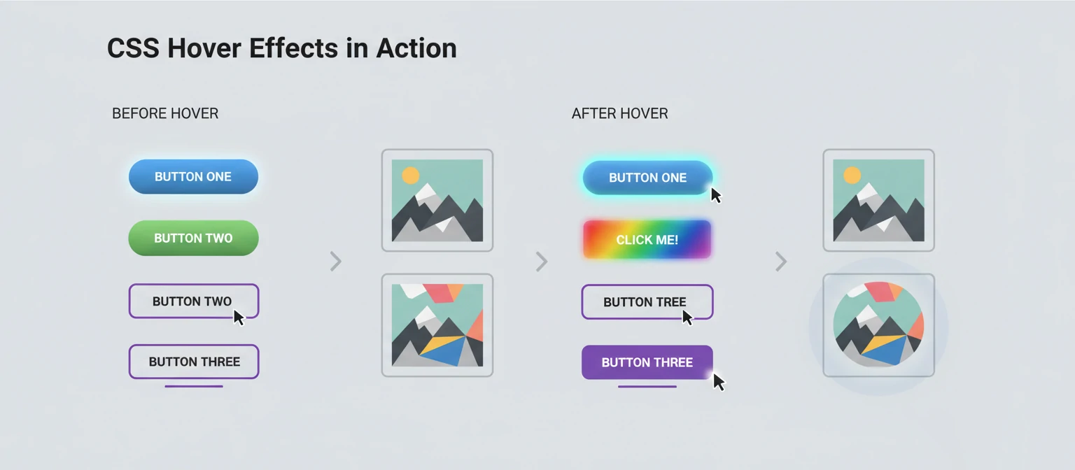
Hover effects are CSS styles that are applied to an element when the user hovers their mouse cursor over it. The :hover pseudo-class is the cornerstone of these effects, allowing you to define alternative styles that kick in during mouse interaction. It's like giving your website elements a little personality!
The basic syntax is simple:
/* styles to apply on hover */
}
Hover effects can be applied to virtually any HTML element, from simple text links to complex interactive components. They're particularly useful for:
- Providing visual feedback to users
- Enhancing navigation menus
- Creating interactive buttons and cards
- Adding subtle animations to images
- Improving overall user experience
Basic Hover Effects
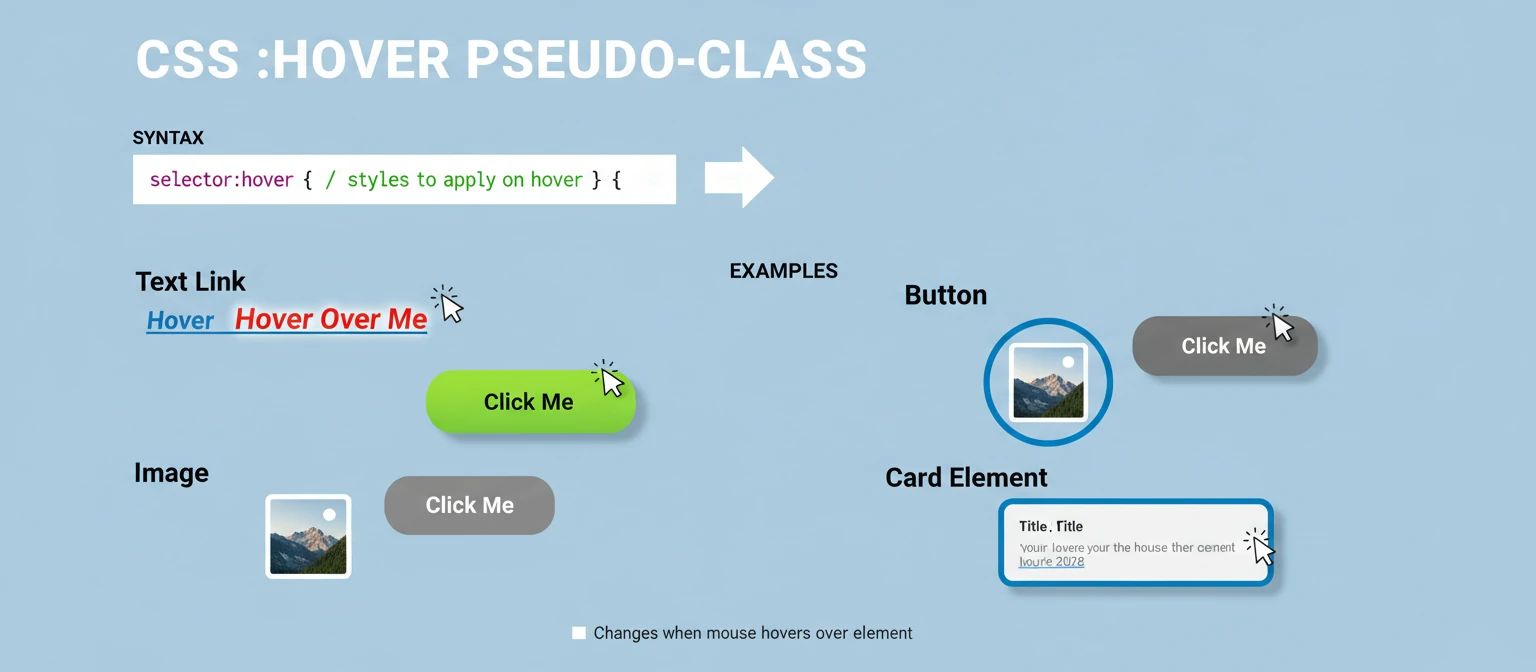
Let's start with some fundamental hover effects that you can implement with just CSS. These are the building blocks for more complex interactions. Don't worry, we'll ease you into it!
Color Changes
One of the simplest and most effective hover effects is changing the color of an element. This works great for text links and buttons, giving that instant visual cue.
color: #007bff;
text-decoration: none;
transition: color 0.3s ease;
}
a:hover {
color: #0056b3;
}
Background Color Changes
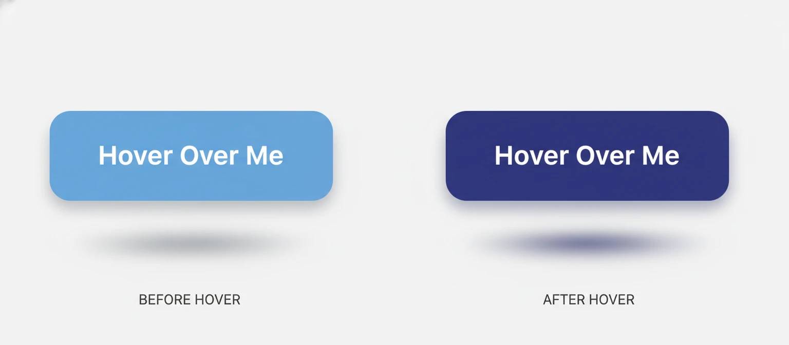
Changing the background color on hover can make buttons and other interactive elements more prominent. It's like giving them a spotlight!
background-color: #28a745;
color: white;
padding: 10px 20px;
border: none;
border-radius: 5px;
cursor: pointer;
transition: background-color 0.3s ease;
}
.button:hover {
background-color: #218838;
}
Border and Shadow Effects
Adding or modifying borders and shadows can create a sense of depth and interactivity. It's like lifting the element off the page!
border: 1px solid #ddd;
padding: 20px;
border-radius: 5px;
transition: all 0.3s ease;
}
.card:hover {
border-color: #007bff;
box-shadow: 0 4px 8px rgba(0,123,255,0.3);
}
Transitions and Animations
To make hover effects smooth and professional-looking, CSS transitions are essential. The transition property allows you to control the speed and easing of property changes. Think of it as the butter that makes everything slide nicely!
Basic Transitions
The transition property can be applied to the normal state, and it will affect how the element transitions to the hover state. It's that simple magic!
background-color: #f8f9fa;
transition: background-color 0.5s ease-in-out;
}
.element:hover {
background-color: #e9ecef;
}
Multiple Property Transitions
You can transition multiple properties at once by separating them with commas. This lets you create complex, multi-faceted hover effects.
background-color: #007bff;
color: white;
padding: 10px 20px;
border-radius: 5px;
transform: scale(1);
transition: background-color 0.3s, transform 0.3s, box-shadow 0.3s;
}
.button:hover {
background-color: #0056b3;
transform: scale(1.05);
box-shadow: 0 4px 8px rgba(0,0,0,0.2);
}
Transform Effects
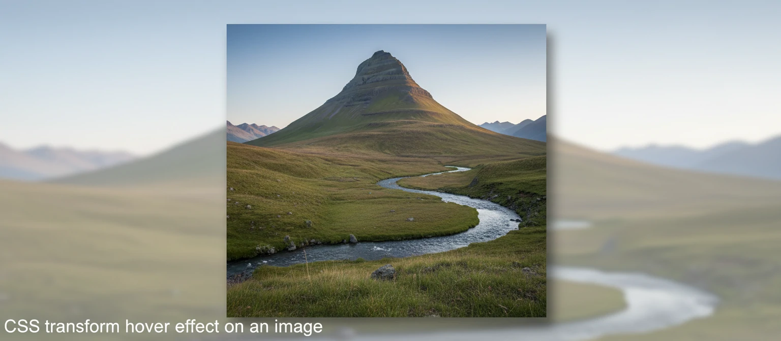
CSS transforms can create dynamic hover effects like scaling, rotating, and skewing elements. They're perfect for adding that wow factor!
overflow: hidden;
border-radius: 5px;
}
.image-container img {
width: 100%;
height: auto;
transition: transform 0.3s ease;
}
.image-container:hover img {
transform: scale(1.1);
}
Advanced Hover Effects
Once you're comfortable with basic hover effects, you can explore more sophisticated techniques to create truly engaging interactions. Let's level up your skills and make your sites pop!
Image Overlay Effects
Creating overlays on images that appear on hover is a popular technique for portfolios and galleries. It's like giving your images a secret message!
position: relative;
overflow: hidden;
}
.image-overlay img {
width: 100%;
height: auto;
display: block;
}
.overlay {
position: absolute;
top: 0;
left: 0;
width: 100%;
height: 100%;
background-color: rgba(0, 0, 0, 0.7);
display: flex;
align-items: center;
justify-content: center;
opacity: 0;
transition: opacity 0.3s ease;
}
.image-overlay:hover .overlay {
opacity: 1;
}
.overlay-text {
color: white;
font-size: 24px;
text-align: center;
}
Navigation Menu Effects
Hover effects are crucial for creating intuitive navigation menus. They guide users and make navigation feel alive!
list-style: none;
padding: 0;
margin: 0;
display: flex;
}
nav li {
margin-right: 20px;
}
nav a {
color: #333;
text-decoration: none;
padding: 10px 15px;
border-radius: 5px;
transition: all 0.3s ease;
position: relative;
}
nav a:hover {
background-color: #007bff;
color: white;
}
nav a::after {
content: '';
position: absolute;
bottom: 0;
left: 50%;
width: 0;
height: 2px;
background-color: #007bff;
transition: all 0.3s ease;
transform: translateX(-50%);
}
nav a:hover::after {
width: 100%;
}

JavaScript Enhancements
While CSS can handle many hover effects, JavaScript can add more complex interactions and logic-based effects. When CSS isn't enough, JS comes to the rescue with superpowers!
Mouse Position Tracking
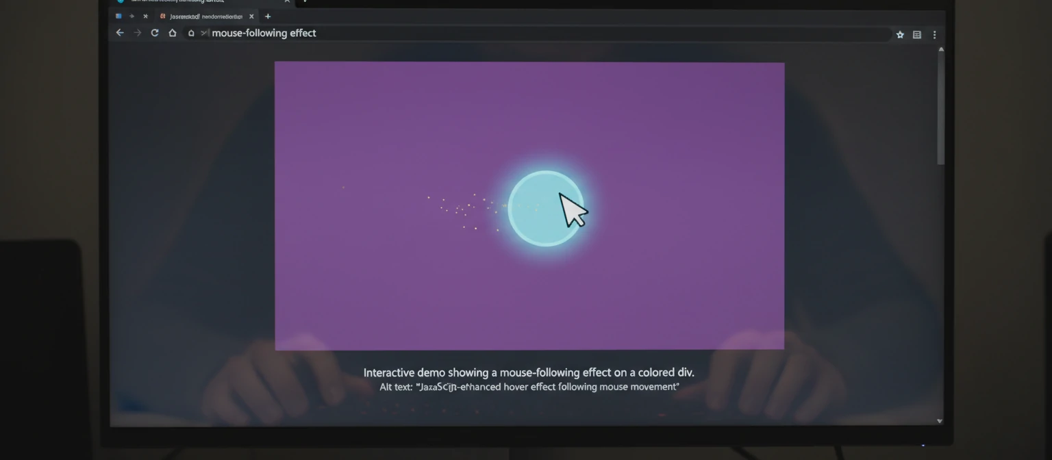
You can use JavaScript to create effects that follow the mouse cursor. It's like having a spotlight that chases your pointer!
element.addEventListener('mousemove', (e) => {
const rect = element.getBoundingClientRect();
const x = e.clientX - rect.left;
const y = e.clientY - rect.top;
element.style.setProperty('--mouse-x', `${x}px`);
element.style.setProperty('--mouse-y', `${y}px`);
});
width: 300px;
height: 200px;
background: linear-gradient(45deg, #667eea, #764ba2);
position: relative;
overflow: hidden;
}
.follow-mouse::before {
content: '';
position: absolute;
top: var(--mouse-y, 0);
left: var(--mouse-x, 0);
width: 50px;
height: 50px;
background: rgba(255, 255, 255, 0.3);
border-radius: 50%;
transform: translate(-50%, -50%);
pointer-events: none;
}
Conditional Hover Effects
JavaScript can enable hover effects based on certain conditions or user interactions. It's like giving your elements a brain!
buttons.forEach(button => {
button.addEventListener('mouseenter', () => {
if (button.classList.contains('active')) {
button.style.transform = 'scale(1.1) rotate(5deg)';
} else {
button.style.transform = 'scale(1.05)';
}
});
button.addEventListener('mouseleave', () => {
button.style.transform = 'scale(1)';
});
});
Move your mouse here
Best Practices for Hover Effects
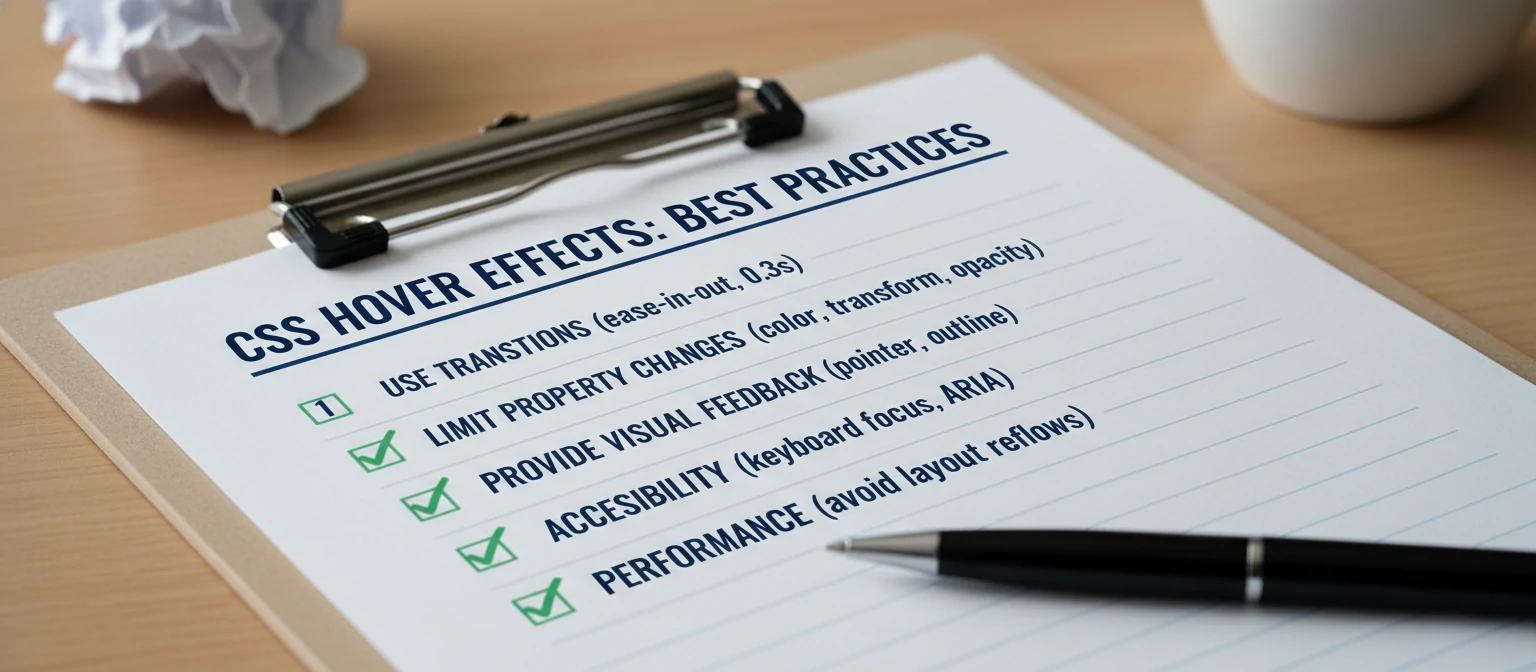
To create effective and accessible hover effects, follow these best practices. Think of them as your secret recipe for success!
Performance Considerations
Avoid animating properties that trigger layout recalculations, like width and height. Instead, use transform and opacity. Keep it smooth and snappy!
Accessibility
Ensure that hover effects don't rely solely on color changes for conveying information. Consider users who may not be able to perceive color differences. Everyone deserves a great experience!
Mobile Responsiveness
Remember that hover effects don't work on touch devices. Provide alternative interactions for mobile users. Don't leave anyone out of the fun!
Consistency
Maintain consistent hover effects throughout your site to avoid confusing users. A little predictability goes a long way.
Real-World Examples
Let's look at some practical examples of hover effects used in popular websites. See how the pros do it!
E-commerce Product Cards
Product cards often use hover effects to show additional information or quick actions. It's like giving products a personality!
border: 1px solid #e1e5e9;
border-radius: 8px;
overflow: hidden;
transition: box-shadow 0.3s ease;
}
.product-card:hover {
box-shadow: 0 8px 25px rgba(0, 0, 0, 0.15);
}
.product-image {
position: relative;
overflow: hidden;
}
.product-image img {
width: 100%;
height: auto;
transition: transform 0.3s ease;
}
.product-card:hover .product-image img {
transform: scale(1.05);
}
.quick-actions {
position: absolute;
bottom: -50px;
left: 0;
right: 0;
background: rgba(255, 255, 255, 0.9);
padding: 10px;
transition: bottom 0.3s ease;
}
.product-card:hover .quick-actions {
bottom: 0;
}
Interactive Buttons
Buttons with multiple hover states can provide rich feedback. Make your buttons dance!
background: linear-gradient(45deg, #ff6b6b, #ffa500);
border: none;
color: white;
padding: 15px 30px;
font-size: 16px;
border-radius: 25px;
cursor: pointer;
position: relative;
overflow: hidden;
transition: all 0.3s ease;
}
.interactive-button::before {
content: '';
position: absolute;
top: 0;
left: -100%;
width: 100%;
height: 100%;
background: linear-gradient(90deg, transparent, rgba(255, 255, 255, 0.2), transparent);
transition: left 0.5s ease;
}
.interactive-button:hover::before {
left: 100%;
}
.interactive-button:hover {
transform: translateY(-2px);
box-shadow: 0 8px 15px rgba(0, 0, 0, 0.2);
}

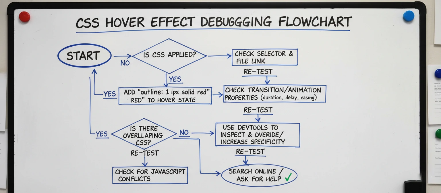
Troubleshooting Common Issues
Even experienced developers run into issues with hover effects. Here are some common problems and solutions. We've all been there!
Hover Effects Not Working
If your hover effects aren't working, check:
- Correct CSS selector syntax
- Proper HTML structure
- CSS specificity issues
- Conflicting styles
Performance Issues
Slow or choppy animations can be caused by:
- Animating non-performant properties
- Too many simultaneous animations
- Lack of hardware acceleration
Mobile Compatibility
Since hover doesn't exist on touch devices, consider:
- Using :active pseudo-class for touch feedback
- Implementing touch-specific interactions
- Progressive enhancement approaches
The Future of Hover Effects
As web technology evolves, so do hover effects. Here are some emerging trends. The future is bright and interactive!
CSS Custom Properties
Using CSS variables for dynamic hover effects. Variables make everything more flexible!
Scroll-Triggered Animations
Combining hover with scroll-based interactions. Scroll and hover together? Mind-blowing!
3D Transforms
More sophisticated 3D hover effects using perspective and transform3d. Enter the third dimension!
AI-Generated Effects
Tools that automatically generate hover effects based on design systems. AI is joining the party!

Conclusion
Hover effects are a powerful way to enhance user interaction and create engaging web experiences. From simple color changes to complex animations, the possibilities are endless. Remember to prioritize performance, accessibility, and user experience when implementing hover effects.
As you've seen throughout this guide, combining CSS with JavaScript can create truly interactive and dynamic effects. Experiment with different techniques, test across devices, and always consider your users' needs. You've got this!
With the knowledge you've gained here, you're ready to start implementing stunning hover effects in your own projects. Happy coding, and may your hovers always be smooth!
Tools and Resources
Ready to dive deeper? Here are some awesome tools and resources to help you master hover effects. Your learning journey continues!
- CodePen: A fantastic playground for experimenting with CSS hover effects in real-time. Play around and have fun!
- CSS-Tricks: Their almanac has detailed guides on every CSS property, including hover. A treasure trove of knowledge!
- MDN Web Docs: The go-to resource for all things web development, with comprehensive hover documentation. Reliable and thorough!
- Hover.css: A ready-to-use library of CSS hover effects you can drop into your projects. Save time and look great!
Frequently Asked Questions
Do hover effects work on mobile devices?
Great question! Hover effects don't work on touch devices since there's no "hover" action. For mobile, consider using :active pseudo-class or touch events. Keep your users happy everywhere!
How can I make my hover effects more performant?
Stick to animating properties like transform, opacity, and color. Avoid width, height, or margin changes that trigger layout recalculations. Speed is key!
Can I combine hover effects with other interactions?
Absolutely! You can layer hover with click events, focus states, and even scroll-triggered animations for rich interactions. The sky's the limit!
Case Studies: Hover Effects in Action
E-commerce Giant: Amazon
Amazon uses subtle hover effects on product images to show quick view options, increasing user engagement without overwhelming the interface. Smart and effective!
Creative Agency: Dribbble
Dribbble employs hover effects on design shots to reveal additional information like likes and comments, creating an interactive browsing experience. Inspiring creativity!
Tech Blog: CSS-Tricks
Their navigation menu uses smooth hover animations that guide users through the site hierarchy. Guiding users with style!
Where to go next
More useful paths
Use these paths to continue with the closest practical topic, service, or decision guide.
Spotted something wrong? Report an error on this page. We correct on the page and say what changed.