Mastering CSS Hover Effects A Comprehensive Guide for Modern Web Design
Enhance user interaction and create stunning visual experiences with CSS hover effects
 Pro Pixel Agency

Enhance user interaction and create stunning visual experiences with CSS hover effects
Table of contents
- Introduction to CSS Hover Effects
- What Are CSS Hover Effects?
- Basic Hover Effects: Getting Started
- Intermediate Hover Effects: Adding Movement and Scale
- Advanced Hover Effects: Complex Animations and Interactions
- JavaScript-Enhanced Hover Effects
- Accessibility Considerations for Hover Effects
- Performance Optimization for Hover Effects
- Real-World Examples and Case Studies
- Common Mistakes and How to Avoid Them
- Tools and Resources for Hover Effects
- Future of Hover Effects
- Creative Hover Effect Ideas for Inspiration
- Building a Hover Effects Library
- Hover Effects in Different Industries
- Testing and Debugging Hover Effects
- Hover Effects in Web Frameworks
- Advanced Image Hover Effects
- Interactive Forms with Hover Effects
- Advanced Hover Techniques: Pushing Boundaries
- Embrace the Power of Hover Effects
Introduction to CSS Hover Effects
Picture this: you're browsing a website, and suddenly, the buttons start glowing softly, images zoom in with smooth elegance, and menus slide into view like they're alive. That's the magic of CSS hover effects! As someone who's spent countless late nights perfecting websites, I can tell you that these little interactions transform a static page into something that feels responsive and delightful.
Think about the websites you've visited recently. Some feel dead and unresponsive, while others seem to dance under your cursor. The difference? Well-crafted hover effects. They don't just look cool—they make your site feel intuitive and engaging, encouraging users to explore more.
In this guide, we'll journey together through the world of hover effects. Whether you're just starting out or you're a seasoned pro looking to level up, you'll find practical techniques, real examples, and tips that work. By the end, you'll have the confidence to add that extra sparkle to your projects.
Here's what we'll explore together:
- The fundamental principles of CSS hover effects
- Step-by-step tutorials for various effect types
- Real-world examples from popular websites
- Performance considerations and optimization techniques
- Accessibility best practices to ensure inclusive design
- Future trends and emerging technologies
You'll walk away with a toolkit that lets you create effects that enhance usability without slowing things down. And remember, the best hover effects are the ones users don't even notice—until they're gone!
Let's keep it simple: hover effects should serve a purpose. They guide users, provide feedback, and add personality. As we go through this, think about how each technique can improve your specific project.
What Are CSS Hover Effects?
CSS hover effects are those magical moments when your webpage comes alive under the user's cursor. They're visual changes triggered by the :hover pseudo-class, ranging from simple color shifts to complex animations. But here's the thing—they're not just eye candy; they're essential for creating intuitive, engaging interfaces.
Imagine hover effects as the friendly nods and smiles in a conversation. They provide instant feedback, guiding users and making your site feel responsive. When done right, they highlight important elements, reveal hidden content, and inject personality into your design.
Back in the early web days, hover was just for changing link colors. Now? It's a playground for creativity. From subtle glows to dramatic reveals, hover effects have evolved into a cornerstone of modern web design.
One important note: hover effects are desktop-first. On phones and tablets, there's no hover—users tap instead. So while they can elevate desktop experiences, never rely on them alone for crucial information.
The Anatomy of a Hover Effect
Every hover effect boils down to three key ingredients:
- The element you want to animate (could be a button, image, or div)
- The :hover trigger that activates on mouseover
- The CSS properties that create the visual change
selector:hover {
/* Your hover magic here */
background-color: #new-color;
transform: scale(1.1);
box-shadow: 0 5px 15px rgba(0,0,0,0.2);
}
This foundation supports everything from gentle fades to wild transformations. The secret sauce? Understanding how these pieces interact to create meaningful user experiences.
Why Hover Effects Matter
In our fast-paced digital world, users crave instant responses. Hover effects deliver exactly that:
Instant Feedback: Users know immediately that an element is clickable. No more guessing games!
Better Navigation: Subtle menu effects help users orient themselves without clutter.
Smart Previews: Reveal extra info or thumbnails without leaving the page.
Brand Voice: Your hover style can be as playful as a startup or as polished as a luxury brand.
Accessibility Boost: Clear hover cues make interfaces more inclusive for all users.
As we dive into specific techniques, remember these benefits. Each effect we explore serves these core purposes while bringing its own creative twist.
Basic Hover Effects: Getting Started
Ready to dip your toes into hover effects? Let's start with the fundamentals that you can implement right away. These building blocks will give you confidence before we tackle the fancy stuff. Remember, great hover effects are like good seasoning—subtle, enhancing, and never overpowering.
First, let's talk about the unsung hero: the transition property. It's what turns jerky changes into smooth, professional animations. Without it, your hovers feel like a glitchy old website. With it? Pure magic.
Color Transitions
The simplest hover effect? Changing colors. It's intuitive and tells users "Hey, I'm clickable!" Perfect for links and buttons.
a {
    color: #3498db;
    text-decoration: none;
    transition: color 0.3s ease;
}

a:hover {
    color: #e74c3c;
}
That smooth 0.3-second transition makes all the difference. The ease timing feels natural, like the color is breathing.
Color choice matters! Blue to red says "urgent," while staying in the blue family feels harmonious.
Background Color Changes
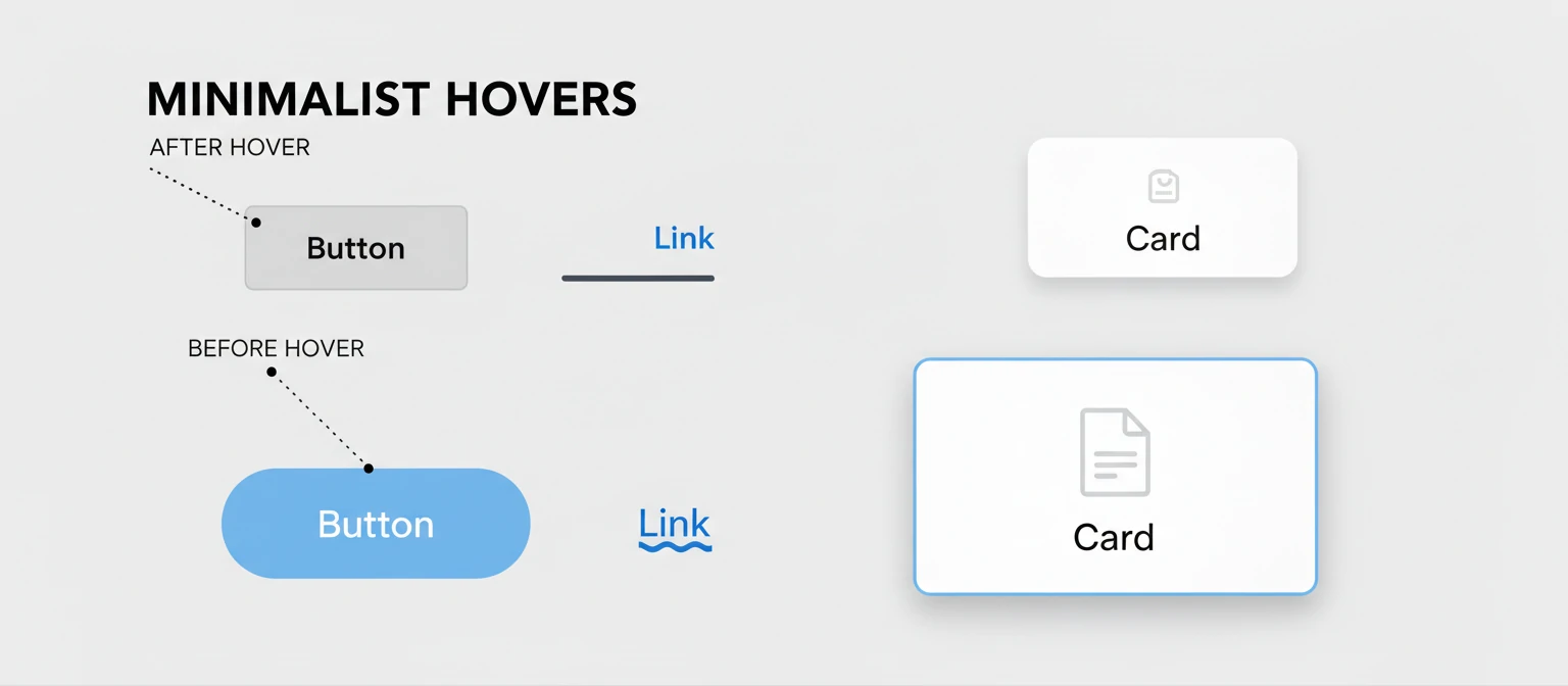
Background changes pack more punch than text colors. Great for buttons and nav items, but don't go overboard.
button {
    background-color: #3498db;
    color: white;
    padding: 10px 20px;
    border: none;
    border-radius: 5px;
    cursor: pointer;
    transition: background-color 0.3s ease;
}

button:hover {
    background-color: #2980b9;
}
Notice we transition only background-color—more efficient than "all". Gradients work too, but watch your contrast!
Border and Shadow Effects
Borders and shadows add depth. Perfect for cards and forms—they make elements feel important without shouting.
div {
    border: 1px solid #ddd;
    border-radius: 5px;
    padding: 20px;
    transition: all 0.3s ease;
}

div:hover {
    border-color: #3498db;
    box-shadow: 0 5px 15px rgba(0,0,0,0.1);
}
Shadows create lift—subtle ones enhance, heavy ones dominate. Match border colors to your theme for cohesion.
Opacity Changes
Opacity hovers are subtle powerhouses. Great for overlays and tooltips—bring elements into focus gently.
div {
    opacity: 0.7;
    transition: opacity 0.3s ease;
}

div:hover {
    opacity: 1;
}
Hardware-accelerated and smooth. Perfect for image galleries where you want to reveal details without layout shifts.
Text Decoration Effects
For text, animated underlines beat boring static ones. More control than default text-decoration.
a {
    text-decoration: none;
    position: relative;
}

a::after {
    content: '';
    position: absolute;
    bottom: 0;
    left: 0;
    width: 0;
    height: 2px;
    background-color: #3498db;
    transition: width 0.3s ease;
}

a:hover::after {
    width: 100%;
}
Best Practices for Basic Hover Effects:
- Always add transitions for smoothness
- Use ease or ease-in-out for natural feel
- Keep durations 0.2-0.5s
- Maintain contrast in hover states
- Test on light and dark backgrounds
- Context matters—subtle in content areas
Intermediate Hover Effects: Adding Movement and Scale
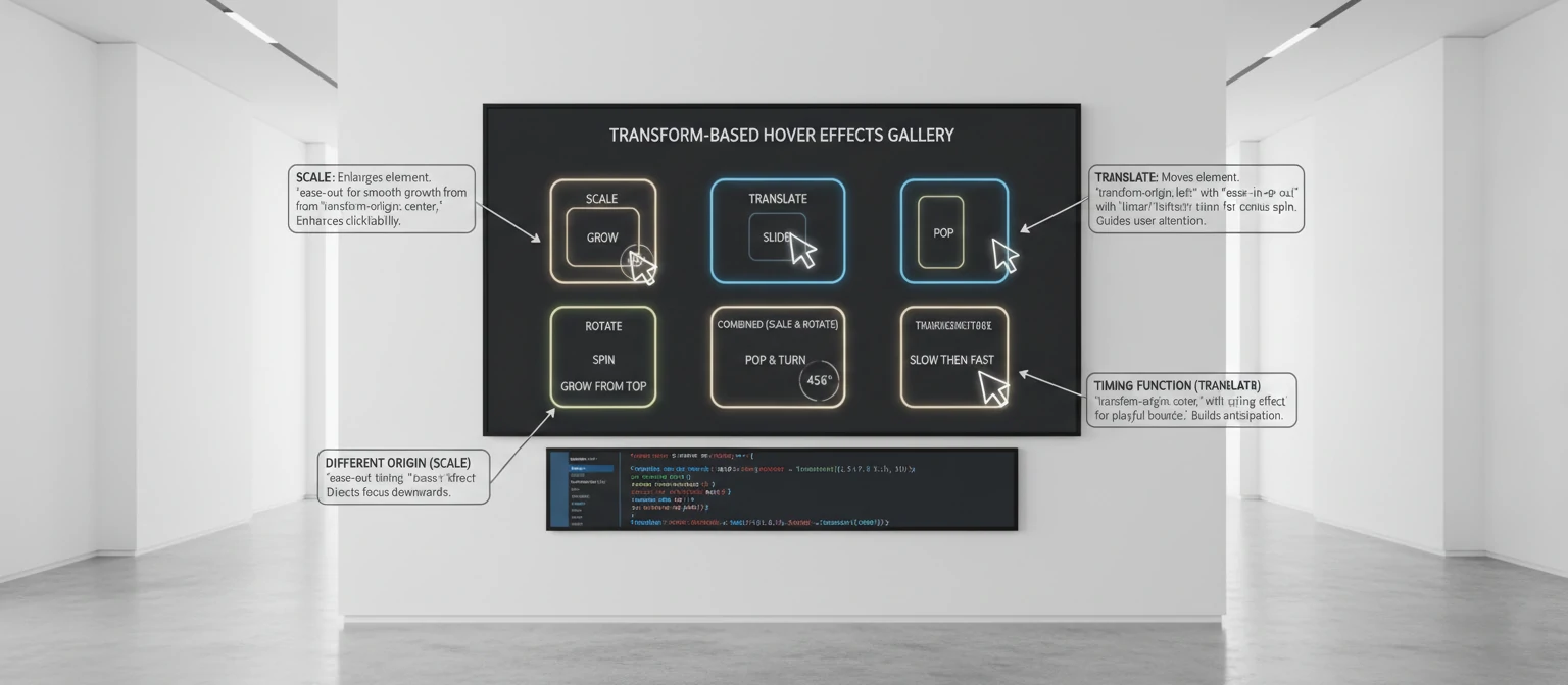
Once you're comfortable with basic color and style changes, it's time to introduce movement and scaling effects. These can make your elements feel more dynamic and engaging. Transform properties like scale, translate, and rotate open up a world of possibilities for creating interactive experiences.
The key advantage of transform-based hover effects is that they're hardware-accelerated, meaning they perform smoothly even on lower-end devices. Unlike changing properties like width or height which can trigger expensive layout recalculations, transforms operate on the GPU for buttery-smooth animations.
Scale Transformations
Using the transform: scale() property, you can make elements grow or shrink on hover, creating a sense of importance or focus. This effect is particularly effective for images, buttons, and cards.
div {
    overflow: hidden;
    border-radius: 5px;
}

div img {
    width: 100%;
    height: auto;
    transition: transform 0.3s ease;
}

div:hover img {
    transform: scale(1.1);
}
This effect is commonly used on image galleries to draw attention to individual photos. The overflow: hidden on the container ensures that the scaled image doesn't break the layout. For a more sophisticated effect, you can combine scaling with other transforms.
div {
    transition: transform 0.3s ease;
}

div:hover {
    transform: scale(1.05) translateY(-5px);
}
This creates a "lift" effect where the element both grows and moves upward, simulating depth and elevation.
Translation Effects
Moving elements slightly on hover can create a sense of depth and interactivity. Translation effects are subtle but powerful, especially when used for navigation elements or interactive lists.
div {
    padding: 10px 20px;
    background: #f8f9fa;
    margin: 5px 0;
    transition: transform 0.2s ease;
}

div:hover {
    transform: translateX(10px);
}
The horizontal translation creates a sense of sliding or expanding. You can also use vertical translations to create accordion-like effects or to simulate elements rising from the page.
div {
    transition: transform 0.3s ease;
}

div:hover {
    transform: translateY(-10px);
}
Vertical translations work well for cards and buttons, creating the illusion that elements are floating above the page surface.
Rotation Effects
For more playful designs, you can rotate elements on hover. Rotation effects should be used sparingly as they can be disorienting if overused, but they're perfect for icons, decorative elements, and playful interfaces.
div {
    transition: transform 0.3s ease;
}

div:hover {
    transform: rotate(15deg);
}
Small rotations (5-15 degrees) work best for maintaining usability while adding personality. For more dramatic effects, you can combine rotation with other transforms.
button {
    transition: transform 0.3s ease;
}

button:hover {
    transform: rotate(-5deg) scale(1.1);
}
Skew Transformations
Skew transforms can create interesting perspective effects, though they should be used carefully to avoid distorting text readability.
div {
    transition: transform 0.3s ease;
}

div:hover {
    transform: skewX(-5deg);
}
Skew effects work well for geometric designs and can create a sense of movement or dynamism.
Combining Multiple Transforms
The real power of transform-based hover effects comes from combining multiple transformations. The order of transforms matters – they are applied from right to left.
div {
    transition: transform 0.4s cubic-bezier(0.175, 0.885, 0.32, 1.275);
}

div:hover {
    transform: translateY(-10px) rotate(5deg) scale(1.05);
}
This creates a bouncy, multi-dimensional effect. The custom cubic-bezier timing function adds a spring-like animation that feels more dynamic than the standard ease.
Transform-Origin Considerations
The transform-origin property controls the point around which transformations occur. By default, transforms originate from the center, but you can change this for different effects.
div {
    transform-origin: bottom left;
    transition: transform 0.3s ease;
}

div:hover {
    transform: rotate(10deg);
}
Changing the transform origin can create effects like doors opening or elements pivoting from specific points.
Tips for Movement Effects:
- Keep movements subtle to avoid disorienting users
- Use consistent timing with the
transitionproperty - Consider the context - playful rotations might not suit professional sites
- Test on mobile devices where hover effects don't apply
- Use hardware-accelerated properties (transform, opacity) for smooth performance
- Experiment with custom timing functions for unique feels
- Consider transform-origin for pivot-based animations
- Combine multiple transforms for complex, engaging effects
Advanced Hover Effects: Complex Animations and Interactions
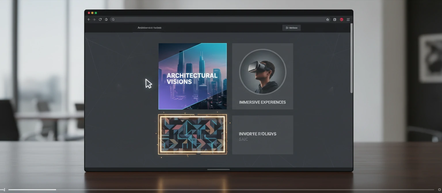
As you become more proficient, you can combine multiple properties and use CSS animations to create sophisticated hover effects that truly impress users. These advanced techniques involve pseudo-elements, complex timing, and creative property manipulation to create memorable interactions.
Advanced hover effects often involve multiple layers of animation and careful choreography. The goal is to create effects that feel organic and responsive, enhancing the user experience without being overwhelming. Let's explore some powerful techniques that push the boundaries of what's possible with CSS.
Multi-Property Transitions
Combine several properties in a single hover effect for more complex interactions. This creates richer, more nuanced animations that feel more polished and professional.
.advanced-button {
    background: linear-gradient(45deg, #3498db, #2980b9);
    color: white;
    padding: 15px 30px;
    border: none;
    border-radius: 25px;
    cursor: pointer;
    transition: all 0.3s ease;
    box-shadow: 0 4px 15px rgba(52, 152, 219, 0.3);
}

.advanced-button:hover {
    transform: translateY(-3px) scale(1.05);
    box-shadow: 0 8px 25px rgba(52, 152, 219, 0.4);
    background: linear-gradient(45deg, #2980b9, #21618c);
}
This effect combines transform, box-shadow, and background changes for a sophisticated button interaction. The upward translation and increased shadow create a sense of depth, while the scale and gradient changes add visual interest.
Hover Effects with Pseudo-Elements
Using ::before and ::after pseudo-elements, you can create layered hover effects that add visual elements without modifying your HTML structure.
.overlay-card {
    position: relative;
    overflow: hidden;
    border-radius: 5px;
}

.overlay-card::before {
    content: '';
    position: absolute;
    top: 0;
    left: -100%;
    width: 100%;
    height: 100%;
    background: linear-gradient(90deg, transparent, rgba(255,255,255,0.3), transparent);
    transition: left 0.5s ease;
}

.overlay-card:hover::before {
    left: 100%;
}
This creates a shimmer effect that sweeps across the element on hover. Pseudo-elements are incredibly powerful for creating complex visual effects without adding extra DOM elements.
Text Reveal Effects
Create engaging text animations that reveal content on hover. These effects work well for portfolios, menus, and interactive typography.
.text-reveal {
    position: relative;
    overflow: hidden;
}

.text-reveal::before {
    content: attr(data-text);
    position: absolute;
    top: 0;
    left: -100%;
    width: 100%;
    height: 100%;
    background: #3498db;
    color: white;
    display: flex;
    align-items: center;
    justify-content: center;
    transition: left 0.3s ease;
}

.text-reveal:hover::before {
    left: 0;
}
This effect uses the data-text attribute to duplicate the text content, creating a sliding reveal animation. It's perfect for navigation items or call-to-action text.
Border Animation Effects
Create animated borders that draw attention to elements on hover. These effects use pseudo-elements to create borders that animate in creative ways.
.animated-border {
    position: relative;
    padding: 20px;
}

.animated-border::before {
    content: '';
    position: absolute;
    top: 0;
    left: 0;
    right: 0;
    bottom: 0;
    border: 2px solid transparent;
    border-radius: 5px;
    transition: border-color 0.3s ease;
}

.animated-border:hover::before {
    border-color: #3498db;
}
For more complex border animations, you can animate individual sides:
.border-draw {
    position: relative;
    padding: 20px;
}

.border-draw::before,
.border-draw::after {
    content: '';
    position: absolute;
    background: #3498db;
    transition: all 0.3s ease;
}

.border-draw::before {
    top: 0;
    left: 0;
    width: 0;
    height: 2px;
}

.border-draw::after {
    bottom: 0;
    right: 0;
    width: 0;
    height: 2px;
}

.border-draw:hover::before {
    width: 100%;
}

.border-draw:hover::after {
    width: 100%;
}
3D Transform Effects
Using 3D transforms, you can create perspective-based hover effects that add depth and realism to your interfaces.
.perspective-card {
    transform-style: preserve-3d;
    transition: transform 0.3s ease;
}

.perspective-card:hover {
    transform: rotateY(10deg) rotateX(5deg);
}
3D transforms work best when combined with proper perspective settings on parent elements. They can create card-flipping effects, tilt interactions, and immersive experiences.
Staggered Animations
Create complex sequences where multiple elements animate at different times for a choreographed effect.
.stagger-container:hover .stagger-item:nth-child(1) {
    transform: translateY(-10px);
    transition-delay: 0s;
}

.stagger-container:hover .stagger-item:nth-child(2) {
    transform: translateY(-10px);
    transition-delay: 0.1s;
}

.stagger-container:hover .stagger-item:nth-child(3) {
    transform: translateY(-10px);
    transition-delay: 0.2s;
}
Staggered animations create a wave-like effect that's visually appealing and feels more dynamic than uniform animations.
Clip-Path Animations
Use clip-path to create unique shape transitions and reveals on hover.
.clip-hover {
    clip-path: circle(0% at center);
    transition: clip-path 0.5s ease;
}

.clip-hover:hover {
    clip-path: circle(100% at center);
}
Clip-path animations can create circular reveals, polygon morphing, and other geometric transitions that add a modern, geometric feel to your designs.
Advanced Hover Effect Best Practices:
- Use pseudo-elements to avoid cluttering your HTML
- Combine multiple properties for richer interactions
- Experiment with custom timing functions for unique feels
- Consider performance impact of complex animations
- Test effects across different browsers and devices
- Use CSS custom properties for easy theming
- Layer effects thoughtfully to avoid visual noise
JavaScript-Enhanced Hover Effects
While CSS alone can create impressive hover effects, combining it with JavaScript opens up even more possibilities for dynamic and interactive experiences.
Mouse Position Tracking
Use JavaScript to track the mouse position and create effects that respond to cursor movement.
const element = document.querySelector('.interactive-element');

element.addEventListener('mousemove', (e) => {
    const rect = element.getBoundingClientRect();
    const x = e.clientX - rect.left;
    const y = e.clientY - rect.top;

    const centerX = rect.width / 2;
    const centerY = rect.height / 2;

    const rotateX = (y - centerY) / 10;
    const rotateY = (centerX - x) / 10;

    element.style.transform = `rotateX(${rotateX}deg) rotateY(${rotateY}deg)`;
});

element.addEventListener('mouseleave', () => {
    element.style.transform = 'rotateX(0deg) rotateY(0deg)';
});
Dynamic Content on Hover
Show or hide content dynamically based on hover states.
const tooltip = document.querySelector('.tooltip');
const trigger = document.querySelector('.tooltip-trigger');

trigger.addEventListener('mouseenter', () => {
    tooltip.style.opacity = '1';
    tooltip.style.visibility = 'visible';
});

trigger.addEventListener('mouseleave', () => {
    tooltip.style.opacity = '0';
    tooltip.style.visibility = 'hidden';
});
Progressive Enhancement
Always ensure your hover effects work without JavaScript as a fallback, then enhance with JS for better experiences.
JavaScript Hover Best Practices:
- Use JavaScript sparingly - CSS can handle most hover effects
- Ensure accessibility by providing alternatives for touch devices
- Test performance, especially with mouse tracking effects
- Consider using libraries like GSAP for complex animations
Accessibility Considerations for Hover Effects
While hover effects can enhance user experience, it's crucial to ensure they don't create barriers for users with disabilities or those using different input methods.
Mobile and Touch Devices
Hover effects don't work on touch devices. Always provide alternative ways to access the same information or functionality.
Keyboard Navigation
Ensure that hover effects are also triggered by keyboard focus states using the :focus pseudo-class.
.interactive-element:hover,
.interactive-element:focus {
    /* Hover and focus styles */
    background-color: #3498db;
    color: white;
}
Motion Sensitivity
Some users are sensitive to motion. Respect the prefers-reduced-motion media query.
@media (prefers-reduced-motion: reduce) {
    * {
        animation-duration: 0.01ms !important;
        animation-iteration-count: 1 !important;
        transition-duration: 0.01ms !important;
    }
}
Color Contrast
Ensure that hover states maintain sufficient color contrast for readability.

Performance Optimization for Hover Effects
Smooth hover effects require careful attention to performance to ensure they don't negatively impact user experience.
Hardware Acceleration
Use CSS properties that can be hardware accelerated for smoother animations.
.accelerated-element {
    transform: translateZ(0); /* Forces hardware acceleration */
    transition: transform 0.3s ease;
}

.accelerated-element:hover {
    transform: scale(1.1) translateZ(0);
}
Transition Property Optimization
Be specific about which properties to transition to avoid unnecessary calculations.
/* Instead of 'all' */
transition: transform 0.3s ease, opacity 0.3s ease;

/* Instead of vague timing */
transition: transform 0.3s cubic-bezier(0.4, 0, 0.2, 1);
Reducing Repaints and Reflows
Avoid changing properties that trigger layout recalculations on hover.
Performance Tips:
- Use
transformandopacityfor smooth animations - Avoid changing
width,height, ortop/lefton hover - Limit the number of elements with hover effects on a page
- Test on lower-end devices to ensure smooth performance
Real-World Examples and Case Studies
Let's look at how leading websites implement hover effects to enhance user experience and achieve their design goals.
E-commerce Product Galleries
Online stores often use hover effects to showcase product details without cluttering the page.
.product-card {
    position: relative;
    overflow: hidden;
}

.product-card img {
    transition: transform 0.3s ease;
}

.product-card:hover img {
    transform: scale(1.05);
}

.product-info {
    position: absolute;
    bottom: -100%;
    left: 0;
    right: 0;
    background: rgba(0,0,0,0.8);
    color: white;
    padding: 20px;
    transition: bottom 0.3s ease;
}

.product-card:hover .product-info {
    bottom: 0;
}
Navigation Menus
Hover effects on navigation can provide clear visual feedback and improve site usability.
.nav-item {
    position: relative;
    padding: 10px 20px;
}

.nav-item::after {
    content: '';
    position: absolute;
    bottom: 0;
    left: 50%;
    width: 0;
    height: 2px;
    background: #3498db;
    transition: all 0.3s ease;
    transform: translateX(-50%);
}

.nav-item:hover::after {
    width: 100%;
}
Portfolio Websites
Creative professionals use hover effects to showcase their work dynamically.
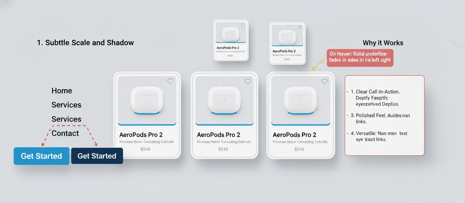
Common Mistakes and How to Avoid Them
Even experienced developers can fall into traps when implementing hover effects. Here are some common pitfalls and how to steer clear of them.
Overusing Effects
Too many hover effects can overwhelm users and slow down your site. Use them strategically.
Ignoring Mobile Users
Always provide alternatives for touch devices where hover doesn't exist.
Poor Timing
Effects that are too fast or too slow can feel jarring. Aim for 0.2-0.5 seconds for most transitions.
Accessibility Oversights
Remember to include focus states and respect user preferences for reduced motion.
Avoid These Mistakes:
- Hover effects that change layout dramatically
- Effects that make text unreadable
- Animations that don't have a clear purpose
- Forgetting to test across different browsers
Tools and Resources for Hover Effects
Here are some tools and resources to help you create and implement hover effects more efficiently.
CSS Frameworks
- Bootstrap: Pre-built hover effects for common components
- Tailwind CSS: Utility classes for quick hover implementations
- Animate.css: Ready-to-use CSS animations
Animation Libraries
- GSAP: Powerful JavaScript animation library
- Framer Motion: React animation library
- anime.js: Lightweight JavaScript animation library
Online Tools
- CSS Gradient Generator: Create beautiful gradient backgrounds
- Cubic-Bezier: Design custom easing functions
- Hover.css: Collection of CSS hover effects
Learning Resources
- MDN Web Docs: Comprehensive CSS reference
- CSS-Tricks: In-depth articles on CSS techniques
- A List Apart: Web design and development articles
Future of Hover Effects
As web technology evolves, so do the possibilities for hover effects. Here are some emerging trends to watch.
CSS Containment and Scrolling
New CSS properties like contain and advanced scrolling APIs will enable more complex hover interactions.
Web Animations API
This JavaScript API provides more control over animations and could revolutionize how we implement hover effects.
3D Transforms and CSS
As browsers improve 3D rendering capabilities, we can expect more immersive hover experiences.
Voice and Gesture Interactions
With the rise of voice assistants and gesture controls, hover effects may evolve to include these input methods.

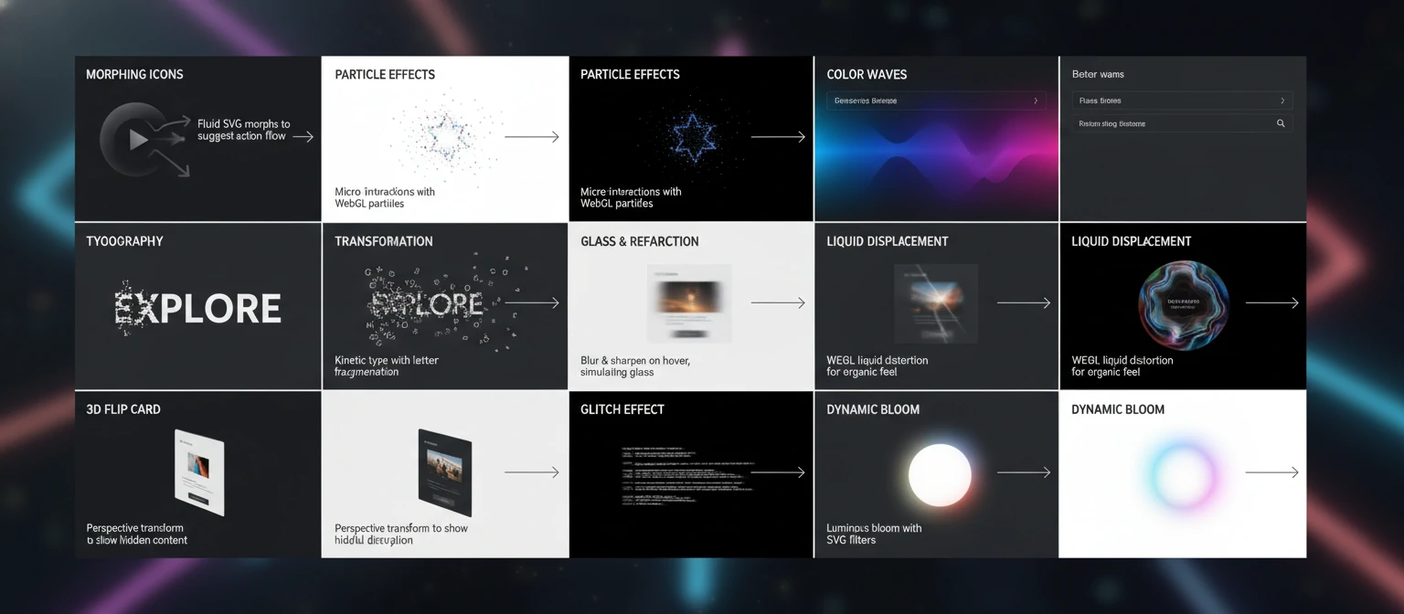
Creative Hover Effect Ideas for Inspiration
Now that we've covered the technical foundations, let's explore some creative and inspiring hover effect ideas that can take your designs to the next level. These concepts combine the techniques we've learned with artistic vision to create truly memorable interactions.
Morphing Shapes and Icons
Transform simple shapes or icons into entirely different forms on hover, creating a sense of magic and transformation.
.morphing-icon {
    width: 50px;
    height: 50px;
    background: #3498db;
    clip-path: circle(50%);
    transition: clip-path 0.5s ease;
}

.morphing-icon:hover {
    clip-path: polygon(50% 0%, 0% 100%, 100% 100%);
}
Particle Effects
Create subtle particle animations that emerge on hover, adding a touch of magic to your interfaces.
.particle-container {
    position: relative;
    overflow: hidden;
}

.particle-container::before {
    content: '✨';
    position: absolute;
    top: -20px;
    left: -20px;
    opacity: 0;
    transform: scale(0);
    transition: all 0.5s ease;
}

.particle-container:hover::before {
    opacity: 1;
    transform: scale(1) translate(20px, 20px);
}
Color Wave Effects
Use gradients and pseudo-elements to create flowing color waves that sweep across elements.
.wave-effect {
    position: relative;
    background: linear-gradient(45deg, #3498db, #2980b9);
}

.wave-effect::before {
    content: '';
    position: absolute;
    top: 0;
    left: -100%;
    width: 100%;
    height: 100%;
    background: linear-gradient(45deg, #e74c3c, #c0392b);
    transition: left 0.5s ease;
}

.wave-effect:hover::before {
    left: 0;
}
Typography Transformations
Make text come alive with creative font and spacing changes on hover.
.typography-hover {
    font-weight: 400;
    letter-spacing: 0;
    transition: all 0.3s ease;
}

.typography-hover:hover {
    font-weight: 700;
    letter-spacing: 2px;
    transform: scale(1.05);
}
Shadow Play
Use multiple shadows to create depth and dimension that evolves on hover.
.shadow-play {
    box-shadow:
        0 1px 3px rgba(0,0,0,0.12),
        0 1px 2px rgba(0,0,0,0.24);
    transition: box-shadow 0.3s ease;
}

.shadow-play:hover {
    box-shadow:
        0 14px 28px rgba(0,0,0,0.25),
        0 10px 10px rgba(0,0,0,0.22);
}
Interactive Backgrounds
Create backgrounds that respond to hover with subtle animations or pattern changes.
.interactive-bg {
    background-image: radial-gradient(circle at center, #3498db 0%, transparent 50%);
    background-size: 0 0;
    transition: background-size 0.5s ease;
}

.interactive-bg:hover {
    background-size: 200% 200%;
}
Magnetic Effects
Make elements appear to be attracted to the cursor using JavaScript-enhanced hover effects.
const magneticElement = document.querySelector('.magnetic');

document.addEventListener('mousemove', (e) => {
    const rect = magneticElement.getBoundingClientRect();
    const x = e.clientX - rect.left - rect.width / 2;
    const y = e.clientY - rect.top - rect.height / 2;

    magneticElement.style.transform = `translate(${x * 0.1}px, ${y * 0.1}px)`;
});
Glass Morphism Effects
Create frosted glass effects that become more transparent on hover.
.glass-effect {
    background: rgba(255, 255, 255, 0.1);
    backdrop-filter: blur(10px);
    border: 1px solid rgba(255, 255, 255, 0.2);
    transition: all 0.3s ease;
}

.glass-effect:hover {
    background: rgba(255, 255, 255, 0.2);
    backdrop-filter: blur(20px);
}
Creative Hover Design Tips:
- Match hover effects to your brand personality
- Use effects sparingly to maintain visual hierarchy
- Consider the emotional impact of your animations
- Test creative effects on real users for feedback
- Balance innovation with usability
- Document your creative effects for future reference
Building a Hover Effects Library
As you master hover effects, consider building your own reusable library of effects that you can apply across projects. This not only saves time but also ensures consistency in your interactive design language.
Creating a Modular System
Develop a system of CSS custom properties and utility classes for consistent hover effects.
:root {
    --hover-duration: 0.3s;
    --hover-easing: cubic-bezier(0.4, 0, 0.2, 1);
    --hover-scale: 1.05;
    --hover-lift: -5px;
}

.hover-lift {
    transition: transform var(--hover-duration) var(--hover-easing);
}

.hover-lift:hover {
    transform: translateY(var(--hover-lift)) scale(var(--hover-scale));
}
Effect Categories
Organize your hover effects into categories for easy reference and application.
- Entrance Effects: How elements appear or draw attention
- Feedback Effects: Confirmation of user interactions
- Navigation Effects: Menu and link interactions
- Content Effects: Image and text hover behaviors
- Functional Effects: Effects that serve a specific purpose
Documentation and Testing
Maintain a living style guide that showcases all your hover effects with usage examples.
/* Hover Effect Documentation */
/*
Effect: Button Glow
Usage: Primary action buttons
Accessibility: High contrast maintained
Performance: Hardware accelerated
*/
Cross-Platform Considerations
Ensure your hover effects work across different devices and input methods.
/* Touch-friendly hover effects */
@media (hover: hover) and (pointer: fine) {
    .hover-effect {
        /* Desktop hover styles */
    }
}

@media (hover: none) {
    .hover-effect {
        /* Touch device styles */
    }
}
Library Building Best Practices:
- Start with a core set of reliable effects
- Use CSS custom properties for easy customization
- Include accessibility considerations in your library
- Version control your effect library
- Share effects with your team for consistency
- Regularly audit and update your library
Hover Effects in Different Industries
Hover effects aren't one-size-fits-all. Different industries and audiences respond to different styles. Let's explore how to tailor your hovers for maximum impact.
E-commerce: Trust and Conversion
In online stores, hovers build confidence and guide purchases. Subtle product zooms and "Add to Cart" glows work wonders.
.product-card:hover img {
    transform: scale(1.05);
}

.add-to-cart:hover {
    background: #27ae60;
    transform: translateY(-2px);
}
Creative Portfolios: Show Your Style
For designers and artists, hovers showcase personality. Playful rotations and color bursts reflect creativity.
.portfolio-item:hover {
    transform: rotate(2deg) scale(1.1);
    filter: brightness(1.1);
}
Corporate Sites: Professional and Reliable
Business websites need trustworthy hovers. Clean shadows and subtle color shifts convey stability.
.corporate-button:hover {
    box-shadow: 0 5px 15px rgba(0,0,0,0.2);
    background: linear-gradient(45deg, #2c3e50, #34495e);
}
Industry Hover Tips:
- E-commerce: Focus on conversion with clear CTAs
- Creative: Let personality shine through
- Corporate: Prioritize professionalism and accessibility
- Test with your target audience
Testing and Debugging Hover Effects
Creating hover effects is only half the battle—ensuring they work correctly across all devices and scenarios is equally important. Let's explore systematic approaches to testing and debugging your hover implementations.
Cross-Browser Testing
Different browsers may render hover effects differently. Always test on multiple browsers including Chrome, Firefox, Safari, and Edge.
/* Check for vendor prefixes if needed */
-webkit-transition: transform 0.3s ease;
-moz-transition: transform 0.3s ease;
-ms-transition: transform 0.3s ease;
-o-transition: transform 0.3s ease;
transition: transform 0.3s ease;
Mobile and Touch Device Testing
Hover effects don't exist on touch devices. Ensure your design provides alternative interactions and that hover states don't interfere with touch functionality.
/* Use media queries for touch devices */
@media (hover: none) {
    .hover-effect {
        /* Touch-friendly styles */
        transform: scale(1.05); /* Apply on tap instead */
    }
}
Performance Debugging
Use browser developer tools to check if your animations are hardware-accelerated and identify performance bottlenecks.
Debugging Checklist:
- Check browser console for errors
- Use Chrome DevTools Performance tab to analyze animations
- Verify hardware acceleration with will-change property
- Test on actual devices, not just emulators
- Check for layout thrashing with properties like width/height changes
Hover Effects in Web Frameworks
Modern web frameworks offer powerful ways to implement hover effects with better organization and reactivity. Let's explore how to integrate hover effects into popular frameworks.
React Hover Effects
In React, you can use state to manage hover effects or leverage CSS-in-JS libraries for dynamic styling.
Vue.js Hover Effects
Vue's reactive system makes it easy to create dynamic hover effects with computed properties or class bindings.
Hover content.hovered { transform: translateY(-5px); transition: transform 0.3s ease; }
Angular Hover Effects
Angular provides host listeners and style bindings for implementing hover effects in components.
Card content
Framework Integration Tips:
- Use framework-specific animation libraries for complex effects
- Leverage CSS modules or scoped styles to avoid conflicts
- Consider performance implications of reactive hover states
- Test hover effects in development mode before production
Advanced Image Hover Effects
Images are powerful storytelling tools, and hover effects can bring them to life. Let's explore sophisticated techniques for creating engaging image interactions that enhance user experience without overwhelming the design.
Zoom with Overlay Reveal
Combine image scaling with overlay information for a professional gallery effect.

Tilt Effect with Shadows
Create depth with 3D-like tilting and dynamic shadows that respond to cursor movement.
3D Tilt Effect
Hover for depth
Morphing Image Shapes
Use clip-path to transform rectangular images into circles, polygons, or custom shapes on hover.

Image Hover Best Practices:
- Always use high-quality images that work well at different sizes
- Consider loading performance - optimize images for web
- Ensure text overlays have sufficient contrast
- Test on various devices and screen sizes
- Use subtle animations to avoid motion sickness
Interactive Forms with Hover Effects
Forms are the gateway to user interaction, and hover effects can make them more engaging and user-friendly. Let's explore how to enhance form elements with subtle, effective hover states.
Input Field Focus Enhancement
Make input fields more inviting with smooth hover transitions that prepare users for interaction.
Button State Variations
Different button types can have distinct hover behaviors to guide user actions.
Checkbox and Radio Enhancements
Make form controls more interactive with custom hover states.
Form Hover Guidelines:
- Keep hover effects subtle to avoid form confusion
- Ensure hover states don't interfere with focus indicators
- Test on touch devices where hover doesn't apply
- Maintain accessibility standards for all users
- Use hover to preview form validation states
Advanced Hover Techniques: Pushing Boundaries
Ready to explore the cutting edge of hover effects? These advanced techniques combine multiple CSS properties, JavaScript interactions, and creative thinking to create truly memorable user experiences. Let's dive into some sophisticated approaches that will set your designs apart.
Magnetic Hover with Cursor Tracking
Create elements that subtly follow the cursor, creating an engaging magnetic effect that draws users in.
🧲 Magnetic Element
Liquid Button Morphing
Buttons that morph and flow like liquid, creating organic, fluid interactions that feel alive.
Particle Explosion Effects
Create explosive particle effects that burst forth on hover, adding a touch of magic and celebration to your interactions.
3D Card Flip Interactions
Cards that flip in 3D space to reveal different content, creating immersive storytelling experiences.
Ripple Effect Propagation
Create expanding ripple effects that propagate outward from the hover point, like dropping a pebble in water.
Advanced Techniques Tips:
- Combine multiple effects for complex interactions
- Use JavaScript for dynamic, cursor-based effects
- Consider performance impact of complex animations
- Test on various devices and input methods
- Balance innovation with usability
- Use CSS custom properties for easy customization
Embrace the Power of Hover Effects
CSS hover effects are more than visual flourishes—they're essential for creating engaging, interactive web experiences. By mastering these techniques, you'll transform static pages into dynamic interfaces that captivate users.
Remember, the best hovers enhance usability without overwhelming. Start simple, test often, and let your creativity guide you.
Now go create something amazing—your users will thank you!
Where to go next
More useful paths
Use these paths to continue with the closest practical topic, service, or decision guide.
Spotted something wrong? Report an error on this page. We correct on the page and say what changed.