Make Every Speaker Instantly Recognizable
Lower thirds, animated frames, and on-screen graphics that identify speakers, orient viewers, and reinforce your brand — the polished broadcast touch that makes any video look professional.
 Pro Pixel Agency

Lower thirds, animated frames, and on-screen graphics that identify speakers, orient viewers, and reinforce your brand — the polished broadcast touch that makes any video look professional.
Explore Styles
Understanding the Basics
What Are Lower Thirds & Animated Frames?
A lower third is the graphic overlay in the bottom portion of the screen — the bar that names a speaker, their title, or a topic without covering the action. Animated frames are the borders, containers, and accents that structure and brand your footage.
Together they're the quiet workhorses of professional video — telling viewers who, what, and where at a glance, while keeping your brand front and centre.
Why They Matter
The Power of Professional Graphics
Instant Speaker Identification
Viewers know who's talking, immediately.
Professional Credibility
Clean graphics make content look trustworthy.
Brand Reinforcement
Consistent colours and logos build recognition.
Viewer Orientation
Time, place, and topic labels keep viewers oriented.
Accessibility Support
On-screen text aids comprehension for all.
Content Organization
Chapter and segment titles structure longer videos.
Style Categories
Types of Lower Thirds & Frames
Name & Title Lower Thirds
The essential speaker-identification graphic.
Secondary line for job title or company.
Optional third line for extra context.
Location & Context Graphics
Timestamps for when footage was recorded.
Chapter and segment titles for structure.
Topic labels with reinforcing iconography.
Animated Frames & Borders
Picture-in-picture frames for secondary video.
Quote frames for reviews and testimonials.
Split-screen dividers and corner accents.
Data & Information Graphics
Quote attributions with proper sourcing.
Fact boxes that support without interrupting.
Contact displays for sites and social handles.
Animation Methods
Animation Techniques That Work
Slide Animations
Glide in from the edge.
Fade Transitions
Gentle opacity in and out.
Scale Reveals
Grow into view from a point.
Text Wipes
Reveal text behind a mask.
Draw-On Effects
Lines that draw themselves in.
Staggered Timing
Elements cascade in sequence.
Easing Functions
Smooth, natural acceleration.
Shape Morphing
Backgrounds shift form.
Design Components
Essential Design Elements
Typography Selection
Readable, on-brand typefaces.
Background Shapes
Bars and panels that frame text.
Colour Strategy
Brand-aligned, high-contrast palettes.
Accent Lines
Dividers and underlines for hierarchy.
Icons & Symbols
Visual cues for the information type.
Logo Integration
Subtle branding that doesn't dominate.
Software Options
Tools for Creating Lower Thirds
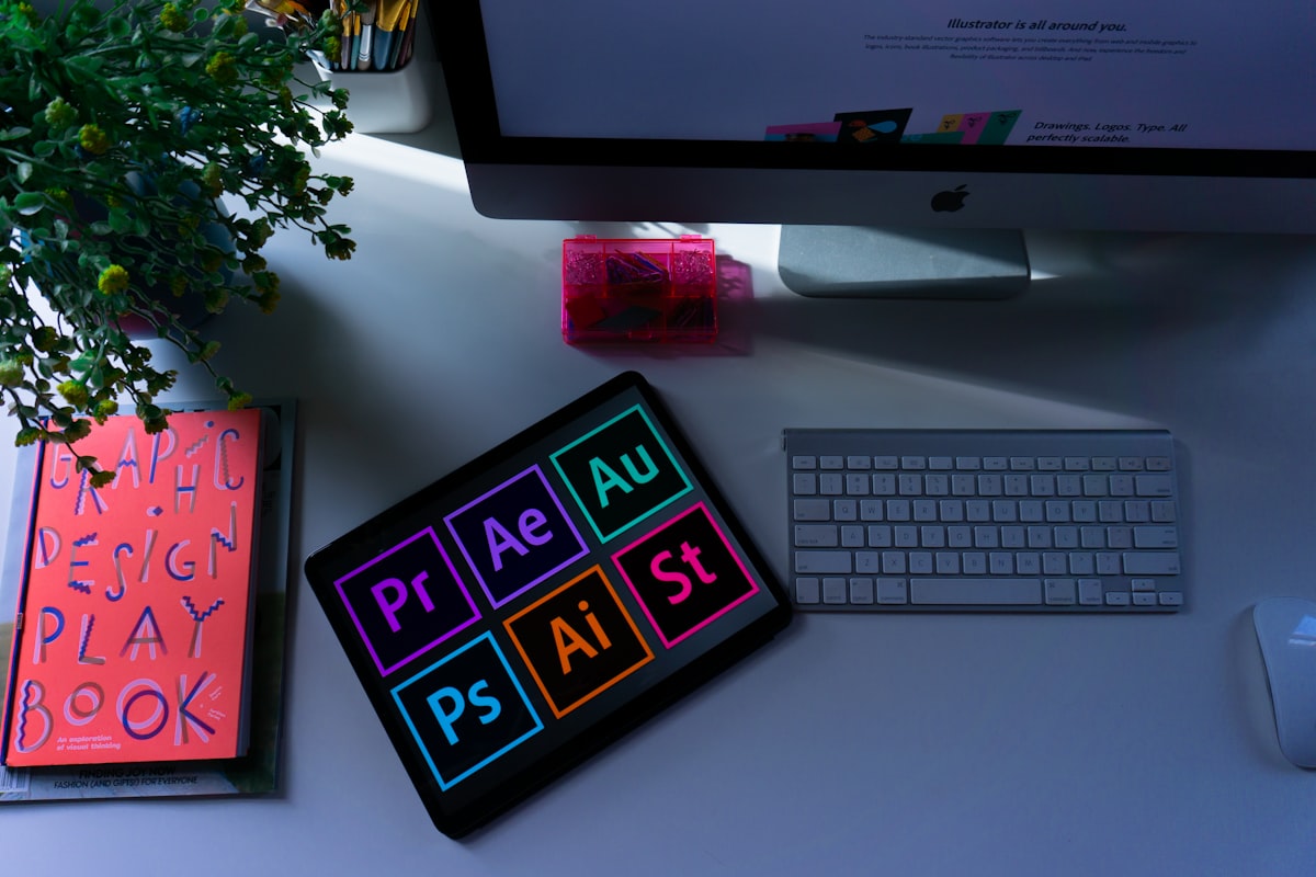
Adobe After Effects
Industry standard
Adobe Premiere Pro
Editor integrated
DaVinci Resolve
Free professional
Apple Motion
Mac exclusive
Canva
Beginner friendly
Template Marketplaces
Ready to use
Step by Step
The Creation Workflow
01
Define Requirements
02
Design Static Layout
03
Plan Animation
04
Build in Software
05
Animate Elements
06
Test on Footage
07
Create Template
08
Document Usage
Design Guidelines
Best Practices for Lower Thirds
Prioritize Readability
Clear text beats clever effects.
Keep Duration Appropriate
Long enough to read, then gone.
Respect Safe Zones
Keep text clear of screen edges.
Maintain Consistency
One style across every graphic.
Use Cases
Where Lower Thirds Shine
News & Journalism
Documentary Production
Corporate Video
Podcast Video
YouTube Content
Educational Content
Quick Reference
Lower Third Style Comparison
Match the style to your content and brand.
Style
Best For
Brand Impact
Time
Minimal Clean
Corporate, professional
Subtle
1–2 hrs
Bold Modern
YouTube, social media
Strong
2–4 hrs
Broadcast News
News, live coverage
Strong
Days
Cinematic
Documentary, film
Refined
Hours–days
Template-Based
Fast turnaround, creators
Varies
Minutes
Frequently Asked
Questions
Why is it called a "lower third"?
Because the graphic sits in the lower third of the screen — the bottom horizontal band. It keeps the identifying text out of the way of faces and action in the upper two-thirds of the frame.
How long should a lower third stay on screen?
Long enough to read the name and title comfortably twice — usually around 4–6 seconds. Show it when a speaker first appears, and bring it back if they return after a long gap.
What is a "safe zone"?
It's the central area of the frame guaranteed to display on any screen. Keeping text inside the title-safe zone ensures it never gets cropped on TVs, phones, or different aspect ratios.
Should I build reusable templates?
Absolutely. A template with editable text fields lets you drop in new names in seconds while keeping every graphic perfectly consistent — essential for series, shows, and any recurring content.
Where to go next
- Character Animation: Creating Digital Performers
- Transform Complex Ideas into Engaging Visual Stories
- Transform Data IntoAnimated Stories
More useful paths
Use these paths to continue with the closest practical topic, service, or decision guide.
Spotted something wrong? Report an error on this page. We correct on the page and say what changed.