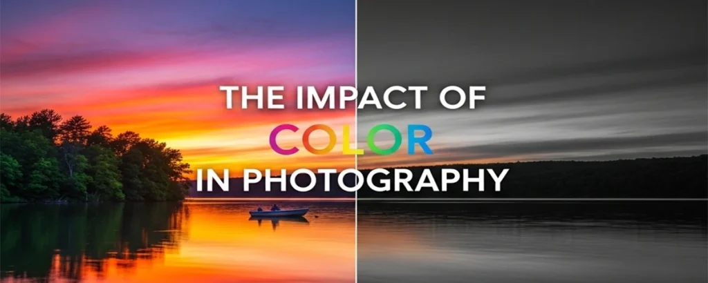
A Comprehensive Exploration of How Color Transforms Visual Storytelling
🌈 Introduction
Color is the silent language of photography, speaking directly to our emotions and shaping our perception of the world captured within the frame. From the golden warmth of a sunset to the cool blues of a winter landscape, color has the power to transform a simple photograph into a compelling visual narrative that resonates with viewers on a profound level.
In the realm of photography, color serves as more than mere decoration—it functions as a fundamental compositional element that can guide the viewer's eye, establish mood, convey meaning, and create lasting emotional connections. Whether working with the vibrant hues of street photography or the subtle tones of portrait work, understanding how color operates within the photographic medium is essential for any photographer seeking to elevate their craft.
Color theory, originally developed for painters and visual artists, has found profound relevance in photography. This systematic approach to understanding how colors interact, complement, and contrast with one another provides photographers with a powerful toolkit for creating more impactful images. By mastering the principles of color theory—from the basic relationships found on the color wheel to the complex psychological associations that different hues evoke—photographers can make more intentional choices about their visual storytelling.
This comprehensive exploration will delve deep into the multifaceted role of color in photography, examining not only the technical aspects of color capture and manipulation but also the artistic and psychological dimensions that make color such a potent force in visual communication. We'll journey through the fundamental principles of color theory, explore the emotional and cultural significance of different hues, and discover practical techniques for harnessing color's power in your own photographic work.
🎨 Understanding Color Theory

Color theory forms the backbone of effective visual communication in photography. At its core, this systematic approach to understanding color relationships begins with the fundamental building blocks: primary, secondary, and tertiary colors. These relationships, first mapped on the traditional color wheel, provide photographers with a roadmap for creating harmonious and impactful compositions.
Primary Colors: The Foundation
Primary colors—red, blue, and yellow in traditional color theory, or red, green, and blue in digital photography—serve as the foundation from which all other colors are derived. In digital photography, understanding the RGB color model is crucial, as it directly relates to how camera sensors capture light and how displays render images. These primary colors cannot be created by mixing other colors, making them the pure building blocks of the visible spectrum.
Secondary and Tertiary Colors
Secondary colors emerge from the combination of two primary colors: orange (red + yellow), green (blue + yellow), and purple (red + blue). Tertiary colors, created by mixing a primary and secondary color, fill the gaps on the color wheel and provide photographers with a rich palette of intermediate hues. Understanding these relationships helps photographers predict how colors will interact within their compositions and how post-processing adjustments might affect the overall color balance.
Color Harmony and Schemes
Color harmony refers to the pleasing arrangement of colors that creates a sense of order and visual satisfaction. Several established color schemes provide frameworks for achieving harmony: monochromatic schemes use variations of a single color, creating unity and sophistication; analogous schemes employ colors that sit adjacent on the color wheel, producing gentle, comfortable compositions; and complementary schemes pair colors from opposite sides of the wheel, generating vibrant contrast and visual tension.
Triadic color schemes, using three colors equally spaced on the color wheel, offer vibrant yet balanced compositions, while split-complementary schemes provide the visual interest of complementary colors with less tension. Tetradic or rectangular schemes use four colors arranged in two complementary pairs, offering rich color palettes with numerous possibilities for emphasis and subordination.
Practical Application in Photography
For photographers, color theory translates into practical decision-making tools. When composing a shot, understanding complementary relationships can help create striking contrasts—imagine the warm orange of a sunset against the cool blue of twilight sky. Analogous color schemes might guide the selection of wardrobe colors for a portrait session, ensuring the subject harmonizes with their environment while maintaining visual interest.
The digital age has expanded photographers' control over color relationships through post-processing. Color grading tools allow for precise manipulation of color schemes, enabling photographers to enhance existing harmonies or create entirely new color relationships that serve their artistic vision. Understanding color theory provides the foundation for making these adjustments purposefully rather than randomly, ensuring that color choices support rather than detract from the photograph's intended message.
💡 Suggested Images for This Section:
- Interactive color wheel diagram showing primary, secondary, and tertiary relationships
- Photography examples demonstrating complementary color schemes (orange/blue, red/green)
- Analogous color scheme examples in landscape photography
- Before/after examples showing color harmony adjustments in post-processing
🧠 The Psychology of Color
❤️ Warm Colors
Energy, passion, warmth, excitement
💙 Cool Colors
Calm, trust, serenity, professionalism
💚 Natural Colors
Growth, harmony, freshness, balance
The psychological impact of color in photography extends far beyond aesthetic appeal, tapping into deep-seated emotional and cultural associations that influence how viewers interpret and respond to images. This psychological dimension of color represents one of photography's most powerful tools for communication, allowing photographers to evoke specific emotions, create atmosphere, and guide viewer interpretation without relying on explicit visual elements.
Emotional Associations and Responses
Different colors trigger distinct emotional responses rooted in both evolutionary biology and learned cultural associations. Red, perhaps the most psychologically charged color, evokes feelings of passion, energy, danger, and urgency. In photography, red can create immediate visual impact, drawing attention and creating emotional intensity. Whether capturing the red of a rose, a sunset, or warning signage, photographers can leverage red's psychological power to create images that demand attention and evoke strong emotional responses.
Blue, conversely, tends to evoke feelings of calm, trust, and stability. The association with sky and water creates inherent connections to vastness, tranquility, and reliability. Corporate photography often employs blue tones to convey professionalism and trustworthiness, while landscape photographers might emphasize blue tones to create serene, contemplative moods. The psychological effect of blue can help viewers feel at ease and create a sense of spaciousness even in confined compositions.
Green, strongly associated with nature, growth, and renewal, carries psychological connotations of harmony, freshness, and vitality. In photography, green can create feelings of balance and restoration, making it particularly effective in environmental portraits, nature photography, and images intended to convey health, growth, or sustainability. The human eye's sensitivity to green wavelengths also makes it naturally comfortable to view, contributing to its psychologically soothing effect.
Cultural Significance and Context
The psychological impact of color is significantly influenced by cultural context, creating layers of meaning that photographers must consider when creating images for diverse audiences. White, for example, symbolizes purity and innocence in Western cultures, making it popular for wedding photography and minimalist compositions. However, in some Eastern cultures, white is associated with mourning and death, completely altering its psychological impact and appropriate usage.
Similarly, red carries vastly different cultural connotations across societies. While Western cultures often associate red with danger or passion, Chinese culture views red as a symbol of good fortune, prosperity, and celebration. Understanding these cultural variations allows photographers to make more informed decisions about color usage, particularly when creating images for international audiences or documenting cultural events and traditions.
Purple, historically associated with royalty and luxury due to the rarity and expense of purple dyes, continues to carry connotations of sophistication, creativity, and mystery. In photography, purple tones can elevate the perceived value and artistic merit of subjects, making them particularly effective in fashion, product, and fine art photography.
Practical Applications in Visual Storytelling
Understanding color psychology enables photographers to make strategic choices that support their narrative intentions. A portrait photographer might choose warm, golden tones to create feelings of comfort and intimacy, while cool, desaturated colors might better serve a documentary project exploring urban isolation. The psychological impact of color can reinforce or contradict other visual elements, creating complex layers of meaning within a single image.
Color temperature plays a crucial role in psychological impact, with warm colors (reds, oranges, yellows) generally creating feelings of energy, comfort, and intimacy, while cool colors (blues, greens, purples) tend to evoke calm, distance, and contemplation. Photographers can manipulate color temperature during capture through lighting choices or in post-processing to fine-tune the emotional impact of their images.
The saturation and intensity of colors also influence psychological response. Highly saturated colors create energy and excitement, making them effective for dynamic, attention-grabbing images. Desaturated or muted colors, conversely, can create sophisticated, contemplative moods that encourage longer viewing and deeper emotional engagement. By understanding these psychological principles, photographers can make more intentional choices about color treatment that align with their artistic and communicative goals.
💡 Suggested Images for This Section:
- Portrait series showing different emotional responses to warm vs. cool color palettes
- Cultural photography examples demonstrating color symbolism across different societies
- Mood board showing color associations (red=passion, blue=calm, green=nature, etc.)
- Before/after examples of color temperature adjustments and their emotional impact
📐 Color and Composition

Color functions as a fundamental compositional element in photography, working in concert with lines, shapes, texture, and form to create compelling visual narratives. Understanding how color interacts with these traditional compositional elements allows photographers to create more sophisticated and impactful images that guide viewer attention, establish visual hierarchy, and create emotional resonance through strategic color placement and relationships.
Color as a Compositional Tool
Color serves multiple compositional functions simultaneously, acting as both a unifying element and a tool for creating visual separation and emphasis. Warm colors naturally advance toward the viewer, making them effective for highlighting key subjects or creating focal points within a composition. Cool colors recede, making them ideal for backgrounds or supporting elements that shouldn't compete with the main subject for attention.
The strategic placement of contrasting colors can create visual pathways that guide the viewer's eye through the composition. A photographer might use a series of warm-colored elements to create a visual flow from foreground to background, or employ complementary color contrasts to establish clear subject-background separation. This understanding of color's spatial properties allows for more intentional composition decisions that support the photograph's narrative goals.
Color can also function as a compositional anchor, providing stability and structure within complex scenes. A consistent color theme running through different elements of a composition creates visual unity, while strategic color variations can establish rhythm and movement. Understanding these principles allows photographers to use color as actively as they might use leading lines or the rule of thirds in creating compelling compositions.
Interaction with Lines, Shapes, and Texture
Color's interaction with linear elements in photography creates opportunities for enhanced visual impact and meaning. Strong lines combined with contrasting colors can create dramatic emphasis, while subtle color variations along curved lines can enhance their graceful flow. The color of linear elements—whether architectural features, natural formations, or implied lines created by color transitions—significantly influences their compositional weight and visual impact.
Geometric shapes gain additional meaning and visual weight through color choices. A red circle commands different attention than a blue one, not just due to color psychology but also because of the interaction between form and hue. Color can enhance or diminish the impact of shapes within a composition, and understanding these relationships allows photographers to make more strategic decisions about subject placement and color treatment.
Texture and color share a particularly intimate relationship in photography. Color can enhance the perception of texture—warm colors might emphasize the roughness of weathered wood, while cool colors could highlight the smoothness of water or metal. Conversely, texture can influence how colors are perceived, with rough textures often appearing to intensify color saturation while smooth surfaces might reflect and modify color appearance.
Color Balance and Visual Weight
Color balance in composition extends beyond technical color correction to encompass the distribution and relationship of colors throughout the frame. A small area of intense, saturated color can balance a much larger area of muted tones, creating visual equilibrium without symmetrical placement. Understanding color's visual weight allows photographers to create balanced compositions that feel stable and harmonious even when employing asymmetrical arrangements.
The concept of color temperature balance also plays a crucial role in composition. Mixing warm and cool tones within a single image can create dynamic tension and visual interest, but requires careful consideration to avoid creating uncomfortable or jarring color relationships. Successful color temperature mixing often involves establishing a dominant temperature while using contrasting temperatures as accents or focal points.
Contrast and Visual Hierarchy
Color contrast serves as one of the most powerful tools for establishing visual hierarchy within photographic compositions. High contrast between subject and background colors ensures clear subject separation and immediate visual impact. However, contrast doesn't always require complementary colors—subtle variations in saturation, brightness, or hue can create effective contrast while maintaining color harmony.
Understanding how different types of color contrast affect viewer perception allows photographers to make strategic choices about emphasis and subordination within their compositions. Simultaneous contrast, where colors appear different depending on their surrounding colors, can be leveraged to enhance subject prominence or create visual illusions that add interest and depth to photographs. This sophisticated understanding of color relationships enables photographers to create compositions that work on multiple visual levels, rewarding both casual viewing and careful examination.
💡 Suggested Images for This Section:
- Side-by-side comparisons showing how color affects visual weight and balance
- Examples of color creating leading lines and visual flow in compositions
- Demonstrations of warm colors advancing and cool colors receding
- Before/after examples of color adjustments improving compositional balance
⚙️ Techniques for Using Color in Photography
☀️ Natural Light Techniques
- Golden hour warmth
- Blue hour coolness
- Overcast diffusion
- Directional color casting
💡 Artificial Light Control
- Color temperature adjustment
- Gel filters for mood
- Mixed lighting balance
- Creative color casting
Mastering color in photography requires understanding both capture techniques and post-processing methods that allow photographers to control and enhance color relationships. From leveraging natural light conditions to employing sophisticated digital color grading, these techniques provide the practical tools necessary to transform color theory knowledge into compelling visual results.
Natural Light and Color Temperature
Natural light provides photographers with an ever-changing palette of color temperatures and qualities throughout the day. The golden hour, occurring shortly after sunrise and before sunset, bathes subjects in warm, flattering light that enhances skin tones and creates romantic, inviting atmospheres. Understanding how to position subjects relative to this warm light—whether using it as key lighting, rim lighting, or background illumination—allows photographers to harness its color properties for maximum emotional impact.
The blue hour, the period of twilight when the sun is below the horizon but the sky retains a deep blue color, offers opportunities for creating images with rich, saturated blues that contrast beautifully with artificial lighting. This natural color contrast between cool ambient light and warm artificial sources creates dynamic color relationships that can transform ordinary scenes into extraordinary photographs.
Overcast conditions provide naturally diffused light that can enhance color saturation while eliminating harsh shadows. This even lighting allows colors to appear more true-to-life and can be particularly effective for capturing subtle color variations and relationships. Understanding how different weather conditions affect color rendition enables photographers to choose optimal shooting conditions for their intended color palette.
Artificial Lighting and Color Control
Artificial lighting provides photographers with precise control over color temperature and quality, enabling consistent color results regardless of natural lighting conditions. LED panels with adjustable color temperature allow photographers to match or contrast with ambient lighting conditions, creating specific moods and color relationships within their images.
Color gels, transparent colored filters placed over light sources, offer creative opportunities for introducing specific colors into photographs. These tools can create dramatic color contrasts, establish mood, or solve color balance challenges when mixing different light sources. Understanding how different gel colors interact with various subjects and backgrounds allows for sophisticated color control that supports the photograph's narrative goals.
Flash photography presents unique color challenges and opportunities. Modern flash units often provide adjustable color temperature, allowing photographers to match ambient conditions or create intentional color contrasts. Understanding how flash color temperature affects different subjects—particularly skin tones—is crucial for achieving natural-looking results or creating specific artistic effects.
Post-Processing and Color Grading
Digital post-processing has revolutionized photographers' control over color, providing tools that allow for precise manipulation of color relationships, saturation, and temperature. Color grading, the process of adjusting colors to achieve a specific look or mood, has become an essential skill for contemporary photographers seeking to develop distinctive visual styles.
Selective color adjustments allow photographers to modify specific color ranges without affecting others, enabling fine-tuned control over color relationships within an image. This technique can enhance existing color harmonies, create new color relationships, or correct color imbalances that occurred during capture. Understanding how to use tools like HSL (Hue, Saturation, Lightness) adjustments, color wheels, and curves enables photographers to achieve precise color control.
Split-toning techniques, which apply different colors to highlights and shadows, can create sophisticated color relationships that add depth and visual interest to photographs. This technique can enhance the three-dimensional quality of images while establishing specific moods or artistic styles. Understanding how highlight and shadow colors interact allows photographers to create cohesive color schemes that support their artistic vision.
Filters and Lens Considerations
Physical filters continue to play important roles in color photography, offering effects that are difficult or impossible to replicate in post-processing. Polarizing filters can enhance color saturation by reducing reflections and atmospheric haze, making them particularly valuable for landscape photography. Understanding how polarization affects different colors and surfaces allows photographers to use these filters strategically for maximum color impact.
Neutral density filters, while primarily used for exposure control, can also affect color rendition. High-quality ND filters maintain color neutrality, while lower-quality filters may introduce color casts that can be either problematic or creatively useful. Understanding these characteristics allows photographers to choose filters that support their color goals.
Lens choice also influences color rendition, with different lenses exhibiting varying color characteristics, contrast levels, and saturation properties. Understanding how different lenses render colors allows photographers to choose optics that complement their intended color palette and artistic style. Some lenses are known for warm color rendition, while others produce cooler, more clinical color reproduction, and these characteristics can be leveraged to support specific artistic goals.
💡 Suggested Images for This Section:
- Golden hour vs. blue hour comparison shots showing color temperature differences
- Before/after examples of color grading transformations
- Demonstrations of gel filter effects on portrait and product photography
- Split-screen comparisons of natural vs. artificial lighting color effects
📸 Case Studies: Iconic Photographers and Their Use of Color
William Eggleston
"The Democratic Forest" - Pioneer of color photography as fine art
Steve McCurry
"Afghan Girl" - Master of vibrant, emotionally resonant color
Examining the work of master photographers who have elevated color to an art form provides invaluable insights into the practical application of color theory and technique. These case studies demonstrate how different approaches to color can create distinctive visual styles and powerful emotional connections with viewers, offering inspiration and practical lessons for photographers at all levels.
William Eggleston: The Poetry of Everyday Color
William Eggleston revolutionized photography by elevating color from a commercial tool to a legitimate artistic medium. His groundbreaking 1976 exhibition at the Museum of Modern Art, "William Eggleston's Guide," challenged the art world's perception of color photography and established it as a serious artistic pursuit. Eggleston's approach to color is characterized by his ability to find extraordinary beauty in ordinary subjects through masterful color relationships and composition.
Eggleston's color palette often features saturated, almost surreal colors that transform mundane subjects into compelling visual narratives. His famous photograph of a red ceiling demonstrates how a single, dominant color can create dramatic impact and emotional resonance. The intense red, captured with perfect exposure and saturation, transforms an ordinary interior into a powerful statement about domesticity, intimacy, and the hidden drama of everyday life.
His work demonstrates the power of color contrast in creating visual hierarchy and emotional impact. In many of his photographs, Eggleston employs complementary color relationships—such as the interplay between warm artificial lighting and cool daylight—to create tension and visual interest. His understanding of how colors interact within the frame allows him to create compositions that are both visually striking and emotionally complex.
Steve McCurry: Color as Emotional Language
Steve McCurry's approach to color photography demonstrates how vibrant, saturated colors can enhance storytelling and create powerful emotional connections with viewers. His iconic "Afghan Girl" photograph showcases his mastery of color relationships, with the subject's piercing green eyes creating a striking contrast against the warm, earth-toned background and her red headscarf. This color combination not only creates visual impact but also reinforces the photograph's emotional intensity and cultural context.
McCurry's work often features rich, saturated colors that reflect the vibrancy of the cultures and environments he documents. His use of warm color palettes—dominated by reds, oranges, and golden yellows—creates a sense of warmth and humanity that draws viewers into his subjects' worlds. This consistent color approach has become a signature element of his style, making his work immediately recognizable while serving the deeper purpose of creating emotional resonance.
His understanding of how color interacts with cultural symbolism adds layers of meaning to his photographs. The use of traditional colors associated with specific cultures—such as the saffron robes of Buddhist monks or the vibrant textiles of Indian markets—not only creates visual appeal but also respects and celebrates cultural identity. McCurry's color choices demonstrate how photographers can use color to honor their subjects while creating compelling visual narratives.
Vivian Maier: Subtle Color in Street Photography
Vivian Maier's color work, discovered posthumously, reveals a more subtle approach to color photography that emphasizes observation and timing over dramatic color relationships. Her street photography demonstrates how muted, naturalistic color palettes can create sophisticated visual narratives that focus attention on human behavior and urban environments rather than competing for attention through bold color contrasts.
Maier's color photographs often feature harmonious, analogous color schemes that create unity and coherence within complex urban scenes. Her ability to find order within chaos through color relationships demonstrates advanced understanding of how color can serve compositional goals. Rather than relying on dramatic color contrasts, she uses subtle color variations to guide viewer attention and create visual flow through her compositions.
Ernst Haas: Color as Abstract Expression
Ernst Haas pioneered the use of color in abstract and impressionistic photography, demonstrating how color could be the primary subject rather than merely a descriptive element. His motion-blur techniques combined with strategic color choices created images that emphasized color relationships and emotional impact over literal representation. Haas's work shows how photographers can use color as a tool for personal expression and artistic exploration.
His understanding of color temperature and its emotional implications allowed him to create images that conveyed specific moods and feelings through color alone. His sunset and reflection photographs demonstrate masterful use of warm color palettes to create feelings of tranquility and contemplation, while his urban abstracts often employ cooler palettes to convey the energy and alienation of city life.
These master photographers demonstrate that successful color photography requires more than technical proficiency—it demands a deep understanding of color's emotional, cultural, and compositional properties. Their work provides a roadmap for developing personal color sensibilities while demonstrating the diverse approaches possible within color photography. By studying their techniques and approaches, contemporary photographers can develop their own sophisticated understanding of color's potential as a tool for artistic expression and communication.
💡 Suggested Images for This Section:
- William Eggleston's "Red Ceiling" and other iconic color works
- Steve McCurry's "Afghan Girl" with analysis of color relationships
- Vivian Maier's street photography showing subtle color harmonies
- Ernst Haas's abstract color photography demonstrating motion and color
⚠️ Challenges and Considerations
🎯 Common Challenges
- White balance inconsistencies
- Color blindness considerations
- Mixed lighting situations
- Monitor calibration issues
✅ Solutions & Tips
- Use color checker cards
- Implement accessibility testing
- Master manual white balance
- Invest in color-accurate displays
Working effectively with color in photography presents numerous technical and creative challenges that can significantly impact the final image quality and viewer experience. Understanding these challenges and developing strategies to overcome them is essential for photographers seeking to master color as a creative tool while ensuring their work is accessible and technically sound.
Technical Challenges and Solutions
White balance represents one of the most fundamental challenges in color photography, particularly when working in mixed lighting conditions. Different light sources—incandescent, fluorescent, LED, and natural light—each emit different color temperatures, and camera auto white balance systems can struggle to accurately interpret the intended color rendition when multiple sources are present. This challenge is compounded in situations where the photographer wants to preserve the natural color cast of certain light sources for creative effect while correcting others.
Developing proficiency with manual white balance settings and understanding how to use color temperature and tint adjustments in post-processing provides photographers with greater control over color rendition. Using color checker cards or gray cards during shooting can provide reference points for accurate color correction in post-processing, ensuring consistent color reproduction across different lighting conditions and shooting sessions.
Monitor calibration presents another significant challenge, as uncalibrated displays can lead to color adjustments that look correct on the editing monitor but appear incorrect when viewed on other devices or in print. Investing in a color-accurate monitor and regular calibration using hardware calibration tools ensures that color adjustments made during post-processing will translate accurately to other viewing conditions.
Accessibility and Color Blindness Considerations
Color blindness affects approximately 8% of men and 0.5% of women, making it crucial for photographers to consider how their color choices might be perceived by viewers with different types of color vision deficiencies. The most common forms of color blindness affect the perception of red and green, meaning that photographs relying heavily on red-green color contrasts may not be accessible to all viewers.
Understanding the different types of color blindness—protanopia (red blindness), deuteranopia (green blindness), and tritanopia (blue blindness)—allows photographers to make more inclusive color choices. Using tools and apps that simulate different types of color blindness can help photographers evaluate how their images will be perceived by viewers with color vision deficiencies, enabling them to make adjustments that maintain visual impact and accessibility.
Incorporating luminance contrast alongside color contrast ensures that important visual information remains accessible even when color differences cannot be perceived. This approach involves ensuring that elements that need to be distinguished have different brightness levels in addition to different colors, making the composition readable regardless of color perception abilities.
Creative and Artistic Challenges
Developing a personal color style while avoiding clichéd or trendy color treatments presents an ongoing creative challenge. The proliferation of preset filters and automated color grading tools has led to homogenization in color treatment across much photography, making it increasingly difficult to develop distinctive color approaches that stand out while remaining authentic to the photographer's vision.
Balancing color impact with narrative content requires careful consideration of how color choices support or detract from the photograph's intended message. Overly dramatic color treatments can overwhelm the subject matter, while overly conservative approaches might fail to engage viewers or convey the intended emotional impact. Finding the right balance requires developing sensitivity to how color affects viewer perception and learning to evaluate color choices objectively.
Cultural sensitivity in color usage presents challenges for photographers working across different cultural contexts. Colors carry different meanings and associations in different cultures, and photographers must be aware of these differences to avoid unintentional cultural insensitivity or miscommunication. This challenge is particularly relevant for travel photographers, documentary photographers, and those working with diverse communities.
Practical Tips for Overcoming Color Challenges
Developing a systematic approach to color evaluation can help photographers make more consistent and effective color decisions. This might involve creating a checklist that includes technical considerations (white balance accuracy, color cast evaluation), compositional considerations (color balance, contrast, harmony), and accessibility considerations (luminance contrast, color blindness simulation).
Building a reference library of successful color treatments—both from personal work and admired photographers—can provide inspiration and guidance when facing difficult color decisions. Analyzing what makes certain color treatments effective helps develop intuitive understanding of color relationships and their impact on viewer perception.
Regular practice with color exercises—such as shooting the same subject under different lighting conditions, experimenting with different color grading approaches, or creating images using specific color schemes—helps develop color sensitivity and technical proficiency. These exercises build the visual vocabulary and technical skills necessary to overcome color challenges and use color as an effective creative tool.
💡 Suggested Images for This Section:
- Examples of white balance problems and their corrections
- Color blindness simulation showing how images appear to different viewers
- Before/after examples of poorly executed color treatments and improvements
- Demonstration of mixed lighting challenges and solutions
🎯 Conclusion
The journey through color's impact in photography reveals its fundamental role as both a technical consideration and a powerful creative tool. From the foundational principles of color theory to the sophisticated applications demonstrated by master photographers, color emerges as an essential element that can transform ordinary photographs into extraordinary visual narratives that resonate with viewers on emotional, cultural, and aesthetic levels.
Understanding color theory provides photographers with a systematic framework for making intentional color choices, whether creating harmonious compositions through analogous color schemes or generating visual tension through complementary contrasts. This theoretical foundation, combined with practical knowledge of how colors interact psychologically and culturally, enables photographers to use color as a deliberate communication tool rather than leaving color relationships to chance.
The technical aspects of color photography—from mastering natural and artificial lighting conditions to developing proficiency in post-processing color grading—provide the practical skills necessary to realize creative color visions. These technical competencies, when combined with an understanding of color's compositional properties, allow photographers to create images that work on multiple levels, engaging viewers through both immediate visual impact and deeper emotional resonance.
The examination of iconic photographers' approaches to color demonstrates the diverse possibilities within color photography, from Eggleston's elevation of everyday subjects through masterful color relationships to McCurry's use of vibrant palettes to enhance cultural storytelling. These examples illustrate that successful color photography requires developing a personal vision while maintaining technical excellence and cultural sensitivity.
The challenges inherent in color photography—from technical issues like white balance and monitor calibration to creative challenges like developing distinctive color styles—underscore the importance of continuous learning and practice. Overcoming these challenges requires both technical knowledge and creative sensitivity, along with awareness of accessibility considerations that ensure color choices serve all viewers effectively.
As photography continues to evolve in the digital age, color remains a constant source of creative possibility and technical challenge. The principles explored in this comprehensive examination provide a foundation for continued growth and experimentation, encouraging photographers to push beyond conventional color treatments while maintaining respect for color's psychological and cultural significance. Mastering color in photography is ultimately about developing the sensitivity to see color relationships, the technical skills to capture and manipulate them effectively, and the creative vision to use them in service of compelling visual storytelling.
🚀 Ready to Transform Your Photography?
Join our community of photographers exploring the power of color in visual storytelling. Share your color experiments, get feedback from peers, and continue your journey toward mastering color photography.
Have questions about color techniques? Want personalized feedback on your work? Our community of color photography enthusiasts is here to help you grow.


