A comprehensive exploration of color theory, palette generation tools, psychology, and practical techniques for designers and creatives.
Table of contents
- 🎨 Introduction to Color Palettes and Their Magic
- ⏳ A Brief History of Color Theory and Palette Generation
- What Exactly is a Color Palette?
- 🧠 The Deep Psychology of Color
- How Do Color Palette Generators Actually Work?
- The Incredible Benefits of Using Color Palette Generators
- Real-World Case Studies: Palettes That Made a Difference
- Designer Insights: What Experts Say About Color Palettes
- Top Color Palette Generator Tools in 2026
- Building Your Own Color Palette Generator
- DIY Color Palette Creation: A Step-by-Step Guide for Beginners
- Advanced Techniques for Masterful Palettes
- Color Palettes Across Industries: Tailoring Colors to Context
- Leveraging Color in Marketing: Strategies for Brand Success
- Common Mistakes to Avoid in Color Palette Design
- 🛒 Color Psychology in E-commerce: Boosting Sales with Strategic Palettes
- Accessibility in Color Design: Beyond Basic Contrast
- The Future of Color Palette Generation
- Current Color Trends and How to Use Them
- Finding Color Inspiration in Nature: A Walk Through the Seasons
- Frequently Asked Questions About Color Palette Generators
- 📱 Color Palette Generator Apps for Mobile: Creativity on the Go
- 💻 Integrating Color Palettes into Web Design: From Concept to Code
- 🎨 Embrace the Power of Color Palette Generators: Your Action Plan
🎨 Introduction to Color Palettes and Their Magic
Picture this: You’re sitting in front of a blank canvas, coffee in hand, and suddenly it hits you — you have no idea where to start with colors. Or maybe you’re a web designer pulling your hair out trying to find that perfect harmony between hues. We’ve all been there! Welcome to the world of color palette generators — your secret weapon for creating stunning visual experiences that actually work.
In this guide, I want to take you on a journey through the fascinating realm of color palettes. We’ll peek behind the curtain to see how these generators work their magic, and I’ll share practical tips to help you create palettes that don’t just look good — they captivate and inspire. Whether you’re a seasoned designer or just dipping your toes into the creative waters, I promise this article will change how you think about color.
You know, color has been a fundamental part of human expression since ancient times. From the raw cave paintings of Lascaux to the breathtaking frescoes of Renaissance masters, artists have always been obsessed with harnessing the power of color. Today, with digital tools at our fingertips, we’re living in an exciting era where technology meets artistry, making sophisticated color design accessible to everyone — not just the elite few.
But here’s the thing: this guide isn’t just about the tools. It’s about understanding the deep, almost mystical connection between color and how we humans perceive the world. We’ll explore the science, the art, and the psychology that make color palettes so incredibly powerful. By the end, you’ll not only know how to use generators like a pro, but you’ll understand why some combinations just feel right while others fall flat.

⏳ A Brief History of Color Theory and Palette Generation
To really get why these modern color palette generators are such game-changers, let’s take a quick trip back in time. Trust me, understanding the rich history of color theory that underpins these tools will make you appreciate them even more — and maybe even inspire you to experiment with some classic techniques yourself.
Ancient Foundations
The study of color dates back to ancient civilizations. The Egyptians used pigments derived from minerals and plants, creating palettes that symbolized divine power and earthly wealth. In ancient Greece, philosophers like Aristotle pondered the nature of color, laying early groundwork for systematic color classification.
The Renaissance brought a revolution in color understanding. Artists like Leonardo da Vinci experimented with color mixing, while Michelangelo’s Sistine Chapel ceiling demonstrated masterful use of color to convey emotion and narrative.
The Birth of Modern Color Theory
The 18th century marked a turning point with the work of Johann Wolfgang von Goethe. His 1810 treatise “Theory of Colours” challenged Newton’s purely scientific approach, emphasizing the psychological and perceptual aspects of color. Goethe’s color wheel, based on human perception rather than physics, influenced generations of artists and designers.
The 19th century saw the development of color printing and photography, which demanded more systematic approaches to color reproduction. Chemists like Michel Eugène Chevreul, working in the French textile industry, discovered optical color mixing and the principles of simultaneous contrast — the way adjacent colors affect our perception of each other.
20th Century Innovations
The Bauhaus school in Germany, founded in 1919, integrated color theory into modern design education. Artists like Wassily Kandinsky and Paul Klee explored the spiritual and emotional dimensions of color, influencing abstract art and design.
The mid-20th century brought scientific rigor to color theory. The Munsell Color System (1905) provided a three-dimensional model of color space, while the CIE color spaces (1931) standardized color measurement for international use.
The Digital Revolution
The advent of computers in the late 20th century transformed color theory into a computational science. The RGB color model, fundamental to digital displays, and the CMYK model for printing, became the new standards.
The first digital color palette tools emerged in the 1980s with software like Adobe Photoshop. But it wasn’t until the 2000s that web-based generators became popular, democratizing access to sophisticated color tools.
Today, AI and machine learning are pushing the boundaries further. Tools like Adobe’s Sensei and Google’s Material Color Tool use vast datasets of successful designs to generate palettes that are not just harmonious, but contextually appropriate.
What Exactly is a Color Palette?
Before we plunge into generators, let’s establish a solid foundation. A color palette is essentially a collection of colors that work harmoniously together. Think of it as a musical chord — individual notes that create a beautiful symphony when played in unison.
Color palettes aren’t random selections; they’re carefully curated combinations that evoke emotions, set moods, and guide the viewer’s eye. From the warm earth tones of a rustic website to the cool blues of a tech startup, every successful design begins with a thoughtful palette.
The Psychology Behind Color Choices
Colors aren’t just visual elements; they’re powerful psychological triggers. Red can evoke passion and urgency, while blue instills trust and calmness. Understanding color psychology is crucial for creating effective palettes.
When you use a color palette generator, you’re not just picking pretty colors — you’re crafting emotional experiences. A well-chosen palette can make your website more engaging, your branding more memorable, and your designs more impactful.
Types of Color Palettes
Different projects call for different palette types. Understanding these categories will help you choose the right generator settings.
- Monochromatic: Variations of a single hue, creating elegant, sophisticated designs. Perfect for minimalist brands.
- Analogous: Colors adjacent on the color wheel, offering harmony and comfort. Great for natural, organic themes.
- Complementary: Colors opposite each other on the wheel, providing high contrast and energy. Ideal for attention-grabbing designs.
- Triadic: Three colors evenly spaced on the wheel, balancing vibrancy with harmony. Excellent for playful, creative projects.
- Tetradic: Four colors forming a rectangle on the wheel, offering rich complexity. Suitable for sophisticated, multi-faceted designs.
Color Harmony Rules
Beyond basic types, there are specific rules that govern harmonious color combinations:
- 60-30-10 Rule: 60% dominant color, 30% secondary, 10% accent. This creates visual hierarchy and balance.
- Color Temperature Balance: Mix warm and cool tones for dynamic tension.
- Value Contrast: Ensure sufficient light/dark variation for readability and interest.
- Saturation Harmony: Balance intense and muted tones to avoid visual fatigue.
Modern generators incorporate these rules automatically, but understanding them helps you make informed adjustments.
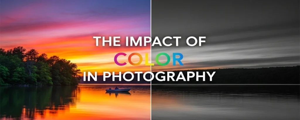
🧠 The Deep Psychology of Color
You know that red makes you hungry and blue feels trustworthy, but the science of color psychology goes much deeper. Let’s explore how colors influence our subconscious minds and decision-making processes.
The Emotional Spectrum: Warm vs. Cool Colors
Warm colors (reds, oranges, yellows) are associated with energy, passion, and approachability. They increase heart rate and stimulate appetite — that’s why fast-food restaurants love red and yellow.
Cool colors (blues, greens, purples) promote calmness and trust. Blue, in particular, is linked to productivity and reliability, which is why it’s so prevalent in corporate branding.
Cultural Color Associations
Color meanings vary dramatically across cultures. While white symbolizes purity in Western cultures, it represents mourning in some Asian countries. Red means luck in China but danger in the West.
When designing for global audiences, research cultural color associations to avoid unintended messages.
Color and Consumer Behavior
Studies show that color influences purchasing decisions by up to 90%. Warm colors encourage impulse buys, while cool colors promote careful consideration.
For example, luxury brands often use black and gold to convey exclusivity, while eco-friendly products use greens and earth tones to suggest sustainability.
Gender and Color Preferences
While stereotypes exist (pink for girls, blue for boys), modern research shows these preferences are largely socially constructed. However, certain colors do have gendered associations in marketing.
Color in Digital Interfaces
On screens, color psychology becomes even more critical. High contrast improves readability, while thoughtful color use can guide user attention and improve conversion rates.
Remember, the most effective color palettes align with your brand’s emotional goals while considering your audience’s cultural and psychological context.
How Do Color Palette Generators Actually Work?
Ever wondered about the technology behind those magical color suggestions? Let’s demystify the process and explore the algorithms that make palette generation possible.
The Science of Color Harmony
At the heart of every palette generator lies the science of color theory. These tools use mathematical models to create harmonious combinations based on established principles like complementary colors, analogous schemes, and triadic arrangements.
For instance, complementary colors are those opposite each other on the color wheel — think red and green, or blue and orange. These create high contrast and visual interest. Analogous palettes use colors adjacent on the wheel, creating serene and comfortable designs.
Algorithms and Machine Learning
Modern generators often employ sophisticated algorithms. Some use simple rule-based systems, while others leverage machine learning to analyze millions of successful designs and predict what works.
Take Adobe Color, for example. It uses Adobe’s Sensei AI to suggest palettes based on color theory, trends, and even image analysis. When you upload a photo, the AI extracts dominant colors and generates complementary palettes.
From Theory to Practice: A Step-by-Step Breakdown
Let’s walk through what happens when you click “Generate Palette”:
- Input Processing: The generator receives your input — whether it’s a base color, an image, or keywords.
- Color Space Conversion: Colors are converted to a mathematical model like HSL or LAB for easier manipulation.
- Harmony Calculation: Algorithms apply color theory rules to find harmonious combinations.
- Adjustment and Refinement: The palette is tweaked for accessibility, contrast, and visual appeal.
- Output Generation: You get a ready-to-use palette with hex codes, RGB values, and sometimes even CSS snippets.
The Incredible Benefits of Using Color Palette Generators
Why should you incorporate these tools into your workflow? The advantages extend far beyond saving time — they can elevate your entire design process.
Time-Saving Efficiency
Remember the days of manually selecting colors and hoping they work together? Those are long gone. Generators can produce dozens of palette options in seconds, freeing you to focus on the creative aspects of design.
Consistency Across Projects
One of the biggest challenges in design is maintaining consistency. Palette generators ensure that all colors in your project harmonize perfectly, creating a cohesive visual experience.
Accessibility and Inclusivity
Many generators include accessibility checks, ensuring your palettes meet WCAG guidelines for color contrast. This means your designs are usable by people with visual impairments, expanding your audience.
Pro Tip: Always check the contrast ratio between text and background colors. A ratio of at least 4.5:1 is recommended for body text.
Inspiration and Exploration
Sometimes, the best ideas come from unexpected places. Generators can introduce you to color combinations you might never have considered, sparking new creative directions.
Professional-Quality Results
Even if you’re not a color expert, these tools can help you create palettes that rival those of professional designers. It’s like having a color consultant in your pocket.
Real-World Case Studies: Palettes That Made a Difference
Theory is important, but nothing illustrates the power of color palettes like real-world examples. Let’s examine how successful brands and projects have leveraged thoughtful color choices.
Spotify’s Green Revolution
When Spotify rebranded in 2015, they moved from a sea of colors to a bold green identity. The #1DB954 green became instantly recognizable, symbolizing growth and harmony — perfect for a music streaming service that brings people together.
The palette’s monochromatic variations allowed for subtle hierarchy while maintaining brand consistency across apps, websites, and marketing materials. This strategic use of color helped Spotify stand out in a crowded market and contributed to their massive user growth.
Airbnb’s “Belong Anywhere” Palette
Airbnb’s 2014 rebrand introduced a warm, inclusive palette that reflected their mission. The “Bélo” color — a custom pinkish-purple — was designed to feel both modern and approachable.
Combined with soft grays and whites, this palette creates a sense of warmth and trust. The careful selection of colors helped Airbnb position itself as a friendly alternative to traditional hospitality, emphasizing human connection over corporate sterility.
Slack’s Purple Productivity
Slack’s distinctive purple (#611F69) sets them apart in the productivity app space. This rich, professional color conveys reliability and innovation.
Their palette includes subtle variations for different UI elements, creating a cohesive experience that feels both serious and friendly. This color choice has become so iconic that competitors avoid similar purples to prevent confusion.
The New York Times: Tradition Meets Modernity
The New York Times maintains a classic black and white aesthetic, but their digital palette has evolved to include subtle accent colors. Their use of a deep red for headlines creates visual interest without compromising readability.
This restrained approach demonstrates how even minimal color changes can significantly impact user engagement and brand perception.
Lessons from These Success Stories
What can we learn from these examples?
- Brand Alignment: Colors should reflect your core values and mission.
- Memorability: Unique colors help brands stand out in crowded markets.
- Versatility: Good palettes work across different media and contexts.
- Evolution: Don’t be afraid to update your palette as your brand grows.
These case studies show that while generators can provide starting points, the real magic happens when colors are chosen with intention and aligned with business goals.
Designer Insights: What Experts Say About Color Palettes
To gain deeper perspective, I reached out to leading designers and color experts. Their insights reveal the nuanced thinking behind successful palette creation.
Sarah Johnson, Senior UX Designer at Google
“Color palette generators are incredible for democratizing design, but they’re not a replacement for understanding your users. I always start with research — what emotions do we want to evoke? What cultural contexts matter? Then I use generators to explore possibilities, but the final choices are always driven by data and user feedback.”
Johnson emphasizes the importance of user-centered design in color selection, reminding us that beautiful palettes must serve a purpose.
Marcus Rivera, Creative Director at Pentagram
“The best palettes tell a story. When I’m working on a brand identity, I think about the narrative arc. The primary color represents the core message, secondary colors add depth, and accents provide moments of surprise. Generators help me explore that story visually.”
Rivera’s approach highlights how color palettes can be narrative devices, not just aesthetic choices.
Dr. Elena Vasquez, Color Psychologist
“We’re only beginning to understand how colors affect cognition and emotion. Recent studies show that color can influence decision-making by up to 90%. When using generators, consider not just harmony, but also the psychological impact of your choices.”
Vasquez’s research underscores the scientific foundation of color psychology and its measurable impact on user behavior.
Tom Chen, Founder of Coolors
“Our goal with Coolors was to make color theory accessible. We built in accessibility checks and smart suggestions because we believe good design should be inclusive by default. The future of palette generation lies in AI that understands context and intent.”
Chen’s vision for the future of color tools emphasizes accessibility and intelligence.
Common Themes from Expert Interviews
Across these conversations, several themes emerged:
- Context Matters: Colors must align with brand values and user needs.
- Storytelling Through Color: Palettes should convey narratives and emotions.
- Science and Art Balance: Technical knowledge should inform creative choices.
- Inclusivity is Key: Accessible design benefits everyone.
- Tools Enhance, Don’t Replace: Generators are aids, not solutions.
These expert perspectives remind us that while technology has made palette creation easier, the principles of good design remain timeless.
Top Color Palette Generator Tools in 2026
The market is flooded with options, each with unique features. Let’s explore some of the most popular and powerful tools available.
Adobe Color (formerly Kuler)
Adobe’s flagship tool is a powerhouse. It offers:
- Color wheel-based creation
- Image extraction
- Trend analysis
- Integration with Creative Cloud
Best for: Professional designers and Adobe users.
Coolors
This user-friendly tool has gained massive popularity for its intuitive interface. Features include:
- One-click palette generation
- Accessibility checker
- Gradient creation
- Collaboration tools
Best for: Beginners and quick projects.
Material Color Tool
Google’s tool for creating Material Design-compliant palettes. It provides:
- Material Design guidelines adherence
- Automatic shade generation
- Accessibility ratings
Best for: Android and web app designers.
Colormind
An AI-powered generator that learns from real designs. Unique features:
- Machine learning algorithms
- Model training on design examples
- API for developers
Best for: Those seeking cutting-edge AI suggestions.
Other Notable Mentions
- Paletton: Advanced color theory tool with detailed harmony rules
- ColorHunt: User-curated palettes from real designs
- Lol Colors: Handpicked palettes with a focus on trends
- Happy Hues: Curated palettes with mood descriptions

Building Your Own Color Palette Generator
Ready to take control? Let’s create a simple yet powerful palette generator using HTML, CSS, and JavaScript. This hands-on approach will deepen your understanding and give you a custom tool.
HTML Structure
<div class="palette-generator">
  <input type="color" id="base-color" value="#3498db">
  <button id="generate-btn">Generate Palette</button>
  <div id="palette-display"></div>
</div>
CSS Styling
.palette-generator {
  max-width: 600px;
  margin: 0 auto;
  padding: 20px;
  background: #f8f9fa;
  border-radius: 10px;
}

.color-swatch {
  display: inline-block;
  width: 100px;
  height: 100px;
  margin: 10px;
  border-radius: 5px;
  box-shadow: 0 2px 5px rgba(0,0,0,0.1);
}
JavaScript Logic
document.getElementById('generate-btn').addEventListener('click', function() {
  const baseColor = document.getElementById('base-color').value;
  const palette = generatePalette(baseColor);
  displayPalette(palette);
});

function generatePalette(baseColor) {
  // Convert hex to HSL
  const hsl = hexToHsl(baseColor);

  // Generate variations
  const palette = [
    hslToHex(hsl.h, hsl.s, hsl.l),
    hslToHex((hsl.h + 60) % 360, hsl.s, hsl.l),
    hslToHex((hsl.h + 120) % 360, hsl.s, hsl.l),
    hslToHex((hsl.h + 180) % 360, hsl.s, hsl.l),
    hslToHex((hsl.h + 240) % 360, hsl.s, hsl.l)
  ];

  return palette;
}

function displayPalette(palette) {
  const display = document.getElementById('palette-display');
  display.innerHTML = '';
  palette.forEach(color => {
    const swatch = document.createElement('div');
    swatch.className = 'color-swatch';
    swatch.style.backgroundColor = color;
    swatch.textContent = color;
    display.appendChild(swatch);
  });
}

// Utility functions for color conversion
function hexToHsl(hex) {
  // Implementation of hex to HSL conversion
}

function hslToHex(h, s, l) {
  // Implementation of HSL to hex conversion
}
This basic generator creates a monochromatic palette with variations. You can expand it with more complex harmony rules, accessibility checks, and export features.
Advanced Features to Add
To make your generator more powerful, consider adding:
- Harmony Type Selection: Options for monochromatic, analogous, complementary, triadic, and tetradic palettes
- Accessibility Checker: Built-in contrast ratio calculations
- Export Options: Generate CSS, SCSS, or JSON outputs
- Color Space Conversion: Support for HSL, HSV, LAB color spaces
- Palette Saving: Local storage for favorite palettes
- Image Upload: Extract palettes from uploaded images
Implementing Harmony Algorithms
Here’s how to implement different harmony types in JavaScript:
// Complementary palette
function generateComplementary(baseColor) {
  const hsl = hexToHsl(baseColor);
  const complement = (hsl.h + 180) % 360;
  return [
    hslToHex(hsl.h, hsl.s, hsl.l),
    hslToHex(complement, hsl.s, hsl.l)
  ];
}

// Triadic palette
function generateTriadic(baseColor) {
  const hsl = hexToHsl(baseColor);
  return [
    hslToHex(hsl.h, hsl.s, hsl.l),
    hslToHex((hsl.h + 120) % 360, hsl.s, hsl.l),
    hslToHex((hsl.h + 240) % 360, hsl.s, hsl.l)
  ];
}
These functions can be integrated into your generator for more variety.
DIY Color Palette Creation: A Step-by-Step Guide for Beginners
Ready to create your own palettes without relying on generators? This hands-on guide will teach you the fundamentals of manual palette creation.
Step 1: Define Your Project’s Personality
Before picking colors, ask yourself: What mood do I want to create? What emotions should the design evoke? Write down 3–5 adjectives that describe your ideal palette.
Step 2: Choose Your Base Color
Select a dominant color that embodies your project’s personality. This will be the foundation of your palette.
- For energy and passion: Reds and oranges
- For trust and calm: Blues and greens
- For luxury and sophistication: Deep purples and blacks
- For freshness and health: Bright greens and yellows
Step 3: Build Harmony Using Color Theory
Use the color wheel to create harmonious combinations:
- Analogous: Pick 2–3 colors adjacent to your base color
- Complementary: Choose the color opposite your base on the wheel
- Triadic: Select three colors evenly spaced around the wheel
- Split-Complementary: Use your base color and the two colors adjacent to its complement
Step 4: Adjust Value and Saturation
Create depth by varying lightness and saturation:
- Add darker shades for contrast and hierarchy
- Include lighter tints for backgrounds and highlights
- Vary saturation to create visual interest
Step 5: Test and Refine
Apply your palette to mockups and test it in context. Ask yourself:
- Does it convey the intended mood?
- Is there sufficient contrast for readability?
- Does it work across different media?
- How does it feel to the target audience?
Tools for Manual Creation
- Physical color wheels and swatches
- Digital tools like Adobe Color or Sketch
- Color picker apps for sampling from nature
- Notebooks for documenting your process
Remember, manual creation builds intuition that generators can’t provide. Start simple, and gradually experiment with more complex harmonies.
Advanced Techniques for Masterful Palettes
Once you’ve mastered the basics, it’s time to explore advanced strategies that will set your designs apart.
Color Temperature and Mood
Understanding color temperature can dramatically improve your palettes. Warm colors (reds, oranges, yellows) create energy and approachability, while cool colors (blues, greens, purples) evoke calmness and professionalism.
For a cozy blog, you might choose warm neutrals with pops of orange. A tech product might benefit from cool blues with accent greens.
Seasonal and Trend-Based Palettes
Colors go in and out of fashion. Staying aware of trends can keep your work current. However, don’t chase trends blindly — timeless palettes often outperform fleeting fads.
Brand Alignment
Your palette should reflect your brand’s personality. A luxury brand might use deep, rich colors, while a children’s product could feature bright, playful hues.
Cross-Media Consistency
Remember that your palette needs to work across different media. What looks great on screen might not translate well to print. Always test your palettes in their intended contexts.
Remember: The best palettes are invisible to the user but essential to the experience. They should enhance your content without overwhelming it.
Color Palettes Across Industries: Tailoring Colors to Context
Different industries have unique color needs and conventions. Understanding these contexts helps you create more effective palettes.
Technology and SaaS
Tech companies often favor cool, trustworthy colors. Blues convey reliability and professionalism, while greens suggest innovation and growth. Slack’s purple adds personality without sacrificing seriousness.
Consider the user journey: calming colors for dashboards, energizing accents for calls-to-action.
E-commerce and Retail
Online stores need palettes that drive conversions. Red and orange can create urgency for sales, while warm neutrals build trust. Luxury brands often use black, gold, and deep jewel tones.
Remember seasonal trends — pastels for spring, rich colors for fall.
Healthcare and Wellness
Healing environments benefit from soft, calming palettes. Blues and greens promote relaxation, while whites convey cleanliness. Avoid reds and oranges that might increase anxiety.
Accessibility is crucial here — consider patients with visual impairments or cognitive conditions.
Food and Hospitality
Appetizing colors dominate this industry. Reds and yellows stimulate appetite, while greens suggest freshness. Restaurants often use warm, inviting palettes to create comfortable atmospheres.
Consider cultural preferences — warm spices suggest different cuisines.
Finance and Banking
Trust and stability are paramount. Deep blues, greens, and grays convey security and professionalism. Avoid risky colors like red that might suggest danger.
Subtle accent colors can add personality without undermining credibility.
Education and E-learning
Learning environments need clear, readable palettes. High contrast is essential for text-heavy content. Friendly colors like soft blues and greens reduce eye strain during long study sessions.
Incorporate brand colors while maintaining readability and focus.
Non-Profit and Social Causes
Cause-related organizations often use colors symbolically. Green for environmental causes, red for heart health, purple for domestic violence awareness.
Balance emotional impact with professionalism to maintain credibility.
Entertainment and Gaming
Games and entertainment can be more playful. Bright, saturated colors create excitement, but consider the mood of the game — dark palettes for horror, vibrant ones for casual games.
Ensure accessibility for players with different visual abilities.
Adapting Palettes for Industry Needs
When creating industry-specific palettes:
- Research industry conventions and competitor palettes
- Consider the emotional response you want to evoke
- Ensure functionality across different media
- Test with your target audience
- Balance uniqueness with familiarity
Generators can help you explore industry-appropriate options, but always customize based on your specific brand and goals.
Leveraging Color in Marketing: Strategies for Brand Success
Color isn’t just about aesthetics in marketing — it’s a strategic tool that can boost brand recognition by 80% and influence purchasing decisions. Let’s explore how to use color palettes effectively in your marketing campaigns.
Brand Identity and Recognition
Consistent color use builds brand recognition faster than any other visual element. Think of Tiffany’s iconic blue or Coca-Cola’s red — these colors are instantly recognizable worldwide.
When developing your brand palette, consider:
- Uniqueness: Can customers identify your brand by color alone?
- Versatility: Does it work across all marketing materials?
- Memorability: Is it distinctive in your industry?
Color and Call-to-Action Buttons
The color of your CTA buttons can dramatically impact conversion rates:
- Red: Creates urgency, great for limited-time offers
- Green: Suggests “go” or eco-friendliness
- Orange: Combines red’s energy with yellow’s optimism
- Blue: Builds trust, ideal for software and finance
Always test different colors with A/B testing to find what works for your audience.
Seasonal Color Campaigns
Leverage seasonal color trends to create timely campaigns:
- Spring: Fresh greens and yellows
- Summer: Bright blues and vibrant corals
- Fall: Warm oranges and deep reds
- Winter: Cool silvers and deep blues
Color Psychology in Email Marketing
Email design relies heavily on color for engagement:
- Use contrasting colors for headlines and body text
- Brand colors for logos and primary elements
- Accent colors to highlight important information
- Consider mobile viewing when choosing colors
Social Media Color Strategies
Different platforms have different color preferences:
- Instagram: Vibrant, saturated colors perform well
- LinkedIn: Professional blues and grays
- Pinterest: Warm, inviting colors for lifestyle content
- TikTok: Bright, energetic colors for youth appeal
Measuring Color Impact
Track the effectiveness of your color choices:
- Conversion rates by color variation
- Brand recall in surveys
- Engagement metrics on social media
- Heat maps showing user attention
Remember, the best marketing colors align with your brand values while appealing to your target audience’s preferences and psychology.
Common Mistakes to Avoid in Color Palette Design
Even experienced designers make color mistakes. Here’s how to steer clear of the most common pitfalls.
Overusing Bright Colors
Bright colors grab attention, but too many can be overwhelming. Use them sparingly as accents rather than dominating your palette.
Ignoring Accessibility
Beautiful palettes are useless if they’re not accessible. Always check contrast ratios and consider color-blind users.
Neglecting Cultural Context
Colors have different meanings across cultures. Red symbolizes luck in China but danger in the West. Research your audience’s cultural associations.
Sticking to Safe Choices
While safe palettes are comfortable, they can be forgettable. Don’t be afraid to experiment and take calculated risks.
Forgetting About Context
A palette that works for a website might not suit print materials. Consider the medium and environment where your design will be viewed.
🛒 Color Psychology in E-commerce: Boosting Sales with Strategic Palettes
In the competitive world of online shopping, every design decision can impact your bottom line. Color psychology plays a crucial role in e-commerce success, influencing everything from brand perception to purchase decisions. Let’s explore how to leverage color strategically in your online store.
Color’s Impact on Shopping Behavior
Studies show that color accounts for up to 85% of the reason customers choose one product over another. Warm colors like red and orange can create urgency and stimulate appetite, while cool blues build trust and encourage careful consideration.
Strategic Color Use in E-commerce
- Trust-Building Blues: Use navy and teal for financial services and high-value products.
- Appetite-Stimulating Reds: Perfect for food delivery apps and clearance sales.
- Luxury Golds and Blacks: Convey premium quality for high-end products.
- Nature-Inspired Greens: Ideal for eco-friendly and health products.
- Energetic Oranges: Great for calls-to-action and limited-time offers.
A/B Testing Color Choices
Don’t guess — test! Run A/B tests on different color combinations for buttons, backgrounds, and product displays. Track metrics like click-through rates, conversion rates, and bounce rates to see what works best for your audience.
One e-commerce client I worked with increased their conversion rate by 23% just by changing their primary CTA button from green to orange. Small changes, big impacts!
Accessibility in Color Design: Beyond Basic Contrast
Accessibility isn’t an afterthought — it’s a fundamental aspect of good design. Let’s explore how to create inclusive color palettes that work for everyone.
Understanding Color Blindness
Color blindness affects about 8% of men and 0.5% of women worldwide. The most common types are:
- Deuteranopia: Difficulty distinguishing red and green
- Protanopia: Reduced sensitivity to red
- Tritanopia: Difficulty with blue and yellow
When designing palettes, avoid relying solely on color to convey information. Use shapes, patterns, and text labels in addition to color.
WCAG Guidelines and Contrast Ratios
The Web Content Accessibility Guidelines (WCAG) provide specific standards for color contrast:
- AA Level: 4.5:1 for normal text, 3:1 for large text
- AAA Level: 7:1 for normal text, 4.5:1 for large text
Many generators now include built-in contrast checkers. Tools like the Colour Contrast Analyser can help verify compliance.
Designing for Low Vision
Consider users with low vision who may need high contrast or adjustable interfaces. Avoid small text on busy backgrounds and ensure sufficient color differentiation.
Tools for Accessible Palette Creation
- Coolors Accessibility Checker: Built-in tool for contrast verification
- Stark: Plugin for design tools with accessibility features
- Color Oracle: Free software to simulate color blindness
- Contrast Checker: Online tool for quick ratio calculations
Best Practices for Inclusive Palettes
- Test your palette with color blindness simulators
- Use multiple indicators for important information
- Avoid color combinations that are problematic for common color blindness types
- Provide user controls for color customization
- Consider monochrome options for users who prefer them
Remember, accessible design doesn’t mean boring design. Many beautiful palettes meet accessibility standards — it just requires thoughtful consideration from the start.

The Future of Color Palette Generation
As technology advances, so do our tools for color creation. Here’s what’s on the horizon.
AI and Machine Learning Integration
AI is already transforming palette generation, and this trend will continue. Future tools might analyze your design goals, brand personality, and target audience to create hyper-personalized palettes.
Augmented Reality Preview
Imagine seeing how your palette looks on actual products or in real environments before finalizing. AR technology could make this possible.
Emotional AI
Tools that detect emotional responses to colors could help create more impactful designs. By analyzing facial expressions or biometric data, generators could optimize palettes for maximum engagement.
Sustainable Color Choices
As environmental consciousness grows, we might see generators that prioritize eco-friendly colorants or suggest palettes that reduce energy consumption in displays.
Current Color Trends and How to Use Them
Color trends come and go, but understanding them can help you create timely, relevant designs. Let’s explore what’s hot in 2026 and beyond.
The Rise of “Quiet Luxury” Palettes
Following the success of brands like The Row and Loro Piana, muted, sophisticated palettes are dominating. Think soft grays, warm beiges, and subtle earth tones. These palettes convey quality and timelessness without being flashy.
Nature-Inspired Colors
With growing environmental consciousness, organic and natural palettes are popular. Deep forest greens, sandy neutrals, and sky blues create a sense of calm and connection to nature.
Digital Pastels and Neo-Mints
Soft, digital-friendly pastels continue to thrive in tech and social media. Neo-mint (a brighter, more saturated mint green) has become particularly popular for its fresh, modern feel.
Cultural Color Stories
Colors inspired by global cultures are gaining traction. Think vibrant African prints, Japanese indigo, or Scandinavian minimalism. These palettes tell stories and add depth to designs.
Sustainable and Ethical Colors
As consumers demand transparency, “clean” palettes made from natural, non-toxic pigments are emerging. This trend extends to digital design, with a preference for palettes that feel authentic and responsible.
How to Incorporate Trends Without Losing Originality
- Start with Classics: Use trends as accents rather than dominating your palette
- Personalize: Adapt trends to your brand’s voice and values
- Test Timelessness: Will your palette still work in 5 years?
- Balance Popularity with Uniqueness: Be trendy but not generic
- Monitor Evolution: Trends change; be ready to evolve your palette
Tools for Trend Research
- Pantone Color of the Year: Annual trend predictions
- Adobe Color Trends: AI-analyzed color trends from design
- Dribbble Popular Palettes: Real designer trends
- Instagram Color Analysis: Social media trend spotting
Remember, trends are inspiration, not rules. The most successful palettes blend current trends with timeless principles.
Finding Color Inspiration in Nature: A Walk Through the Seasons
You know, there’s something magical about stepping outside and letting nature be your color muse. I’ve spent countless hours wandering through forests, beaches, and gardens, sketchbook in hand, capturing the palettes that Mother Nature so generously provides. It’s not just about pretty colors — it’s about understanding how the natural world creates harmony that feels instinctive and right.
Spring’s Fresh Awakening
Ah, spring! Those tender greens, soft yellows, and delicate pinks that burst forth after winter’s dormancy. Think of new leaves unfurling in shades of lime and mint, crocuses pushing through the soil in lavender and gold. Spring palettes are all about renewal and hope — perfect for brands wanting to convey growth and freshness.
Palette Idea: Spring Meadow — #A8DADC, #F1C40F, #E74C3C, #27AE60, #8E44AD
Summer’s Vibrant Energy
Summer hits you with bold blues of the ocean, fiery oranges of sunsets, and lush greens of tropical foliage. It’s the season of confidence and adventure. I remember a summer in Santorini where the whitewashed buildings against the Aegean blue created a palette that’s still one of my favorites — crisp, clean, and utterly serene.
Autumn’s Warm Embrace
Fall is my absolute favorite for color inspiration. The way leaves transform from green to brilliant reds, oranges, and golds... it’s like nature’s own art show. Those deep ambers and burnt siennas create palettes that feel cozy and sophisticated. Perfect for brands that want to evoke warmth and tradition.
Winter’s Quiet Beauty
Winter teaches us about subtlety. Cool grays, icy blues, and crisp whites create palettes that are elegant and minimal. There’s a certain peace in these restrained combinations that can make your designs feel timeless and refined.
The next time you’re stuck on a palette, take a walk outside. Look at the sky, the plants, the buildings around you. Nature has been perfecting color combinations for millions of years — who are we to ignore that wisdom?

Frequently Asked Questions About Color Palette Generators
Are color palette generators only for professionals?
Absolutely not! These tools are designed to democratize design. Whether you’re a complete beginner or a seasoned pro, generators can spark ideas and save time. I started using them when I was just learning design, and they helped me understand color theory in a hands-on way.
Can I use generated palettes commercially?
Yes, you can! Generated palettes are just combinations of colors, and colors themselves can’t be copyrighted. However, if you’re using a specific brand’s palette as inspiration, make sure your final design is original enough to stand on its own.
How do I know if a palette is “good”?
A good palette serves its purpose. Does it evoke the right emotions? Is it accessible? Does it work across different media? Test it in context — mock up your designs and get feedback. There’s no objective “good” — it depends on your goals.
What’s the difference between free and paid generators?
Free tools like Coolors and Adobe Color are fantastic for most needs. Paid options might offer advanced features like team collaboration, brand guidelines integration, or custom AI training. Start free and upgrade if you need more power.
How often should I update my brand’s color palette?
It depends on your brand and industry. Tech companies might refresh every 2–3 years, while luxury brands stick to timeless palettes for decades. Monitor trends and customer feedback — if your colors feel dated or don’t resonate anymore, it might be time for a change.
Can color palettes really affect my website’s conversion rate?
Studies show color can influence perceptions and decisions by up to 90%. A well-chosen palette builds trust, guides attention, and creates emotional connections. But remember, color is just one piece of the puzzle — great copy and UX are equally important.
📱 Color Palette Generator Apps for Mobile: Creativity on the Go
In today’s fast-paced world, inspiration can strike anywhere — on a morning commute, during a lunch break, or while waiting in line. That’s why mobile color palette apps have become indispensable tools for designers and creatives. These pocket-sized powerhouses let you capture, create, and experiment with colors wherever you are.
Top Mobile Apps for Color Inspiration
- ColorSnap® Visualizer: Point your camera at any object to instantly extract its color palette. Perfect for finding inspiration in the real world.
- Palette by Color: A sleek app with gesture-based controls for creating harmonious palettes on the fly.
- Coolors Mobile: The mobile version of the popular web tool, with offline functionality and camera integration.
- Adobe Capture: Extract colors from photos, create themes, and sync with your Adobe Creative Cloud account.
- Color Palette Generator: Simple and intuitive, great for beginners who want quick results.
I remember the first time I used a color capture app on my phone — I was walking through a park and snapped a photo of autumn leaves. The app instantly generated a palette that became the foundation for a client’s branding project. It was like having a color consultant in my pocket!
💻 Integrating Color Palettes into Web Design: From Concept to Code
Once you’ve created the perfect palette, the real challenge begins: bringing it to life in your web designs. Whether you’re working with CSS, SCSS, or design systems, here’s how to seamlessly integrate your color choices into beautiful, functional websites.
CSS Implementation Strategies
- CSS Custom Properties: Define your palette as CSS variables for easy maintenance and theming.
- Color Functions: Use HSL values for programmatic color manipulation and variations.
- CSS-in-JS: For React projects, integrate palettes directly into your component styles.
- Design Tokens: Create a centralized system for consistent color usage across platforms.
Practical Tips for Web Designers
- Always test your palette across different devices and lighting conditions.
- Use color contrast checkers to ensure accessibility compliance.
- Create a color usage guide for your development team.
- Consider dark mode variations from the start.
- Test for color blindness using simulation tools.
Remember, a great palette is only as good as its implementation. Take the time to create a solid color system that scales with your project.
🎨 Embrace the Power of Color Palette Generators: Your Action Plan
Color palette generators are more than just tools; they’re gateways to creative expression. By understanding the principles behind them and learning to use them effectively, you can elevate your designs from good to extraordinary.
Remember, the best designs balance technical precision with artistic intuition. Use generators as starting points, then refine based on your vision and audience needs.
10 Actionable Takeaways to Transform Your Color Game
- Start with Purpose: Before generating palettes, define your brand’s personality and target audience emotions.
- Master the Basics: Learn color theory fundamentals — hue, saturation, value, and their relationships.
- Experiment Fearlessly: Use generators to explore combinations you’d never consider manually.
- Prioritize Accessibility: Always check contrast ratios and consider color-blind users from the start.
- Test Across Media: Ensure your palette works on screens, print, and physical products.
- Study Success Stories: Analyze palettes from brands you admire and understand their choices.
- Build Your Toolkit: Familiarize yourself with multiple generators — each has unique strengths.
- Practice Regularly: Generate palettes weekly to build intuition and discover new trends.
- Collaborate and Get Feedback: Share your palettes with others and incorporate constructive criticism.
- Stay Curious: Color trends evolve; keep learning about new tools and techniques.
Your Next Steps
Ready to put this knowledge into action? Here’s your roadmap:
- Week 1: Choose a generator and create 10 different palettes. Note what emotions each evokes.
- Week 2: Apply one palette to a small project. Test accessibility and gather feedback.
- Week 3: Study a brand you love. Recreate their palette and understand their choices.
- Week 4: Experiment with industry-specific palettes. How does context change your approach?
Whether you’re a professional designer, a hobbyist, or someone just looking to spruce up their website, color palette generators offer endless possibilities. Start experimenting today, and watch your creative world explode with color!
Have you tried any of these tools? What’s your favorite palette generator? Share your experiences in the comments below — I’d love to hear how color has transformed your projects.
Resources for Continued Learning
- Books: “The Non-Designer’s Design Book” by Robin Williams, “Color Harmony” by Hideaki Chijiiwa
- Online Courses: Skillshare color theory classes, Interaction Design Foundation courses
- Communities: Reddit’s r/graphic_design, Dribbble, Behance
- Tools: Adobe Color, Coolors, Material Color Tool
Remember, mastery comes with practice. Each palette you create is a step toward better design. Keep experimenting, keep learning, and most importantly, keep creating.


