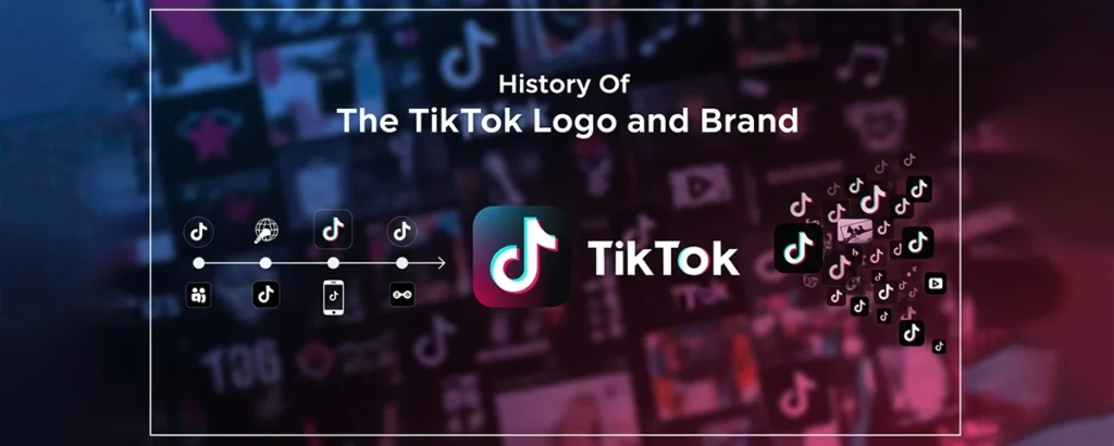
Exploring the evolution of one of the world's most recognizable social media brands
Introduction
In the rapidly evolving landscape of social media, few platforms have captured global attention as swiftly and dramatically as TikTok. What began as a Chinese app called Douyin has transformed into a cultural phenomenon that has redefined how we consume and create content, particularly among younger generations. With over 1 billion active users worldwide, TikTok has become synonymous with viral dances, creative challenges, and bite-sized entertainment that keeps millions scrolling for hours.
TikTok's Iconic Logo
A symbol recognized by billions worldwide
In the digital age, branding has become more crucial than ever before. A company's logo serves as its visual identity, instantly communicating values, personality, and purpose to consumers across the globe. For social media platforms, this visual representation becomes even more significant as it appears on millions of devices, in app stores, and across countless marketing materials. The logo becomes a gateway to the user experience, setting expectations and creating emotional connections before users even open the app.
The power of effective branding in the social media space cannot be overstated. Consider how instantly recognizable the Facebook "f," Twitter's bird, or Instagram's camera icon have become. These symbols transcend language barriers and cultural differences, creating universal recognition that drives user engagement and platform loyalty. In this context, TikTok's branding journey becomes particularly fascinating, as it represents not just the evolution of a logo, but the transformation of a regional app into a global cultural force.
This comprehensive exploration delves deep into the history of TikTok's logo and brand identity, tracing its origins from the early days of Douyin in China to its current status as one of the world's most influential social media platforms. We'll examine the strategic decisions behind each design choice, the cultural and market forces that influenced the brand's evolution, and the impact this visual identity has had on popular culture. Through this journey, we'll uncover how a simple logo became a symbol of creativity, youth culture, and the democratization of content creation in the 21st century.
Early Beginnings: The Douyin Era
To understand TikTok's branding journey, we must first travel back to September 2016, when ByteDance launched Douyin (抖音) in the Chinese market. The name "Douyin" literally translates to "shaking sound" or "vibrating sound," perfectly capturing the app's core concept of short-form video content set to music. This linguistic choice was deliberate and culturally significant, as it immediately conveyed the app's audio-visual nature to Chinese-speaking users.
Original Douyin Branding Elements

Original Douyin Logo
Featured Chinese character with musical note styling
Musical Focus
Emphasized audio-visual content creation
The original Douyin logo was distinctly different from what we recognize as TikTok today. It featured a stylized musical note combined with Chinese characters, reflecting its primary market and core functionality. The color palette was predominantly red and pink, colors that resonate strongly with Chinese consumers and symbolize good fortune, joy, and prosperity in Chinese culture. This initial branding was specifically tailored for the domestic Chinese market, with little consideration for international expansion at the time.
ByteDance's initial marketing strategy for Douyin was laser-focused on capturing the attention of young Chinese users, particularly those in tier-one cities like Beijing, Shanghai, and Shenzhen. The app was positioned as a platform for creative expression, allowing users to showcase their talents through short videos enhanced with special effects, filters, and popular music tracks. The branding materials from this era emphasized fun, creativity, and social connection, themes that would later become central to TikTok's global identity.
2016September
Douyin launches in China with original logo featuring Chinese characters and musical note styling. Initial focus on tier-one Chinese cities.2017Early
First major branding campaign featuring young Chinese influencers and celebrities. Logo appears across subway stations and digital billboards in major cities.2017Mid
Douyin reaches 100 million users, establishing itself as a major player in the Chinese social media landscape. Brand recognition grows significantly.
The early success of Douyin in China was remarkable, but it also presented ByteDance with an interesting challenge: how to expand internationally while maintaining the essence of what made the app successful. The original branding, while perfect for the Chinese market, would need significant adaptation for global audiences who couldn't read Chinese characters and might not connect with the cultural references embedded in the original design.
During this period, ByteDance was also observing the international success of Musical.ly, an app with similar functionality that had gained significant traction in Western markets, particularly among American teenagers. Musical.ly's branding was more universally accessible, featuring a simple musical note logo and English-language marketing materials. This observation would prove crucial in shaping ByteDance's approach to international expansion and the eventual creation of the TikTok brand.
The Birth of TikTok: A Strategic Merger
The year 2018 marked a pivotal moment in social media history when ByteDance made the strategic decision to acquire Musical.ly for approximately $800 million and merge it with Douyin to create TikTok for international markets. This wasn't just a business acquisition; it was a masterclass in global branding strategy that required careful consideration of cultural differences, user expectations, and market positioning across diverse international audiences.
Douyin (China)
Character-based, culturally specific
TikTok (Global)
Universal symbol, globally accessible
The creation of the TikTok logo represented a significant departure from both Douyin's character-based design and Musical.ly's simple musical note. The new logo featured a stylized musical note that appeared to be glitching or duplicating, creating a distinctive visual effect that immediately communicated the app's focus on creative, dynamic content. The design was intentionally abstract enough to transcend cultural boundaries while maintaining a clear connection to music and movement.
TikTok Logo Design Elements
♪
Musical Note Base
Represents the audio-centric nature of content
⚡
Glitch Effect
Suggests digital creativity and viral content
🌈
Dual Colors
Pink and cyan create vibrant, youthful energy
The color scheme of the new TikTok logo was particularly strategic. The combination of hot pink and electric cyan created a vibrant, energetic palette that appealed to younger demographics while standing out dramatically in app stores and on mobile devices. These colors were chosen not just for their visual impact, but for their psychological associations with creativity, fun, and digital innovation. The slight offset or "glitch" effect between the pink and cyan elements gave the logo a sense of movement and digital authenticity that resonated with the platform's core value proposition.
The typography accompanying the logo was equally thoughtful. The wordmark "TikTok" used a custom typeface that was bold, friendly, and highly legible across various sizes and contexts. The double "k" at the end created a visual rhythm that echoed the repetitive, catchy nature of the content on the platform. This attention to typographic detail ensured that the brand would be recognizable even when the logo icon wasn't present.
Beyond the visual elements, the name "TikTok" itself was a stroke of branding genius. The onomatopoeia suggested the ticking of a clock, implying both the time-based nature of the content and the addictive, time-consuming quality of the user experience. It was short, memorable, and easily pronounceable across different languages and cultures. The repetitive syllable structure made it inherently catchy, much like the content it would host.
The launch of TikTok with its new branding was carefully orchestrated across multiple markets simultaneously. Unlike many app launches that start in one region and expand gradually, TikTok's rebrand was a global event that created immediate international recognition. This bold approach required significant investment in marketing and brand awareness campaigns, but it established TikTok as a major player in the global social media landscape from day one of its international presence.
Logo Evolution: Refinement and Recognition
While TikTok's core logo design has remained remarkably consistent since its 2018 launch, the brand has undergone subtle but significant refinements that reflect its growing maturity and expanding global presence. These changes, while often imperceptible to casual users, demonstrate the careful attention to detail that has helped maintain TikTok's visual coherence across billions of interactions and countless marketing touchpoints.
Logo Evolution Timeline
2018August
Initial TikTok logo launch with pronounced glitch effect and bold color contrast.
v1.0: Original launch version2019Early
Subtle refinements to improve readability at smaller sizes and enhance app store visibility.
v1.1: Optimized for mobile displays2020Mid
Color saturation adjustments to improve accessibility and comply with platform guidelines.
v1.2: Enhanced accessibility2021Present
Current version with optimized proportions and refined color balance for global consistency.
Latest: Current optimized version
One of the most significant factors driving these evolutionary changes has been user feedback and usability testing. As TikTok's user base expanded to include older demographics and users with varying levels of digital literacy, the company discovered that certain aspects of the original logo design could be optimized for better recognition and accessibility. For instance, the initial glitch effect, while visually striking, sometimes caused confusion when the logo appeared at very small sizes on mobile devices or in crowded interface environments.
Market trends and platform requirements have also influenced the logo's evolution. As TikTok expanded its presence across different operating systems, app stores, and digital platforms, each with their own design guidelines and technical requirements, the logo needed to maintain its distinctive character while adapting to various display contexts. This led to the development of multiple logo variants optimized for different use cases, from the full-color version used in marketing materials to simplified monochrome versions for certain technical applications.
Dark Mode Optimization
![]()
Adjusted brightness and contrast for dark interfaces while maintaining brand recognition.
Light Mode Standard
![]()
Full saturation colors optimized for light backgrounds and maximum visual impact.
The introduction of TikTok for Business and other professional services also necessitated logo adaptations. While the consumer-facing app maintained its playful, energetic branding, business-oriented materials required more subdued versions that could work in corporate environments while still maintaining brand consistency. This led to the development of a comprehensive brand guidelines document that specified exactly how the logo should appear across different contexts, ensuring consistency while allowing for necessary flexibility.
Perhaps most importantly, the logo's evolution has been driven by TikTok's expanding role in global culture. As the platform moved beyond entertainment to become a significant source of news, education, and social commentary, the branding needed to reflect this increased gravitas while maintaining its approachable, creative essence. The subtle refinements made over the years have helped achieve this balance, creating a logo that feels both fun and trustworthy, innovative and reliable.
Looking at the current iteration of the TikTok logo, it's clear that each evolutionary step has been purposeful and data-driven. The company has successfully maintained the core visual identity that made the brand instantly recognizable while continuously optimizing for better performance across an ever-expanding range of use cases and user contexts. This approach to logo evolution serves as a masterclass in maintaining brand consistency while adapting to changing market demands and technological requirements.
Brand Identity and Marketing Strategy
TikTok's brand identity extends far beyond its iconic logo, encompassing a comprehensive strategy that has revolutionized how social media platforms engage with their audiences. The company's approach to branding represents a fundamental shift from traditional top-down marketing to a community-driven, user-generated content strategy that has redefined the relationship between platforms and their users.
Core Brand Pillars
🎨
Creativity
Empowering users to express themselves
🌟
Authenticity
Celebrating real, unfiltered moments
🤝
Community
Building connections through shared interests
⚡
Innovation
Pushing boundaries of digital content
The evolution of TikTok's branding strategy can be traced through several distinct phases, each reflecting the platform's growing sophistication and market position. In its early days, TikTok's marketing focused heavily on user acquisition through traditional digital advertising channels, emphasizing the fun and creative aspects of the platform. However, as the app gained traction, the company recognized that its users themselves were becoming its most powerful marketing asset.
The role of influencer marketing in shaping TikTok's brand cannot be overstated. Unlike other platforms that primarily worked with established celebrities and macro-influencers, TikTok pioneered a more democratic approach to influence, where ordinary users could achieve viral fame overnight. This strategy was not just about marketing efficiency; it was a fundamental expression of the brand's values around accessibility, creativity, and meritocracy. The platform's algorithm, which could propel unknown creators to millions of views, became a core part of the brand promise.
Notable Brand Campaigns
#MakeYourMove (2019)
Encouraged users to showcase their unique talents and perspectives, reinforcing the platform's commitment to individual expression.
#LearnOnTikTok (2020)
Positioned the platform as an educational resource during the pandemic, expanding beyond entertainment to include learning and skill development.
#TikTokMadeMeBuyIt (2021)
Celebrated the platform's influence on consumer behavior and product discovery, acknowledging its role in driving purchasing decisions.
Community engagement has been central to TikTok's branding strategy from the beginning. The platform's approach to community building goes beyond simply providing tools for content creation; it actively fosters a sense of belonging and shared experience among users. This is evident in features like duets, stitches, and collaborative challenges that encourage users to build upon each other's content, creating a truly collaborative creative environment.
The platform's response to major cultural moments has also shaped its brand identity. During the COVID-19 pandemic, TikTok became a source of comfort, entertainment, and connection for millions of people stuck at home. The company's branding during this period emphasized themes of resilience, creativity in constraints, and the power of digital community to maintain human connections. This positioning helped establish TikTok not just as an entertainment platform, but as an essential social infrastructure.
TikTok's approach to brand partnerships and advertising has been equally innovative. Rather than simply inserting traditional advertisements into the user experience, the platform has developed native advertising formats that feel organic to the TikTok environment. Branded hashtag challenges, for example, invite users to create content around brand themes, turning advertising into a collaborative creative exercise. This approach has proven highly effective, with many branded campaigns achieving viral status and generating millions of user-generated content pieces.
The company's commitment to supporting creators has become a cornerstone of its brand identity. Through programs like the Creator Fund, educational resources, and creator-focused events, TikTok has positioned itself as a platform that genuinely invests in its community's success. This approach has created a virtuous cycle where successful creators become brand ambassadors, attracting new users and reinforcing TikTok's reputation as a platform where creative dreams can become reality.
Cultural Impact and Recognition
The transformation of TikTok from a simple video-sharing app to a global cultural phenomenon represents one of the most significant shifts in digital media consumption and creation in the 21st century. The platform's logo has become more than just a brand identifier; it has evolved into a symbol of cultural participation, creative expression, and generational identity that transcends traditional boundaries of geography, language, and social status.
Cultural Milestones
🏆 Awards & Recognition
- App Store App of the Year (2018)
- Google Play Awards Winner (2019)
- Webby Awards - Social Media Platform (2020)
- Time Magazine's 100 Most Influential Companies (2021)
📊 Cultural Statistics
- 1+ billion monthly active users
- Available in 150+ countries
- 75+ languages supported
- 1 billion hours watched daily
TikTok's impact on popular culture extends far beyond its user statistics. The platform has fundamentally altered how trends are created, spread, and consumed in the digital age. Unlike previous social media platforms where trends often originated from celebrities or major media outlets, TikTok democratized trend creation, allowing anyone with creativity and timing to influence global culture. The platform's logo has become synonymous with this cultural democratization, representing a space where viral fame is accessible to all.
The phenomenon of TikTok dances exemplifies the platform's cultural influence. Choreographed routines created by users, often teenagers, have been performed by celebrities, featured in major sporting events, and even influenced professional entertainment productions. The TikTok logo appearing alongside these cultural moments has reinforced its association with creativity, youth culture, and cultural innovation. Major brands, politicians, and institutions have recognized this influence, leading to widespread adoption of TikTok-style content across other platforms and media.
Viral Cultural Moments
The Renegade Dance
Created by 14-year-old Jalaiah Harmon, this dance became a global phenomenon, performed everywhere from NBA games to late-night television shows.
Sea Shanty Revival
TikTok single-handedly revived interest in traditional sea shanties, leading to chart-topping music releases and mainstream media coverage.
Educational Content Boom
Teachers, scientists, and experts found new audiences through bite-sized educational content, changing how knowledge is shared and consumed.
The platform's influence on language and communication patterns has been equally profound. TikTok has accelerated the creation and spread of new slang, phrases, and communication styles that have permeated offline conversations, particularly among younger demographics. The logo has become a visual shorthand for this linguistic innovation, representing a space where language evolves rapidly and organically through community interaction.
TikTok's role in social and political movements has further cemented its cultural significance. The platform has become a crucial space for activism, awareness campaigns, and social commentary, with the logo appearing alongside important cultural and political conversations. From climate change activism to social justice movements, TikTok has provided a platform for voices that might otherwise struggle to reach mainstream audiences, making its logo a symbol of democratic participation in public discourse.
The economic impact of TikTok's cultural influence cannot be ignored. The platform has created entirely new career paths and economic opportunities, from professional content creators to TikTok marketing specialists. The logo has become associated with entrepreneurship and creative economy opportunities, representing a platform where creative skills can translate into economic success. This has particularly resonated with younger generations who see TikTok not just as entertainment, but as a potential career platform.
Perhaps most significantly, TikTok has influenced how other platforms and media companies approach content creation and audience engagement. The short-form, vertical video format pioneered by TikTok has been adopted across the digital media landscape, from Instagram Reels to YouTube Shorts. The TikTok logo has become iconic not just for its own platform, but as a symbol of a broader shift in digital media consumption patterns that prioritizes authentic, creative, and easily digestible content over traditional, highly produced media formats.
Conclusion: The Future of TikTok's Brand
The journey of TikTok's logo and brand identity from the early days of Douyin to its current status as a global cultural icon represents more than just successful marketing or clever design. It embodies a fundamental shift in how digital platforms can influence culture, create community, and democratize creative expression on a global scale. The evolution we've traced through this exploration reveals a brand that has successfully balanced consistency with adaptability, maintaining its core identity while continuously evolving to meet the changing needs of its diverse, global community.
Key Takeaways
✓ Strategic Evolution
TikTok's branding journey demonstrates the importance of strategic thinking in global brand development, successfully transitioning from regional to universal appeal.
✓ Adaptive Consistency
Maintaining core brand elements while making subtle refinements has allowed TikTok to stay relevant without losing recognition.
✓ Cultural Resonance
The logo's success stems from its ability to represent values that resonate across cultures: creativity, authenticity, and community connection.
✓ Community-Driven Growth
The brand's strength comes from its community, with users becoming active participants in shaping and spreading the brand identity.
Looking toward the future, TikTok's branding faces both tremendous opportunities and significant challenges. As the platform continues to expand into new markets and demographics, the logo and brand identity will need to maintain their universal appeal while potentially adapting to local cultural nuances. The company's expansion into areas like e-commerce, education, and professional networking will require careful consideration of how the brand can stretch to encompass these new use cases without diluting its core identity.
The regulatory and political challenges facing TikTok in various markets also present unique branding considerations. The company will need to navigate questions of trust, data privacy, and cultural sensitivity while maintaining the playful, creative brand identity that has made it successful. This may require developing more sophisticated brand messaging that addresses these concerns without compromising the authentic, user-centric approach that has been central to its success.
Technological evolution will undoubtedly influence TikTok's brand future as well. As new technologies like augmented reality, virtual reality, and artificial intelligence become more prevalent in social media, TikTok's brand will need to evolve to represent these new capabilities while maintaining its accessibility and creative focus. The logo itself may need to adapt to new display contexts and interaction paradigms as the nature of digital interfaces continues to evolve.
Perhaps most importantly, TikTok's brand future will be shaped by its continued commitment to empowering creators and fostering authentic community connections. The logo has become a symbol of creative possibility and cultural participation, and maintaining this association will be crucial as the platform grows and matures. The challenge will be scaling this intimate, community-focused brand identity to serve an increasingly diverse and global user base.
The story of TikTok's logo and brand evolution offers valuable lessons for any organization seeking to build a globally resonant brand in the digital age. It demonstrates the power of authentic community engagement, the importance of cultural sensitivity in global expansion, and the value of maintaining core brand principles while remaining adaptable to changing circumstances. As TikTok continues to evolve, its logo will undoubtedly remain a powerful symbol of creativity, community, and cultural innovation in the digital landscape.
Share Your Thoughts
What's your perspective on TikTok's brand evolution? How has the logo influenced your perception of the platform?


